

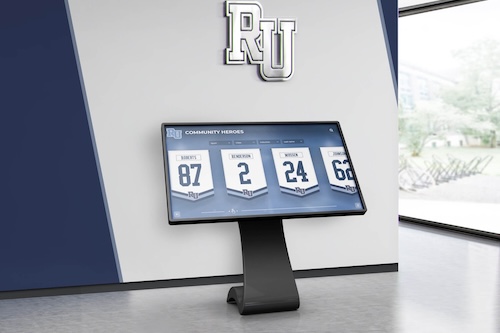

A digital hall of fame ARIA-controls audit is a structured review confirming that every interactive control on your recognition platform—search inputs, sport-filter buttons, class-year tabs, and biography panel toggles—carries an aria-controls attribute that correctly references the ID of the region or panel it affects. Without this attribute, a visitor navigating your hall of fame with NVDA, JAWS, VoiceOver, or TalkBack can activate a search button or filter tab and hear no programmatic indication of which content region just changed, forcing them to explore the page to discover where new results appeared. The short answer for school administrators, athletic directors, and IT teams: identify every control that opens, expands, or updates a separate content region; inspect each control in browser DevTools to confirm aria-controls references a valid panel ID; verify that the referenced panel ID exists in the DOM and is applied to the correct element; and test each interaction with a screen reader to confirm that assistive technology can navigate directly from the control to its associated content.
When a visitor using a screen reader activates the search field on a school’s digital hall of fame—typing a name and pressing Enter—the search results that appear in a separate region of the page are not automatically linked to the control that produced them. Sighted visitors see the results load directly below or beside the search bar. Screen reader users need a programmatic bridge between the control and the output region, and aria-controls is the WAI-ARIA attribute that provides it. The same gap exists for sport-category filter tabs that update an inductee list panel, for biography or statistics tabs that switch the content of a detail region, and for accordion toggles that expand an inductee’s career summary beneath a collapsed header.
For athletic directors, IT teams, and recognition-program administrators who maintain digital inductee archives—whether web-based collections, touchscreen lobby kiosks, or both—the aria-controls audit is one of the more impactful accessibility checks available for interactive recognition interfaces. It addresses not just whether a control is operable (keyboard and touch navigation), but whether the relationship between that control and its controlled content is visible to assistive technology. A search button that keyboard users can reach and activate, but whose result panel is invisible to the screen reader’s relationship model, satisfies the first requirement and fails the second.

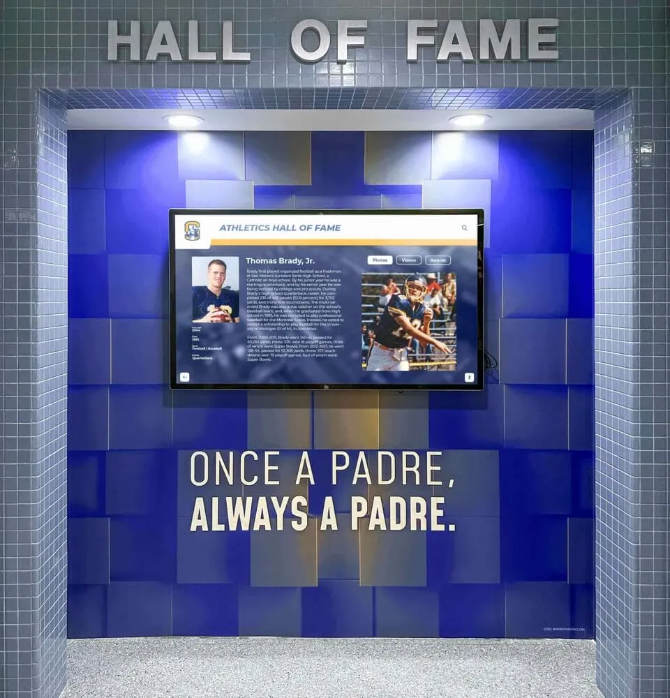
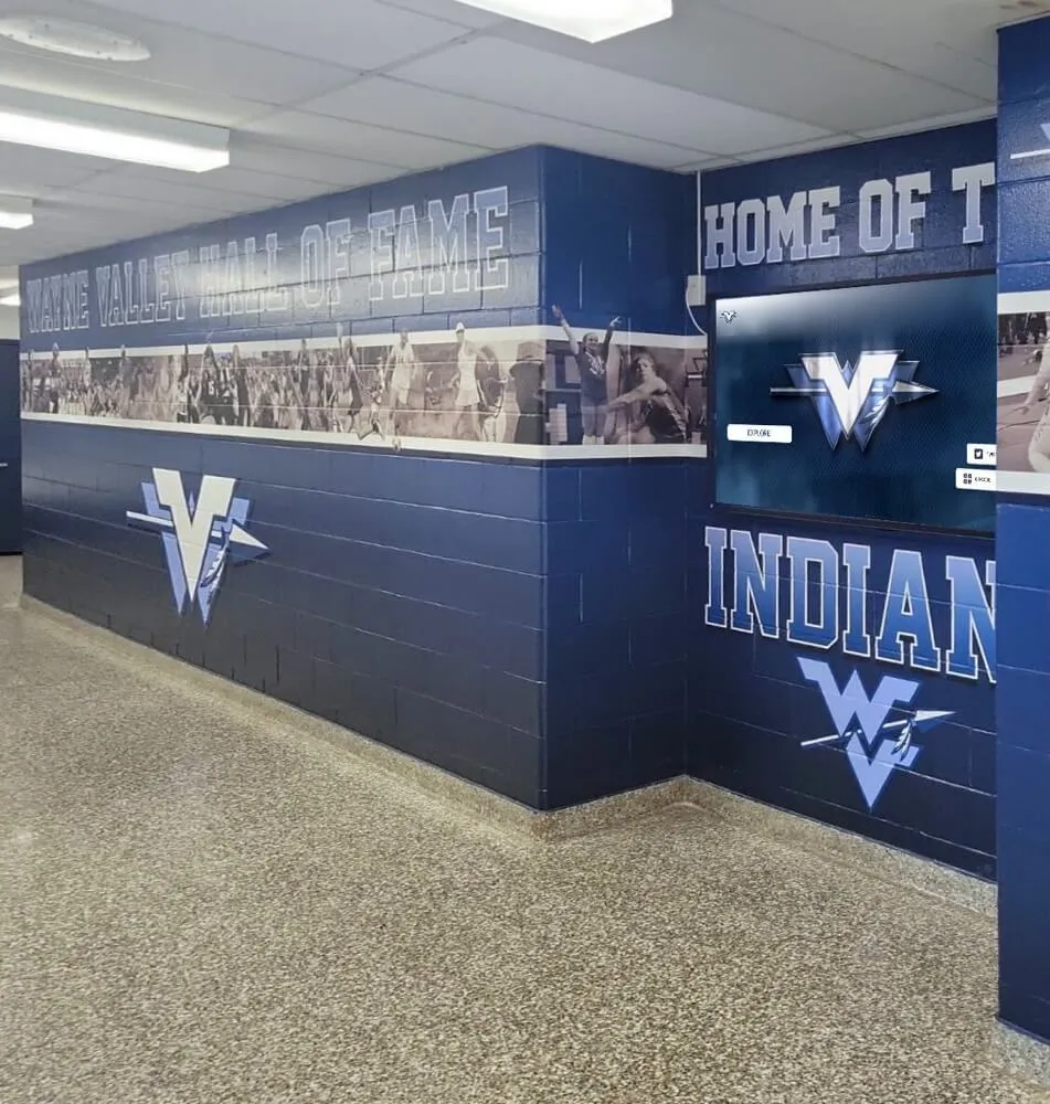
Every search input, filter button, and detail tab on a hall of fame recognition platform should carry aria-controls referencing the ID of the panel it affects—so assistive technology users can navigate directly to newly loaded content
What WCAG Requires for Control-to-Panel Relationships
WCAG 2.1 Success Criterion 4.1.2 (Name, Role, Value) at Level A requires that for all user interface components, the name, role, and any current states, properties, and values can be programmatically determined and set. The WAI-ARIA specification extends this to include relationships between components: when a control element affects a separate content region, the relationship between control and region should be programmatically determinable so that assistive technology can expose it to the user.
aria-controls is the attribute defined in the WAI-ARIA specification for declaring this relationship. Placing aria-controls="results-panel" on a search button tells a supporting screen reader that this button controls the element with id="results-panel". A screen reader that implements support for aria-controls can then offer the user a shortcut to jump to the controlled panel after activating the control—or announce the relationship when the user focuses the control—allowing efficient navigation from search input to search results without requiring the user to explore the full page.
WCAG 2.1 SC 1.3.1 (Info and Relationships) at Level A additionally requires that the relationships implied by visual layout be programmatically determinable. A visual design that positions a “Filter by Sport” button directly above an inductee grid visually implies a relationship between button and grid; that implied relationship must be programmatically exposed for it to be accessible to screen reader users who cannot perceive the spatial arrangement.
Both criteria are Level A requirements—the foundational accessibility tier referenced by virtually every school ADA compliance policy. Schools should consult the authoritative WCAG 2.1 specification at www.w3.org and their accessibility advisor for compliance guidance specific to their program. Recognition programs that also provide print or digital award documentation organized as structured records benefit from applying the same relationship-mapping discipline to their digital archive interfaces.
The aria-controls Attribute: How It Works
The aria-controls attribute accepts one or more space-separated IDs of elements that the current element controls. The attribute is placed on the controlling element—the button, input, tab, or toggle—and the referenced IDs must exist in the DOM and match the id attribute of the controlled panel or region.
<!-- Correct: button references the ID of the panel it controls -->
<button aria-controls="search-results" aria-expanded="true">
  Search Inductees
</button>
<div id="search-results" role="region" aria-label="Search results">
  <!-- search result cards rendered here -->
</div>
When a screen reader user focuses the search button in this example, a supporting screen reader can announce the relationship (“controls search results region”) and may offer a shortcut key to jump to the controlled panel. Without aria-controls, the screen reader announces only the button’s name and role, providing no guidance about where results will appear.
aria-controls is defined in the WAI-ARIA specification but has historically had uneven implementation across screen readers. JAWS has supported it longest; NVDA’s support is present but varies by version; VoiceOver on macOS and iOS has partial support. Because support is not universal, aria-controls is most effective when combined with other techniques—aria-live regions for search results that update dynamically, focus management that moves keyboard focus to the results region after a search completes, and clear visible labels on result regions. The attribute should be included as part of a complete accessibility implementation, not relied upon as the sole bridge between control and panel.
For schools evaluating the full spectrum of interactive touchscreen recognition platforms and their software capabilities, aria-controls implementation quality is one useful differentiator to examine during platform review—it indicates whether the platform’s ARIA implementation extends beyond basic labeling to control-panel relationships.
Hall of Fame Control Scenarios Requiring aria-controls
Search Input and Results Panel
The search interface is the most consequential surface for aria-controls in a digital hall of fame. A school with decades of inductees may have hundreds of names in its recognition database; the search field is the primary navigation tool for visitors who arrive with a specific person in mind. When a visitor types a name and activates the search, the results panel that loads must be programmatically associated with the search control.
The search control pattern should include:
aria-controlson the search button referencing the results region IDaria-labelon the search input describing its purpose (“Search inductees by name or sport”)role="search"on the form container to identify the search landmarkaria-live="polite"on the results region so screen readers announce when new results load- Focus management that moves keyboard focus to the results region after search completes, or to a “Found N results” status message
When search is implemented as a live-search field that updates results as the user types—common on touchscreen kiosk interfaces—the results region should carry aria-live="polite" and the input should carry aria-controls referencing the results region. The live region handles dynamic announcements; aria-controls handles the declared relationship for screen reader navigation.
Recognition programs that maintain both traditional and digital recognition archives—for example, schools comparing digital and physical display options for hallways and lobbies—often find that the search functionality of digital platforms is a primary advantage over physical cases. Ensuring that advantage is equally accessible to screen reader users protects the value proposition.
Sport-Category Filter Buttons and Inductee List Panel
Sport-category filters are among the most common interactive controls on hall of fame platforms. A visitor seeking basketball inductees selects the “Basketball” filter; the inductee list region updates to show only basketball honorees. The filter button must reference the inductee list panel through aria-controls so that screen reader users know where to navigate after the filter is applied.
When filters are implemented as a button group (rather than as navigation links or a tablist), each filter button should carry:
aria-controlsreferencing the ID of the inductee list or grid regionaria-pressed="true"oraria-pressed="false"to communicate the filter’s active state (oraria-current="true"if appropriate to the implementation)
When filters are implemented as proper ARIA tabs (role="tab" within role="tablist"), aria-controls is part of the required tab pattern: each role="tab" element must carry aria-controls referencing the ID of its associated role="tabpanel" element. This is not optional in the ARIA tablist pattern—the WAI-ARIA specification explicitly lists aria-controls as a required property for the tab role.
<!-- Correct: ARIA tablist with aria-controls wiring -->
<div role="tablist" aria-label="Filter inductees by sport">
  <button role="tab" aria-selected="true" aria-controls="football-panel" id="tab-football">Football</button>
  <button role="tab" aria-selected="false" aria-controls="basketball-panel" id="tab-basketball">Basketball</button>
  <button role="tab" aria-selected="false" aria-controls="volleyball-panel" id="tab-volleyball">Volleyball</button>
</div>

<div role="tabpanel" id="football-panel" aria-labelledby="tab-football">
  <!-- Football inductee cards -->
</div>
<div role="tabpanel" id="basketball-panel" aria-labelledby="tab-basketball" hidden>
  <!-- Basketball inductee cards -->
</div>
<div role="tabpanel" id="volleyball-panel" aria-labelledby="tab-volleyball" hidden>
  <!-- Volleyball inductee cards -->
</div>
In this pattern, aria-controls on each tab and aria-labelledby on each panel create a bidirectional programmatic relationship: a screen reader can navigate from tab to panel and from panel back to its controlling tab.

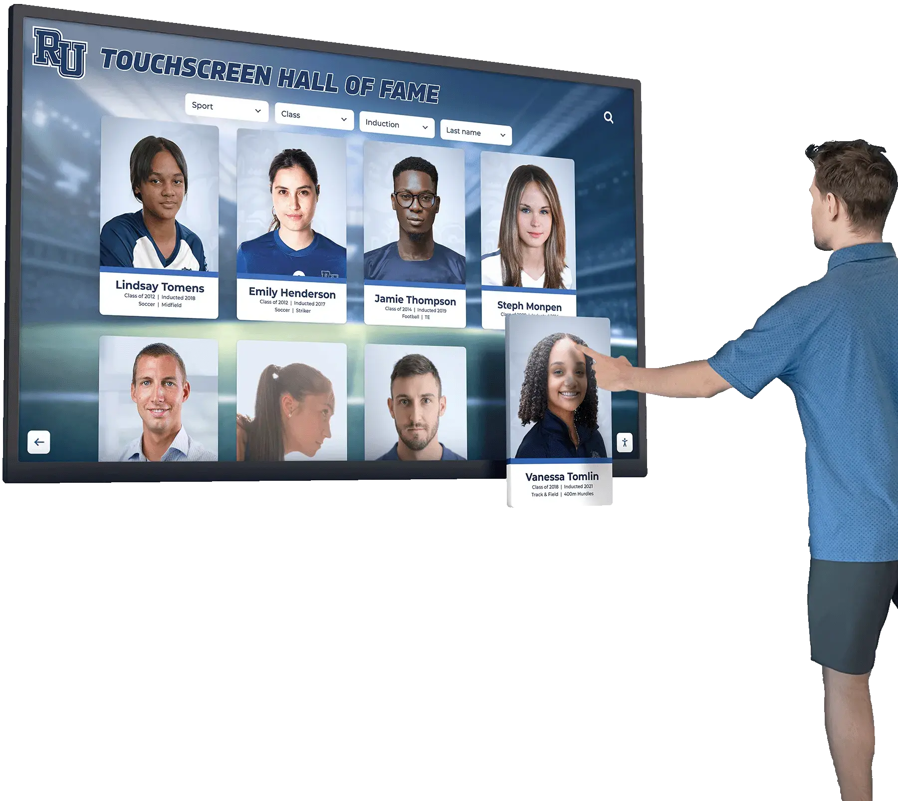
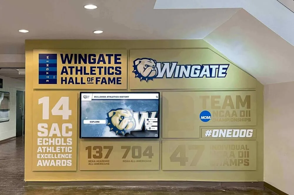
Sport-category filter tabs that update the inductee card grid below them must carry aria-controls referencing the grid region's ID—so screen reader users know where to navigate after selecting a sport filter
Biography and Statistics Detail Tabs on Inductee Profiles
Inductee profile pages commonly organize information across multiple tabs: a Biography tab, a Statistics tab, a Media tab, and an Awards tab. Each tab controls a corresponding detail panel. In this context, the full ARIA tablist pattern—with aria-controls on each tab and role="tabpanel" on each panel—is the required implementation.
For recognition programs that display substantial narrative content about each inductee’s career—similar in depth to the profile reading level and content structure guidelines that govern how biographical content is written—the accessibility of the tab interface that surfaces that content is equally important as the readability of the content itself. A screen reader user who cannot navigate from the Biography tab to the biography detail panel effectively cannot access the profile content.
The profile tab pattern requires:
role="tablist"on the tab container with a descriptivearia-labelrole="tab"on each tab button witharia-selectedandaria-controlsrole="tabpanel"on each content region withidmatching the tab’saria-controlsvalue andaria-labelledbymatching the tab’sidtabindex="0"on the active tabpanel andtabindex="-1"on inactive panels (orhiddenattribute on inactive panels)- Keyboard navigation within the tablist: arrow keys to move between tabs, Enter or Space to activate, Tab to move into the active tabpanel
Class-Year and Decade Archive Selectors
Many hall of fame platforms let visitors browse by induction year or graduating class. A “Class of 2023” button that reveals that year’s inductees in a content region below should carry aria-controls referencing that region. If the year selectors are implemented as tabs—the recommended pattern when each year view shows a distinct content panel—the full tablist pattern with aria-controls applies.
For programs that recognize inductees with associated graduation ceremonies, honors distinctions, and traditions connected to class and cohort identity, the class-year navigation is often a primary discovery path for inductees’ families, classmates, and former teammates who attend recognition events. Ensuring this navigation is accessible protects the experience for all visitors at those events.
Accordion Toggles on Expanded Inductee Detail Sections
Some recognition platforms use accordion components on inductee profile pages or in the inductee gallery sidebar. An accordion toggle that reveals an expanded career summary, a statistical record list, or an awards history section should carry both aria-expanded (to communicate the open/closed state) and aria-controls (to reference the ID of the expanded region).
<!-- Correct: accordion toggle with aria-expanded and aria-controls -->
<button
  aria-expanded="false"
  aria-controls="jane-smith-career-summary"
  id="toggle-jane-smith">
  View Career Summary
</button>
<div id="jane-smith-career-summary" aria-labelledby="toggle-jane-smith">
  <!-- career summary content, hidden when aria-expanded is false -->
</div>
When the visitor activates the toggle, the script should update aria-expanded to "true" and make the controlled region visible. The aria-controls attribute remains static; it always points to the same panel ID regardless of the expanded or collapsed state.
Autocomplete and Search Suggestion Dropdowns
Inductee name search fields that show autocomplete suggestions as the visitor types require aria-controls on the input element referencing the ID of the suggestion list. This is part of the ARIA combobox pattern, which defines aria-controls as a required property of the combobox role when the controlled popup is present.
<!-- Correct: combobox pattern with aria-controls on the input -->
<input
  type="text"
  role="combobox"
  aria-controls="name-suggestions"
  aria-expanded="true"
  aria-autocomplete="list"
  aria-activedescendant="suggestion-1"
  placeholder="Search inductees by name">
<ul role="listbox" id="name-suggestions">
  <li role="option" id="suggestion-1">James Anderson</li>
  <li role="option" id="suggestion-2">Jennifer Anderson</li>
</ul>
Without aria-controls on the combobox input, screen readers may not announce the suggestion list’s presence when it appears, and the input-to-list relationship is not programmatically determinable. This is particularly impactful on touchscreen kiosk displays where visitors are typing names into a search field for the first time.
The ARIA-Controls Audit: Step-by-Step Checklist
Complete this checklist on the web-based inductee collection and on any browser-rendered lobby kiosk interfaces. Steps 1 through 3 require only browser DevTools. Steps 4 and 5 require a screen reader—NVDA on Windows or VoiceOver on macOS.
Step 1: Map Every Control-to-Panel Relationship on Key Page Types
Before testing, document every interactive control on your hall of fame pages that affects a separate content region when activated. Common control-panel relationships include:
- Search input or search button → search results region
- Sport-category filter buttons or tabs → inductee list or grid region
- Class-year or induction-cycle selector → year-specific inductee region
- Biography, Statistics, Media, and Awards tabs → corresponding detail panels on inductee profiles
- Accordion toggle buttons → expanded detail sections on profile pages or gallery sidebars
- Autocomplete search input → suggestion dropdown list
- “View Details” or “Read More” buttons → expanded profile modal or inline detail region
- Year-range or date filter controls → filtered record board results region
For each control identified, record: the control element type and label, the intended controlled region, and whether the two elements are currently linked by aria-controls.
Step 2: Inspect the Controlling Element in DevTools
For each control-panel pair identified in Step 1, perform the following inspection.
- Load the relevant page and open browser DevTools (F12 in Chrome, Firefox, or Edge).
- In the Elements panel, locate the control element (the search button, filter tab, accordion toggle, etc.).
- Check whether
aria-controlsis present and carries a value:
A correctly implemented control appears as:
<button aria-controls="inductee-results" aria-expanded="false">
  Filter: Basketball
</button>
An incorrectly implemented control appears as:
<button class="filter-btn active">
  Filter: Basketball
</button>
In the second example, no programmatic relationship links the button to the inductee results region. A screen reader user who activates this button has no mechanism to navigate directly to the content that changed.
- If
aria-controlsis present, copy its value and search the page source for an element with a matchingidattribute. If no element with that ID exists in the DOM, thearia-controlsreference is broken—it declares a relationship to a panel that the DOM does not contain.
Step 3: Validate aria-controls References in DevTools
For every aria-controls value found in Step 2, verify the following.
- The referenced ID exists in the DOM. Search the Elements panel for
id="[the-referenced-value]"and confirm the element is present. - The referenced element is the correct panel. Confirm that the element whose ID is referenced is actually the result or detail region that the control affects—not an adjacent element, a hidden template, or a wrapper one level too high or low in the DOM hierarchy.
- The referenced element has an appropriate role. For search result regions,
role="region"witharia-labelis recommended. For tab panels,role="tabpanel"is required. For accordion panels, a<div>or<section>witharia-labelledbyis appropriate. - Confirm
aria-controlsIDs do not contain spaces unless intentionally listing multiple controlled panels. A space-separated list of IDs inaria-controlsis valid and indicates the control affects multiple regions simultaneously; confirm this is the intended behavior.
Step 4: Test Search and Filter Controls with a Screen Reader
With NVDA running on Windows, navigate to the inductee search interface. Locate the search input using NVDA’s form field navigation (F to jump to the next form field). Tab to the search button and listen to NVDA’s announcement.
Pass: NVDA announces the button name and may announce the controlled region (“Search button, controls search results region”) or offer a shortcut to navigate to the controlled panel after activation.
Fail: NVDA announces only “Search button” with no relationship information. After activating the search button, NVDA does not provide a direct navigation path to the results region; the user must manually navigate the page to discover where results appeared.
After activating the search and waiting for results to load, test whether focus management moves keyboard focus to the results region or to a status message announcing the result count. If focus remains on the search button after results load, a screen reader user must explore the page to find the results—acceptable if a live region announces the count, but better when focus moves directly.
For programs that host recognition events where large numbers of families and community members visit the hall of fame for the first time—including events like senior nights where many guests may be unfamiliar with the platform—accessible search and navigation protects the experience for all visitors including those using assistive technology on mobile devices.
Step 5: Test Tab Controls and Detail Panels with a Screen Reader
Navigate to an inductee profile page that includes a tab interface (Biography, Statistics, Awards, Media, or similar). Locate the tablist using NVDA’s landmark navigation (D to jump to the next landmark region; look for “tab list” in NVDA’s announcement).
Navigate through the tabs using the arrow keys and activate a tab. Then press Tab to move focus into the associated tabpanel.
Pass: NVDA announces the tab as “Football, tab, 1 of 3, selected” and after Tab is pressed, moves focus into a region announced as “Football inductees, tab panel” or similar. The relationship between tab and panel is navigable.
Fail: NVDA announces the tab buttons without a tablist context, or pressing Tab after activating a tab moves focus to the next interactive element on the page rather than into the tabpanel. The controlled panel is reachable only by arrow-key or mouse navigation, not through the keyboard-focus path from the tab.
Repeat the test on any accordion components found on profile pages. Activate an accordion toggle and confirm that NVDA announces both the state change (“expanded”) and that keyboard Tab subsequently moves focus into the expanded region.
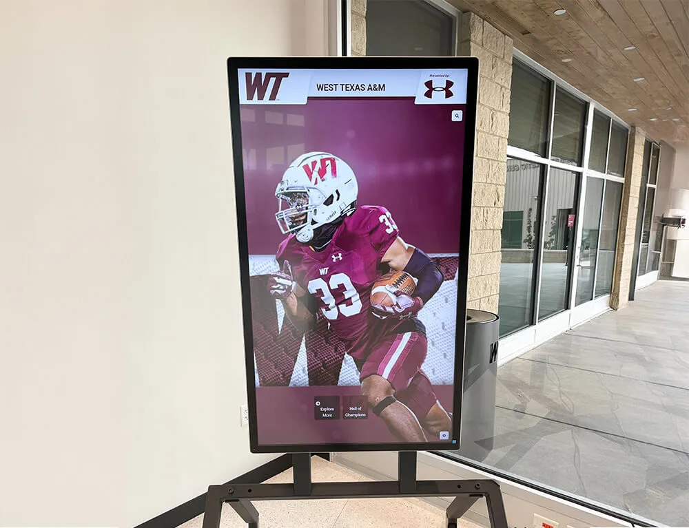
Navigation controls that reveal detail sections on a touchscreen recognition display must carry aria-controls so assistive technology can expose the relationship between each control and its associated content panel
Pass/Fail Code Examples
The following examples show correct and incorrect markup for the control-panel patterns most commonly audited on school hall of fame pages.
Search Control — Pass
<form role="search" aria-label="Search inductees">
  <label for="inductee-search">Search by name or sport</label>
  <input
    type="search"
    id="inductee-search"
    aria-controls="search-results-panel">
  <button type="submit" aria-controls="search-results-panel">
    Search
  </button>
</form>

<section
  id="search-results-panel"
  role="region"
  aria-label="Search results"
  aria-live="polite">
  <!-- search result cards rendered here -->
</section>
Search Control — Fail
<form>
  <input type="text" placeholder="Search inductees...">
  <button type="submit">Search</button>
</form>

<div class="results-container">
  <!-- search result cards rendered here -->
</div>
No aria-controls links the button to the results container. No role="search" identifies the form landmark. No aria-live region announces new results.
Sport Filter Tab — Pass
<div role="tablist" aria-label="Filter inductees by sport">
  <button
    role="tab"
    id="tab-basketball"
    aria-selected="true"
    aria-controls="panel-basketball">
    Basketball
  </button>
  <button
    role="tab"
    id="tab-football"
    aria-selected="false"
    aria-controls="panel-football">
    Football
  </button>
</div>

<div
  role="tabpanel"
  id="panel-basketball"
  aria-labelledby="tab-basketball"
  tabindex="0">
  <!-- Basketball inductee cards -->
</div>
<div
  role="tabpanel"
  id="panel-football"
  aria-labelledby="tab-football"
  tabindex="-1"
  hidden>
  <!-- Football inductee cards -->
</div>
Sport Filter Tab — Fail
<div class="tab-strip">
  <button class="tab active" data-target="basketball">Basketball</button>
  <button class="tab" data-target="football">Football</button>
</div>

<div id="basketball" class="tab-panel active">
  <!-- Basketball inductee cards -->
</div>
<div id="football" class="tab-panel" style="display:none">
  <!-- Football inductee cards -->
</div>
The data-target attribute is a custom attribute with no WAI-ARIA meaning. Screen readers have no mechanism to discover the control-to-panel relationship. No role="tablist", role="tab", or role="tabpanel" attributes expose the widget structure.
Accordion Toggle — Pass
<h3>
  <button
    aria-expanded="false"
    aria-controls="career-summary-1998-class"
    id="toggle-career-1998">
    View Career Summary — Class of 1998
  </button>
</h3>
<div
  id="career-summary-1998-class"
  aria-labelledby="toggle-career-1998"
  hidden>
  <p>Career summary content goes here.</p>
</div>
Accordion Toggle — Fail
<button class="accordion-toggle" onclick="toggleSection('career-1998')">
  View Career Summary
</button>
<div id="career-1998" class="accordion-panel">
  <p>Career summary content goes here.</p>
</div>
aria-expanded and aria-controls are both absent. A screen reader user hears only “View Career Summary, button” with no indication of the control’s expanded state or its relationship to the content below.
Audit Summary Table
| Control Type | Required ARIA Pattern | Common Failure Mode |
|---|---|---|
| Search button or input | aria-controls on button/input referencing results region ID | Button has no aria-controls; results region has no id |
| Sport filter tabs (ARIA tablist) | role="tab" + aria-controls + aria-selected; panels use role="tabpanel" | data-target used instead of aria-controls; panel has no role="tabpanel" |
| Sport filter buttons (non-tab) | aria-controls referencing inductee list region; aria-pressed for toggle state | Custom CSS class communicates active state; no ARIA attributes present |
| Biography/Statistics detail tabs | Full tablist pattern with aria-controls on each tab and aria-labelledby on each panel | Tabs implemented as <div> elements with click handlers; no ARIA roles or relationships |
| Class-year selector | aria-controls referencing year-specific inductee region; tablist pattern if visually tab-styled | Selector uses <select> element but result region has no ARIA relationship declared |
| Accordion toggle | aria-expanded + aria-controls on toggle button; panel labeled with aria-labelledby | Toggle button updates CSS class; aria-expanded not present or not updated dynamically |
| Autocomplete search input | role="combobox" + aria-controls referencing suggestion list; list uses role="listbox" | Input has no combobox role; suggestion list appears but is not programmatically linked to input |
| “View Details” modal button | aria-controls referencing modal dialog ID; modal uses role="dialog" with aria-labelledby | Modal opens via JavaScript; button has no aria-controls or aria-haspopup |
See Accessible Search and Detail Panels in Action
Rocket Alumni Solutions' digital wall of fame platform is built with ADA and WCAG 2.1 AA compliance in mind. Search panels, sport-filter tab interfaces, inductee detail views, and touchscreen kiosk navigation all carry complete ARIA relationship markup—so your recognition team focuses on honoring athletes and alumni, not auditing control-panel wiring. Request a demo to see how accessible search and detail panels work for your school.
Request Your Custom DemoCommon Errors and How to Fix Them
Error: aria-controls references an ID that does not exist in the DOM
A control carries aria-controls="results-panel" but the results region’s id attribute is "search-results" rather than "results-panel". The referenced ID is broken—no element in the DOM matches the declared value. Screen readers that implement aria-controls navigation will find nothing to navigate to. Fix: ensure the value in aria-controls exactly matches the id attribute of the target panel. IDs are case-sensitive; Results-Panel and results-panel are different values.
Error: aria-controls present but aria-expanded absent on accordion and disclosure widgets
An accordion toggle carries aria-controls but omits aria-expanded. Screen readers cannot determine whether the controlled region is currently expanded or collapsed. A visitor hears “View Career Summary, button” with no state information. Fix: add aria-expanded="false" to collapsed toggles and update it to aria-expanded="true" in the JavaScript handler that expands the panel. The value must change dynamically; a static aria-expanded="false" that never updates to "true" is worse than omitting the attribute.
Error: aria-controls placed on the wrong element
A developer places aria-controls on a <div> wrapper around the actual trigger button rather than on the button itself. Screen readers associate aria-controls with the element it is directly applied to; when that element is a non-interactive wrapper, the relationship may not be communicated to the user. Fix: move aria-controls directly to the actionable element—the <button>, <a>, or <input> that the visitor actually activates.
Error: Custom tab implementation uses data-target instead of aria-controls
JavaScript-driven tab implementations frequently use a custom attribute such as data-target, data-panel, or data-tab to link tab buttons to their panels. These custom attributes have no WAI-ARIA meaning and are ignored by screen readers. The visual tab behavior functions correctly; the programmatic relationship is absent. Fix: replace or supplement the custom attribute with aria-controls and add the full tablist ARIA pattern (role="tablist", role="tab", role="tabpanel", aria-selected).
Error: aria-controls not updated when controlled panel ID changes dynamically
Some JavaScript frameworks generate panel IDs dynamically—for example, using a counter or timestamp as part of the ID. If the panel ID changes between page loads or on route change, the static aria-controls value from the initial render may point to an ID that no longer exists in the current DOM. Fix: ensure that when panel IDs are generated dynamically, the corresponding aria-controls value on the controlling element is updated in the same render cycle.
Error: Search results region missing from aria-controls but present in DOM
The search results container exists in the DOM and is visually correct, but the search button carries no aria-controls attribute at all. This is the most common failure: the panel is present, the control is present, but no programmatic relationship is declared. Fix: add id="[descriptive-id]" to the results container and add aria-controls="[that-id]" to the search button. For dynamic results, also add aria-live="polite" to the results container.
Recognition programs that build comprehensive recognition architectures—including dual recognition systems covering both alumni and donor recognition—often implement separate search and filter interfaces for each recognition type. Apply this audit checklist independently to each search and filter surface, as the control-panel relationships may be implemented differently across the hall of fame and donor recognition sections of the same platform.
Frequently Asked Questions
Q: Is aria-controls required by WCAG 2.1?
A: WCAG 2.1 Success Criterion 4.1.2 (Name, Role, Value) requires that the relationships between UI components be programmatically determinable for roles that define relationship properties. For formal ARIA widget patterns—specifically role="tab" within a role="tablist", and role="combobox" with a controlled popup—aria-controls is a required property defined in the WAI-ARIA specification. For other control-panel relationships (search buttons, accordion toggles, filter buttons), aria-controls is the recommended mechanism for declaring the relationship programmatically. Omitting it where a defined ARIA pattern requires it constitutes a failure of SC 4.1.2. Consult the authoritative WCAG 2.1 specification at www.w3.org and your institution’s accessibility advisor for guidance specific to your program.
Q: Which screen readers support aria-controls navigation?
A: JAWS has the most comprehensive support for aria-controls, including a keystroke that moves focus to the controlled element. NVDA’s support is present but has historically been less consistent across versions; always verify current behavior with the NVDA version your target audience is likely to use. VoiceOver on macOS and iOS has partial support. Because support varies, aria-controls should be paired with focus management (moving keyboard focus to the results region after a search) and aria-live regions (announcing new content when it loads) rather than treated as the sole mechanism for directing users to updated content.
Q: Our recognition platform uses a third-party search widget. How do we request aria-controls fixes?
A: Submit a support ticket to your platform vendor identifying the specific control and panel where aria-controls is missing or broken. Reference the WAI-ARIA specification’s definition of aria-controls and WCAG 2.1 SC 4.1.2 in your request. For tab interfaces, cite the WAI-ARIA Authoring Practices Guide’s tab pattern, which lists aria-controls as required on role="tab" elements. Ask for a timeline and post-deployment verification guidance. After the vendor updates the platform, repeat the DevTools inspection in Step 2 and Step 3 and the screen reader tests in Steps 4 and 5.
Q: Does aria-controls apply to the touchscreen kiosk as well as the website?
A: Hall of fame kiosk interfaces that render in a browser-based environment—the most common architecture for modern touchscreen recognition systems—are subject to the same HTML and ARIA requirements as web-based pages. If the kiosk search interface, sport-filter tabs, or inductee detail panels lack aria-controls, those relationships are absent for any visitor using a connected keyboard or assistive technology peripheral. ADA compliance at school facilities increasingly requires that lobby kiosk interfaces support assistive technology input; the ARIA relationship markup required for that support is the same on the kiosk as on the website.
Q: How is aria-controls different from aria-describedby?
A: aria-controls declares a control-to-target relationship: this element actively controls or updates that element. aria-describedby declares a description relationship: that element provides additional descriptive text for this element. For a search button, aria-controls references the results region the button updates; aria-describedby might reference a hint text element explaining search syntax. The two attributes address different semantic relationships and are not interchangeable. Using aria-describedby in place of aria-controls on a tab button does not create the tab-to-panel relationship required by the ARIA tablist pattern.
Q: How often should we run an aria-controls audit?
A: Run a full audit at initial platform launch, after any update that adds or modifies search, filter, or tab interfaces, and annually as part of a broader accessibility review. A lightweight spot-check—loading the inductee gallery, activating the search control, and inspecting the button element in DevTools for aria-controls—takes under five minutes and is appropriate after any deployment that touches search or filter functionality. For platforms that serve large visitor volumes during recognition events—including ceremonies analogous to major hall of fame event experiences where families and alumni arrive expecting a seamless experience—running a spot-check before the event protects accessibility during peak usage.
Q: Can we use aria-owns instead of aria-controls?
A: aria-owns and aria-controls serve different purposes. aria-owns restructures the accessibility tree by declaring that an element logically owns another element that is not its DOM descendant—used when the DOM order does not reflect the logical accessibility structure. aria-controls declares that a control actively controls or updates a target element. For search buttons, filter tabs, and accordion toggles, aria-controls is the correct attribute. aria-owns is not a substitute and should not be used to declare control-panel relationships.
Every school’s digital hall of fame is built around the promise that every inductee’s story is findable and accessible. A visitor who cannot navigate from the search field to the results, or from a sport-filter tab to the inductee cards it reveals, encounters a recognition platform that delivers on that promise visually but not accessibly. Adding aria-controls to a search button, a filter tab, or an accordion toggle is a precise, targeted change—one attribute, one ID reference, one browser DevTools inspection to confirm. For ARIA tablist patterns that power sport-category browsing and biography detail tabs, the attribute is not optional; it is part of the role definition. For search and disclosure patterns, it is the mechanism that makes the visual control-to-panel relationship visible to the screen reader’s relationship model. Running this audit before each induction season—and verifying the results with NVDA or VoiceOver—costs less than an hour and ensures the navigation your recognition program provides is equally available to every visitor who arrives at your hall of fame.
Learn more about Rocket Alumni Solutions’ Digital Wall of Fame platform to understand how the platform’s cloud-based CMS and accessible interface architecture handle aria-controls, tablist patterns, and search panel relationships at the template level for recognition programs of any size.
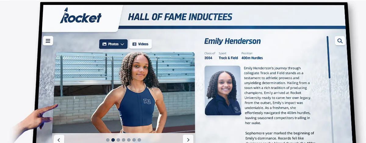
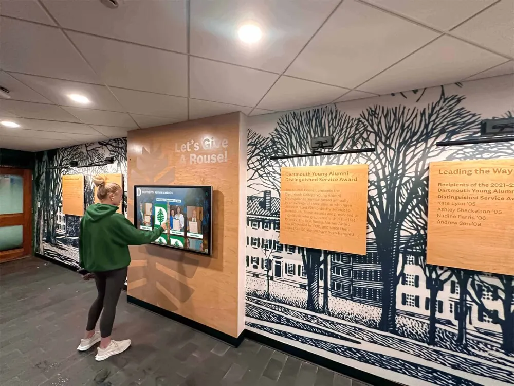
When a visitor activates a tab or button to reveal an inductee detail panel, the aria-controls attribute on that control must reference the panel's ID—creating a programmatic relationship that screen reader users can navigate directly
Schedule a Demo of an Accessible Digital Hall of Fame
Rocket Alumni Solutions builds interactive touchscreen and web-based recognition programs designed to serve every visitor—keyboard users, touch users, and screen reader users alike. Complete aria-controls implementation for search panels, sport-filter tabs, biography detail views, and touchscreen kiosk navigation is built into the platform from the ground up. See how it works for your school's inductee collection.
Schedule Your Demo