


A digital hall of fame aria-labelledby audit is a structured review confirming that every search input, sport filter, class-year selector, and advanced search control on your inductee recognition platform carries an aria-labelledby attribute that references the ID of its visible label element—so screen readers announce the label text a sighted visitor reads when an assistive-technology user focuses the control. The short answer for school athletic directors, administrators, and IT teams: identify every search and filter control on your hall of fame pages; open browser DevTools and inspect each control for an aria-labelledby attribute; verify that the IDs listed in that attribute exist in the DOM and point to elements whose text accurately names the control; confirm that the referenced text is visible (or visually hidden with a compliant technique rather than display:none or visibility:hidden); and test each control with NVDA or VoiceOver to confirm the announced name matches the label a sighted visitor sees before interacting with the search or filter interface.
When a parent arrives at your school’s digital hall of fame looking for an athlete who graduated twenty years ago, the search field is the first control they reach for. For a visitor using NVDA, VoiceOver, or TalkBack, whether that search field announces “Search inductees by name” or announces nothing at all depends on a single attribute: aria-labelledby. A search input with a visible label that reads “Search inductees” beside it but no programmatic link between that label and the input leaves a screen reader user with only the placeholder text—which many screen readers do not announce reliably, and which disappears the moment the visitor begins typing—or with silence. The visible label exists; the programmatic connection does not.
Recognition programs that serve schools with active inductee databases understand that the search and filter interface is not decoration—it is the navigation layer that makes a database of hundreds of inductees findable in seconds. For visitors using assistive technology, that navigation layer must announce its controls correctly. A sport filter combobox labeled visually by the heading “Filter by Sport” above it must reference that heading’s ID through aria-labelledby so screen readers announce “Filter by Sport” when the combobox receives focus. Without the attribute, the screen reader announces the combobox’s role and state but no name: “collapsed combobox.” A visitor navigating a page of filter controls without accessible names cannot identify which control changes which dimension of the inductee results.
This guide covers every search and filter control surface where aria-labelledby applies on a digital hall of fame platform, provides a step-by-step audit checklist, and includes pass/fail code examples for each common failure pattern.

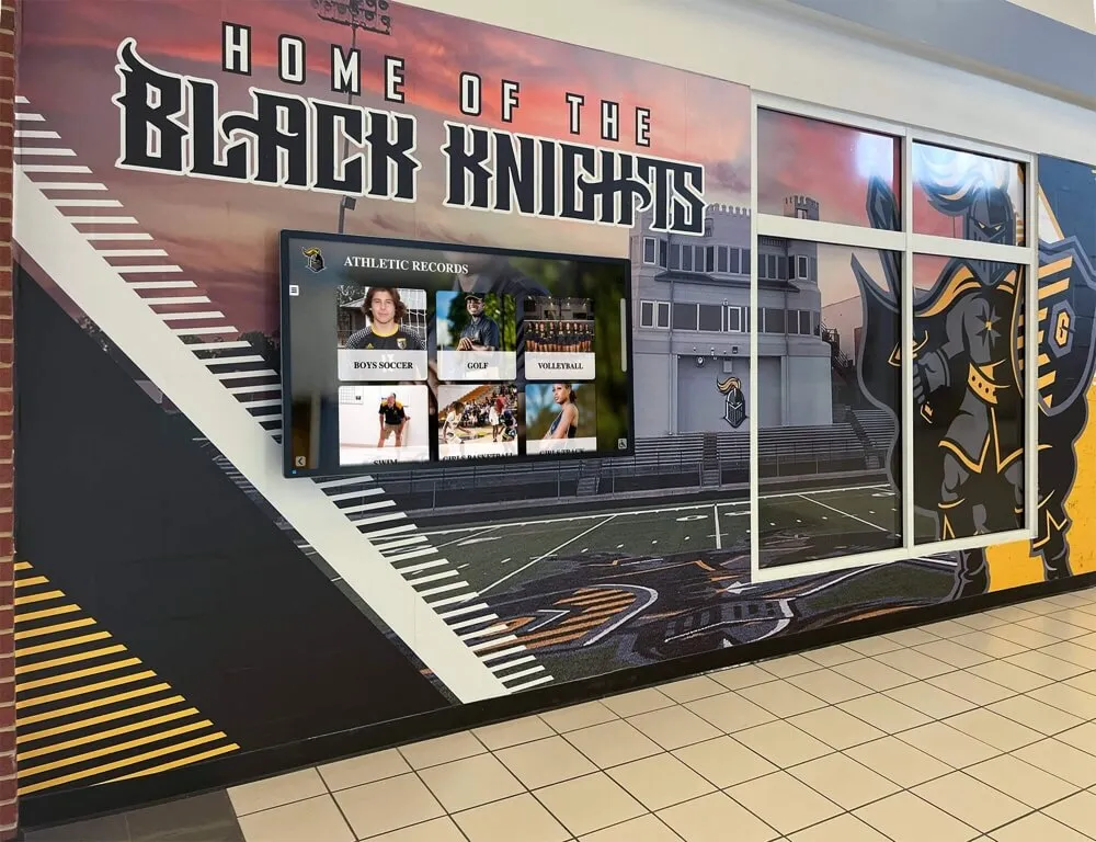
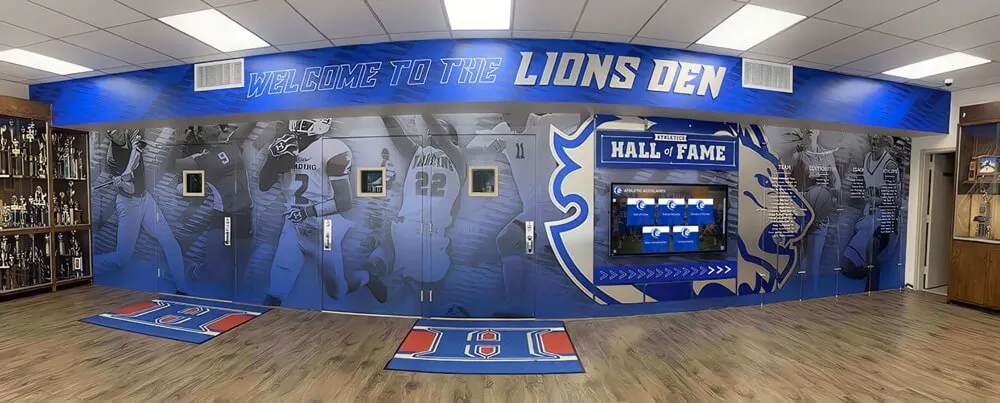
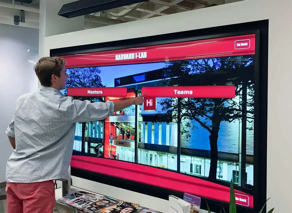
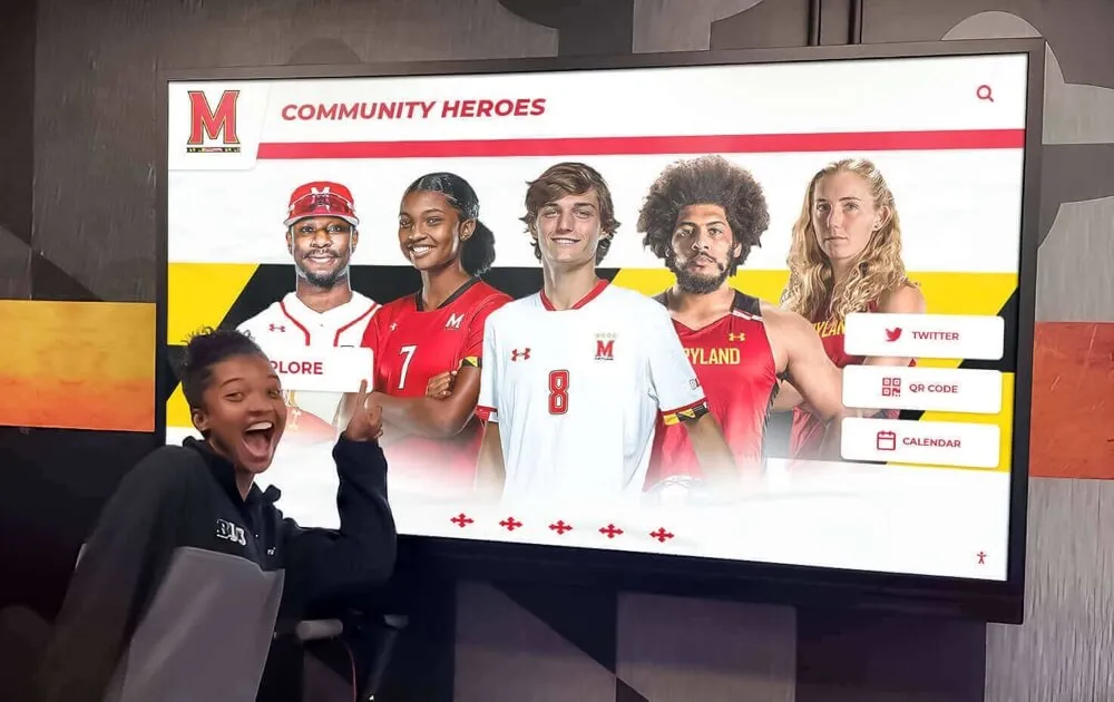
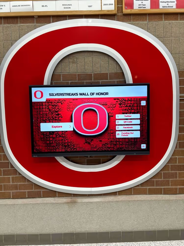
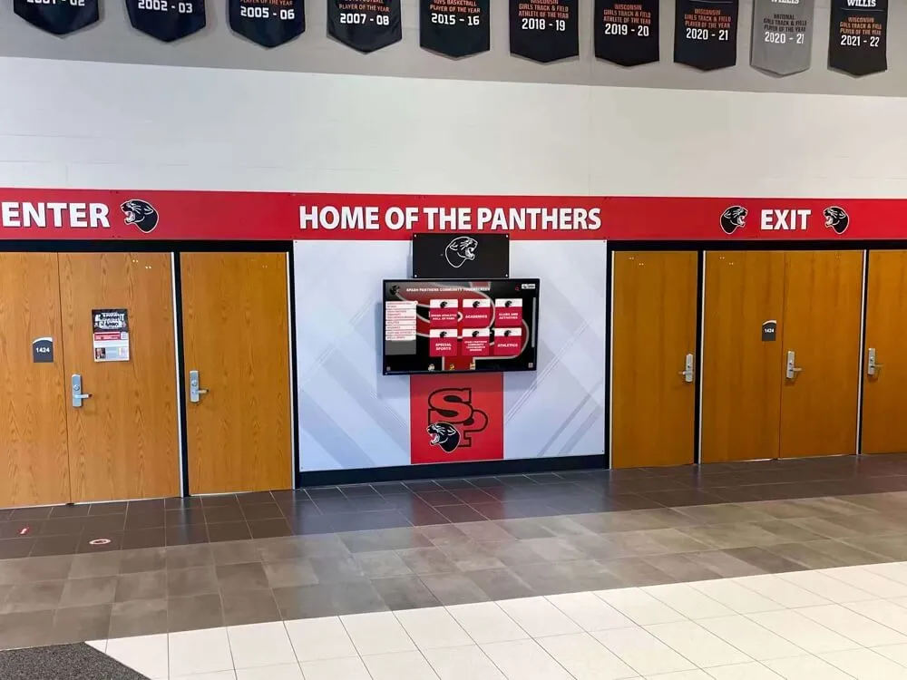
A visitor navigating a touchscreen hall of fame kiosk—search inputs and filter controls on both the web and kiosk interfaces must carry aria-labelledby referencing their visible label elements so assistive-technology users hear an accurate control name on focus
What aria-labelledby Does and When to Use It
aria-labelledby is a WAI-ARIA property that defines the accessible name of an element by reference—it accepts one or more space-separated IDs of elements in the DOM, and the text content of those referenced elements becomes the accessible name that screen readers announce when the element receives focus. If the aria-labelledby attribute lists two IDs, the accessible name is the concatenation of both elements’ text content in the order the IDs appear.
aria-labelledby is the correct labeling mechanism for a search or filter control in three specific situations on a digital hall of fame platform:
1. The visible label is a non-<label> element that cannot be linked with a for attribute. The HTML <label> element with a for attribute is the preferred mechanism for associating a visible text label with an <input> control. When the visible label is a heading (<h2>, <h3>), a paragraph, a <div>, or any other element that cannot carry a for attribute, aria-labelledby is the mechanism for programmatically associating that existing visible text with the control.
2. The accessible name must be composed from multiple visible text elements. A search input positioned beneath a section heading (“Find an Inductee”) and beside a visible descriptor (“by name, sport, or graduation year”) can be given an accessible name that combines both by listing both elements’ IDs in aria-labelledby: aria-labelledby="search-heading search-hint". Screen readers concatenate the text of both elements and announce the combined name.
3. A group of related controls shares a visible group label. A set of filter controls grouped under a visible heading (“Narrow Your Results”) can each reference that heading’s ID through aria-labelledby. This is appropriate when each individual control also has its own distinct label—the group label provides context, not replacement for individual control labels.
aria-labelledby is not appropriate in the following situations:
- When a proper
<label for="...">association is possible. Native HTML labeling is more robust and universally supported than ARIA. If a<label>element can be associated with the control usingforandid, use that pattern first. - When the referenced element is hidden with
display:noneorvisibility:hidden.aria-labelledbyreferences must point to elements that are in the accessibility tree. Elements hidden withdisplay:noneorvisibility:hiddenare removed from the accessibility tree and cannot serve as label sources foraria-labelledby. - As a substitute for
aria-labelwhen no visible label exists. If the design calls for a search input with no visible text label—relying solely on placeholder text or an icon—aria-labelledbycannot help because there is no existing visible element to reference. In this case,aria-label(which takes an inline string) is the appropriate attribute. Platforms that use icon-only search buttons face a similar challenge, which the accessible name audit for icon buttons and search filters covers in detail.
Where aria-labelledby Failures Appear on Inductee Search Controls
Name Search Input
The inductee name search field is the highest-traffic control on most hall of fame platforms. A school whose recognition database spans multiple decades may have alumni and families arriving at the search field specifically to type a name they remember from decades of sports coverage or community history.
The most common labeling pattern for name search inputs on hall of fame platforms is a visible text label (“Search Inductees,” “Find by Name,” or “Search by Athlete Name”) positioned visually adjacent to the input field. When this label is a <label> element with for matching the input’s id, the association is correct and complete. When the label is a heading, a <div>, or a <span> without a for attribute, the visual association is clear to sighted visitors but absent from the accessibility tree.
The failure pattern:
<!-- Visual label present; no programmatic association -->
<h3 class="search-heading">Search Inductees</h3>
<input type="search" placeholder="Type a name...">
A screen reader focusing this input announces “Type a name…, search field” (using the placeholder) or simply “search field” if the screen reader does not expose placeholder text. The visible heading “Search Inductees” is not announced.
The correct pattern using aria-labelledby:
<h3 id="search-heading" class="search-heading">Search Inductees</h3>
<input type="search" aria-labelledby="search-heading" placeholder="Type a name or sport">
A screen reader focusing the input now announces “Search Inductees, search field.” The visible heading and the screen reader announcement match.
For search inputs that also carry a visible hint below them (“Search is not case-sensitive; partial names are accepted”), the hint element’s ID can be added to aria-labelledby alongside the heading ID, or the hint can be associated separately via aria-describedby. Use aria-describedby for supplementary instructions so that the accessible name remains concise and the description is available when the user requests it. Platforms that implement autocomplete suggestions on the search input face additional labeling requirements for the suggestion list, which the aria-autocomplete audit for inductee search addresses alongside the suggestion list’s relationship to the input.
Sport and Category Filter Controls
Sport category filters on hall of fame platforms appear in a variety of implementations: combobox dropdowns, radio button groups, listboxes, and custom button groups that resemble toggle filters. Each implementation has specific labeling requirements, and aria-labelledby applies differently to each.
Combobox filter dropdowns that allow a visitor to select a sport category from a dropdown list should carry an accessible name that matches the visible label above or beside the combobox. When the visible label is a <label> with for, the association is native and complete. When the visible label is a heading or a styled element:
<!-- Correct: combobox labeled by visible heading above it -->
<p id="sport-filter-label" class="filter-label">Filter by Sport</p>
<div
  role="combobox"
  aria-labelledby="sport-filter-label"
  aria-expanded="false"
  aria-haspopup="listbox"
  tabindex="0">
  All Sports
</div>
<ul role="listbox" aria-labelledby="sport-filter-label">
  <li role="option">Football</li>
  <li role="option">Basketball</li>
  <li role="option">Volleyball</li>
</ul>
Radio button groups presenting sport categories as mutually exclusive options require a <fieldset> with a <legend>, or an element with role="group" and aria-labelledby referencing the visible group heading. Individual radio buttons within the group require their own <label> associations; the group-level aria-labelledby provides the container’s accessible name, not the individual option names.
Custom toggle button groups built from <button> elements that visually represent sport filters each need individual accessible names. If the button’s visible text is the sport name (“Football,” “Basketball”), the button name comes from its text content and no aria-labelledby is needed at the button level. The containing group element, however, should carry role="group" and aria-labelledby referencing a visible group heading so screen readers announce the group’s purpose before reading individual buttons.
Recognition programs that have audited their filter controls for toggle state—checking whether aria-pressed correctly communicates which sport filters are active—should extend that audit to confirm each filter control carries an accurate accessible name. The aria-pressed audit for toggle controls covers the state side of this interaction; aria-labelledby covers the name side.

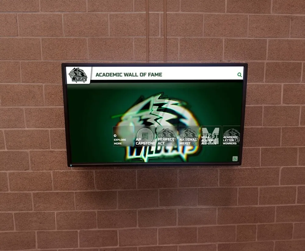
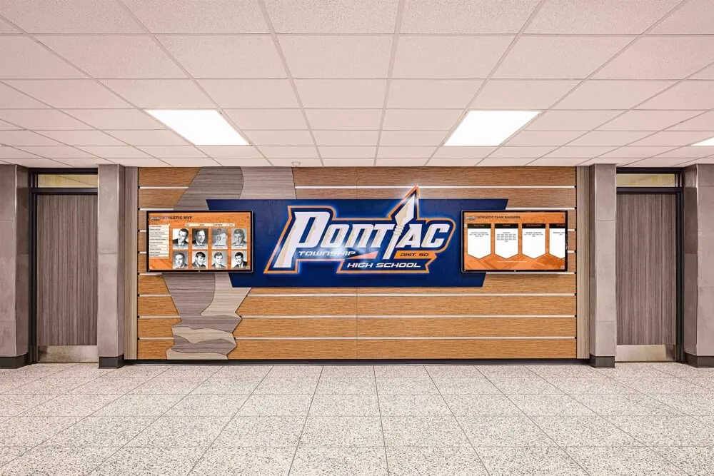
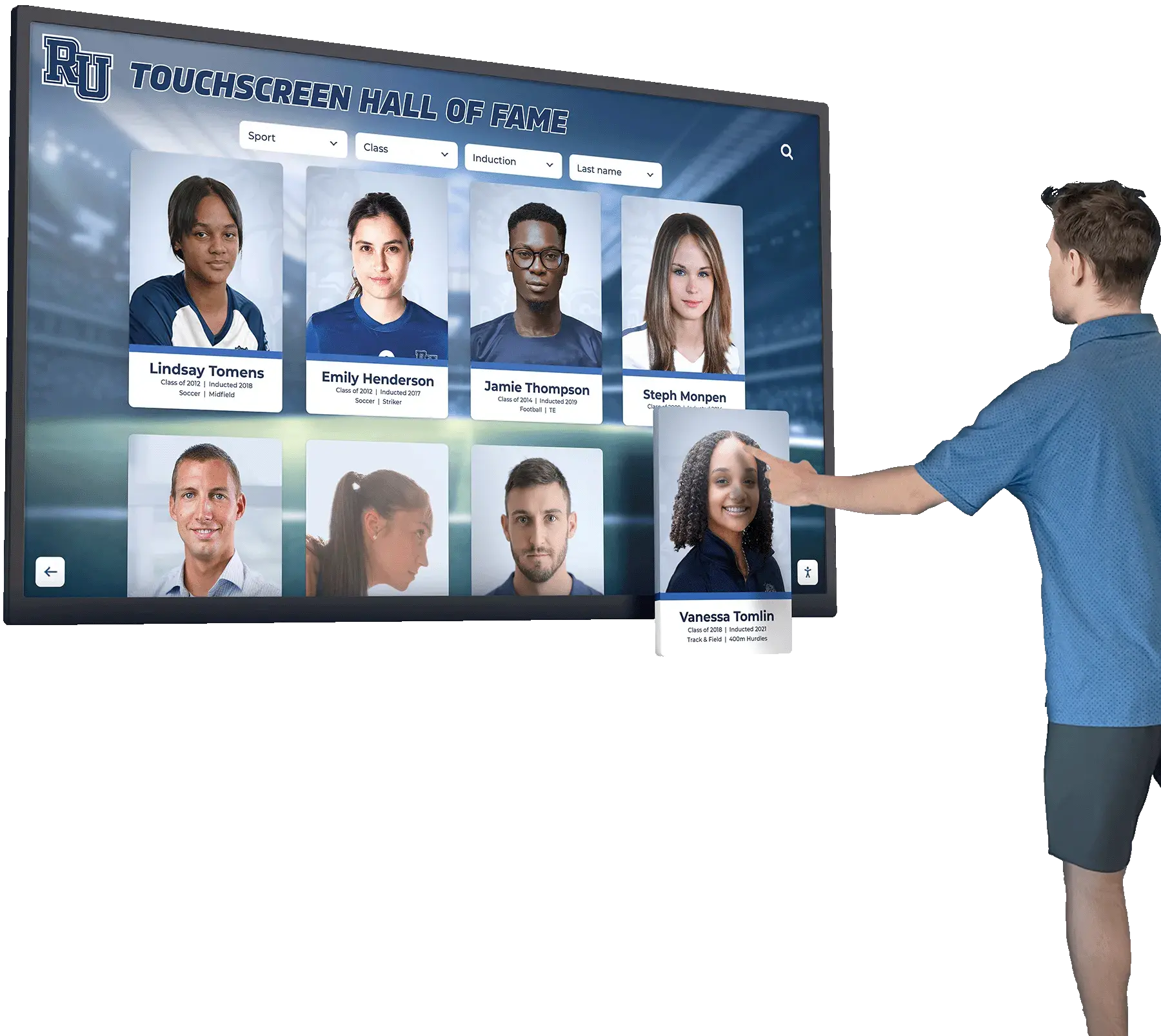
Sport filter controls that determine which inductee cards appear in the grid must carry aria-labelledby referencing their visible label elements—so screen reader users hear "Filter by Sport" rather than "collapsed combobox" when the filter receives focus
Class-Year and Induction-Era Selectors
Class-year selectors are the second most common filter type on school hall of fame platforms. Families searching for an inductee from a specific graduation year, teammates looking up cohorts from a particular era, or administrators browsing induction cycles all rely on this control.
Class-year selectors implemented as native <select> elements benefit from native HTML labeling: a <label> element with for matching the <select>’s id is the complete and preferred solution. aria-labelledby is not needed when native label association is available and in place.
When class-year selectors are implemented as custom combobox components—built from <div> and <span> elements to achieve custom visual styling—the native <label for> association is unavailable and aria-labelledby is required. The failure pattern is common: a styled dropdown with visible label text rendered as a sibling heading element but no programmatic connection between the two.
<!-- Fail: visible label, no programmatic association -->
<span class="filter-heading">Class Year</span>
<div class="custom-select" tabindex="0">Select year...</div>

<!-- Pass: aria-labelledby references the visible label -->
<span id="class-year-label" class="filter-heading">Class Year</span>
<div
  role="combobox"
  aria-labelledby="class-year-label"
  aria-expanded="false"
  aria-haspopup="listbox"
  tabindex="0">
  Select year...
</div>
For platforms that organize inductees into multi-year ranges (“Classes of 2000–2009,” “Classes of 2010–2019”), each range selector—whether implemented as a tab, a button, or a custom control—requires an accessible name that communicates the range. Recognition programs that have examined how search tokenization handles multi-word queries on these platforms will find the related search tokenization audit a useful companion resource for confirming that the accessible name on a range selector matches the query term the control submits.
Advanced Search and Multi-Field Filter Panels
Hall of fame platforms that expose advanced search panels—allowing visitors to filter inductees by name, sport, graduation year, record type, and award category simultaneously—present the most complex labeling landscape for aria-labelledby.
Each field in an advanced search panel requires its own accessible name. Common failure patterns in advanced search panels include:
Failure: All fields in the panel share a single accessible name from the panel’s heading. If the advanced search panel’s heading is “Advanced Search” and every field inside the panel references that heading’s ID through aria-labelledby, every field is announced as “Advanced Search” with no indication of what each field searches. A visitor cycling through fields hears “Advanced Search, text field” for the name field, “Advanced Search, text field” for the sport field, and “Advanced Search, combobox” for the year field—no differentiation.
Correct pattern: Each field references both the panel heading and its own individual label through a two-ID aria-labelledby value:
<section aria-labelledby="advanced-search-heading">
  <h3 id="advanced-search-heading">Advanced Search</h3>

  <label id="name-field-label" for="name-field">Inductee Name</label>
  <input
    type="text"
    id="name-field"
    aria-labelledby="advanced-search-heading name-field-label">

  <label id="sport-field-label" for="sport-field">Sport</label>
  <input
    type="text"
    id="sport-field"
    aria-labelledby="advanced-search-heading sport-field-label">
</section>
In this pattern, the name field is announced “Advanced Search Inductee Name, text field” and the sport field is announced “Advanced Search Sport, text field.” Each field is individually identifiable while the panel context is preserved. Note that when a <label> with for is already present and correct, aria-labelledby on the same <input> overrides the <label> association—test with a screen reader to confirm the announced name is the combination you intended.
Failure: aria-labelledby references an ID that was generated dynamically and has since changed. JavaScript frameworks that generate element IDs dynamically—using counters, hashes, or render-cycle identifiers—may produce IDs that differ between page loads or after component re-renders. An aria-labelledby value of "filter-label-17" that referenced a correctly labeled element on render one may point to a different element or no element on render two.
See Search Controls Built with Correct Accessible Names
Rocket Alumni Solutions' digital wall of fame platform builds search and filter controls with accessible names that screen reader users hear—matching the visible labels sighted visitors read. Request a demo to see how accessible search architecture works for your school's recognition program.
Request Your Custom DemoThe ARIA-Labelledby Audit: Step-by-Step Checklist
Complete this checklist on the web-based recognition platform and on any browser-rendered kiosk interfaces that expose inductee search and filter controls. Steps 1 through 4 use only browser DevTools. Steps 5 and 6 require NVDA on Windows or VoiceOver on macOS.
Step 1: Inventory Every Search and Filter Control
Before inspecting individual elements, build a complete list of every interactive control on the platform’s inductee search and filter interfaces. For each page template that includes search or filter functionality—the main inductee gallery, the search results page, the advanced search panel, individual sport or class-year category pages—document:
- Every
<input>element used for text search or autocomplete - Every
<select>element used for category or year selection - Every custom combobox, listbox, or dropdown built from
<div>or<span>elements with ARIA roles - Every radio button group or checkbox group used for filter selection
- Every button group that acts as a sport or category toggle filter
- Every range input (year range sliders, date range pickers) used to bound inductee results
For each control, record its visible label text—the text a sighted visitor reads to understand the control’s purpose—and the element type and any ARIA role the control carries. This inventory becomes the reference for Steps 2 through 4.
Step 2: Inspect Each Control for aria-labelledby
Open browser DevTools (F12 in Chrome, Firefox, or Edge) and locate each control identified in Step 1 in the Elements panel.
For each control, perform the following checks:
Check 1: Is the control labeled by a native <label for="..."> association?
Inspect the control’s id attribute and search the DOM for a <label> element whose for attribute matches that id. If a correctly associated <label> exists, the control has a valid accessible name from the native HTML mechanism. Record the label text and move to the next control. aria-labelledby is not required when native label association is complete and correct.
Check 2: If no native <label> association exists, is aria-labelledby present?
If the control has no associated <label>, inspect the control element for an aria-labelledby attribute. A correctly labeled custom combobox appears as:
<div
  role="combobox"
  aria-labelledby="sport-filter-label"
  aria-expanded="false"
  tabindex="0">
  All Sports
</div>
An unlabeled control appears as:
<div
  role="combobox"
  aria-expanded="false"
  tabindex="0">
  All Sports
</div>
The second example carries no accessible name. Screen readers announce “All Sports, collapsed combobox” (using the text content as a fallback) or “collapsed combobox” with no name. The visitor cannot determine from the screen reader announcement that this control filters by sport.
Check 3: If aria-labelledby is absent but aria-label is present, is the aria-label string accurate?
aria-label is an acceptable alternative to aria-labelledby when no visible label element exists. If aria-label is present, confirm its value accurately names the control’s purpose and matches the visible context a sighted visitor uses to identify the control.
Check 4: If aria-labelledby is present, does it reference a valid ID?
Copy the aria-labelledby value and search the DOM for an element with a matching id attribute. A broken reference—pointing to an ID that does not exist in the current DOM—produces an empty accessible name. The control is announced as unnamed despite the attribute being present.
In Chrome DevTools, the Accessibility panel (available in the Elements panel’s sidebar) shows the computed accessible name for any selected element. Use this panel to verify the final accessible name without manually tracing ID references.
Step 3: Confirm Referenced Elements Are Visible
aria-labelledby references must point to elements that are rendered in the accessibility tree. Verify that each element referenced by an aria-labelledby value is not hidden in a way that removes it from the accessibility tree.
Accessible hiding (valid for aria-labelledby references):
.visually-hidden {
  position: absolute;
  width: 1px;
  height: 1px;
  padding: 0;
  margin: -1px;
  overflow: hidden;
  clip: rect(0, 0, 0, 0);
  white-space: nowrap;
  border: 0;
}
Elements hidden with this technique remain in the accessibility tree and can serve as aria-labelledby targets. This pattern is valid when a visible label does not exist and a screen-reader-only label is required.
Inaccessible hiding (invalid for aria-labelledby references):
/* These remove the element from the accessibility tree */
display: none;
visibility: hidden;
Elements hidden with display:none or visibility:hidden are removed from the accessibility tree. An aria-labelledby attribute referencing such an element produces an empty accessible name. Inspect each referenced element’s computed styles in DevTools to confirm it is not hidden by these rules.
Step 4: Validate aria-labelledby on Group Containers
For filter controls organized into groups—sport filters grouped under “Filter Results,” year selectors grouped under “Browse by Class Year”—inspect the group container element for a group role and accessible name.
A correctly implemented filter group:
<div role="group" aria-labelledby="sport-group-heading">
  <h3 id="sport-group-heading">Filter by Sport</h3>
  <label><input type="checkbox" name="sport" value="football"> Football</label>
  <label><input type="checkbox" name="sport" value="basketball"> Basketball</label>
  <label><input type="checkbox" name="sport" value="volleyball"> Volleyball</label>
</div>
An incorrectly implemented filter group:
<!-- No role="group" or aria-labelledby on the container -->
<div class="sport-filters">
  <h3>Filter by Sport</h3>
  <label><input type="checkbox" name="sport" value="football"> Football</label>
  <label><input type="checkbox" name="sport" value="basketball"> Basketball</label>
  <label><input type="checkbox" name="sport" value="volleyball"> Volleyball</label>
</div>
In the second example, screen readers announce individual checkboxes with their own labels (Football, Basketball, Volleyball) but no group context. A visitor navigating directly to “Basketball” via checkbox navigation hears “Basketball, checkbox, not checked” without knowing the checkbox belongs to a sport filter group.
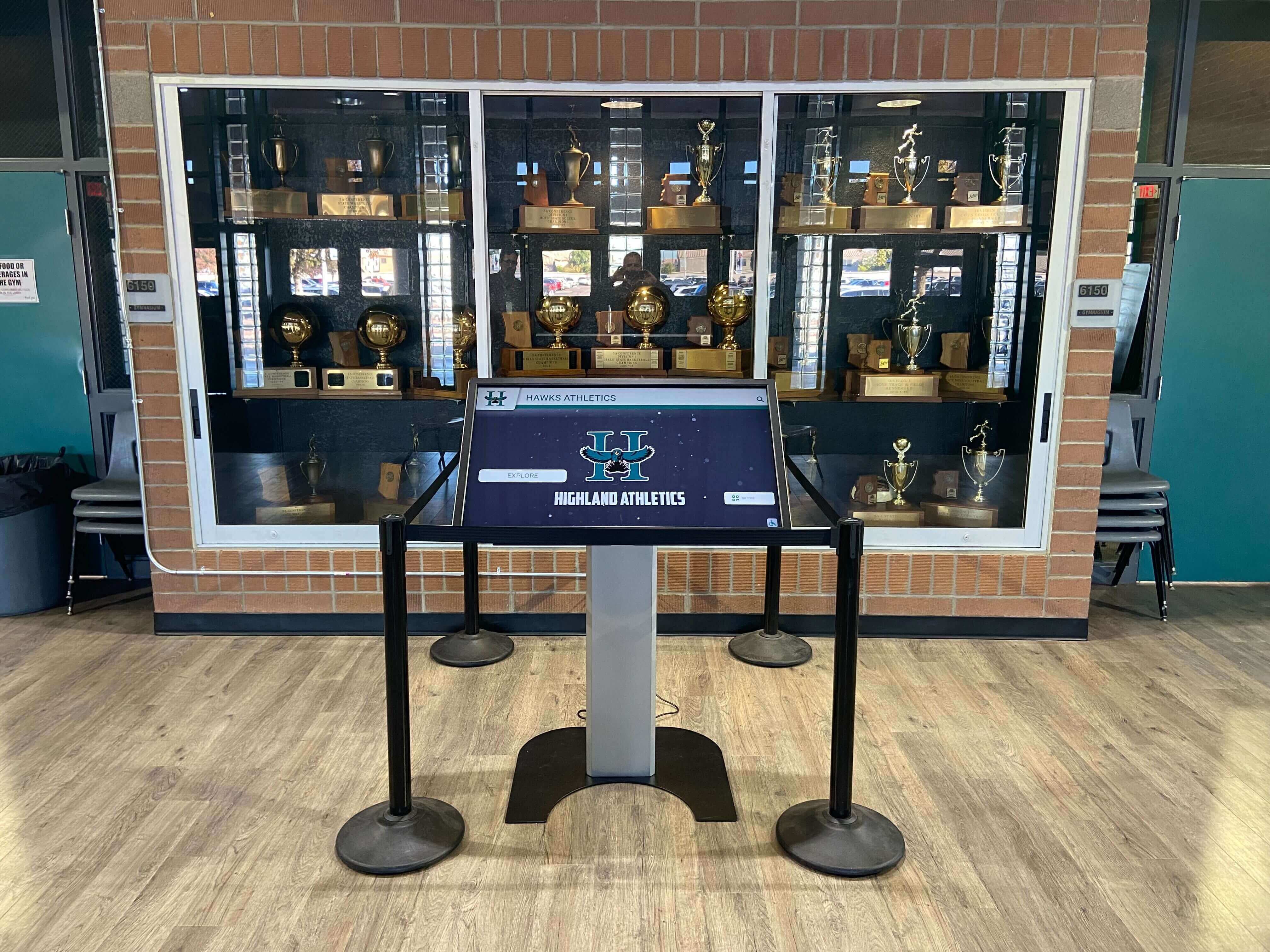
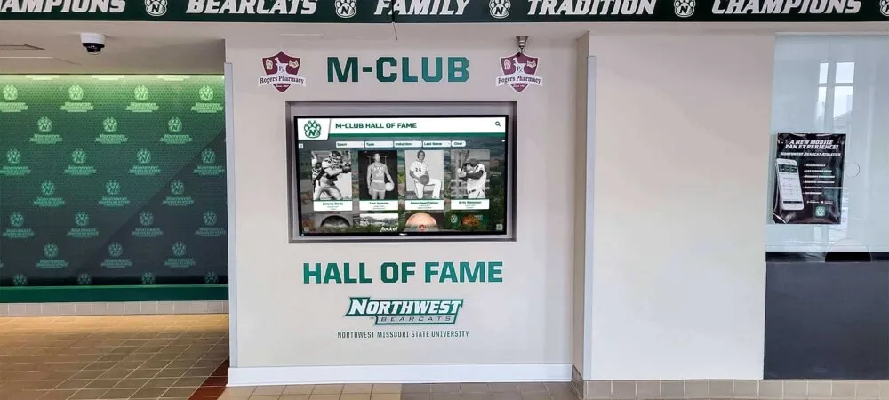
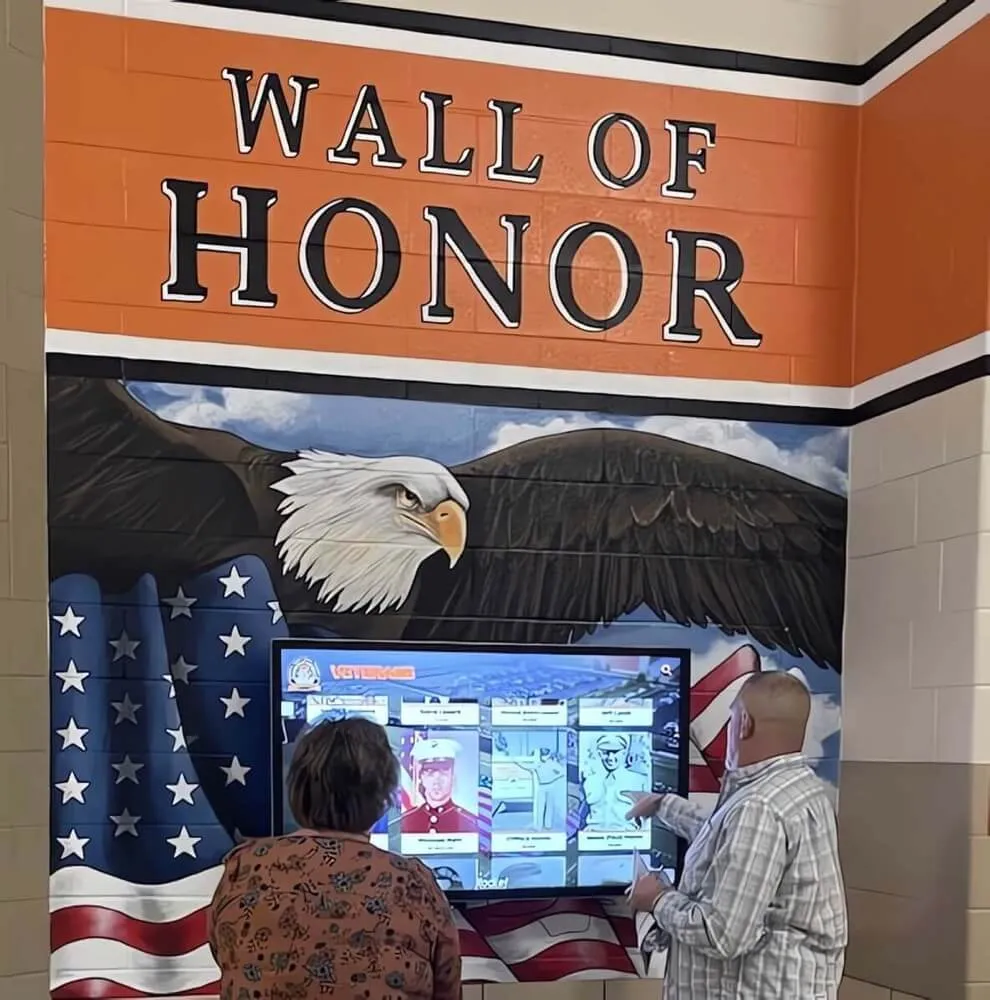
A touchscreen kiosk in a school trophy case—search and filter controls on kiosk interfaces must carry aria-labelledby linking them to their visible label elements so assistive-technology users hear accurate control names on focus
Step 5: Test Accessible Names with a Screen Reader
With NVDA running on Windows (or VoiceOver on macOS), navigate to the inductee search and filter interface and move through each control using keyboard navigation.
NVDA form field navigation test:
Press F to navigate to the next form field. For each control reached, listen to NVDA’s announcement.
Pass: NVDA announces the control’s accessible name followed by its role and state: “Search Inductees, search field.” The announced name matches the visible label text.
Fail: NVDA announces only the role and state with no name: “search field” or “collapsed combobox.” No accessible name is present. The visitor cannot determine the control’s purpose from the announcement.
Fail (placeholder as name): NVDA announces the placeholder text as the accessible name: “Type a name…, search field.” The placeholder disappears when the visitor begins typing, leaving a blank announcement on subsequent focus. Placeholder text is not a reliable substitute for an accessible name.
VoiceOver control navigation (macOS):
Open the Web Rotor (Control + Option + U), navigate to the Form Controls category, and review the list of form controls on the page. Each control should appear with its accessible name preceding its role. A search input labeled “Search Inductees” should appear as “Search Inductees, search field.” An unlabeled combobox appears as “combobox” with no preceding name.
Navigate to each form control from the Rotor. Confirm that the accessible name announced on focus matches the visible label text and that the name accurately describes the control’s purpose to a visitor who cannot see the page.
Step 6: Verify Accessible Names on Kiosk Interfaces
If the recognition platform serves inductee search and filter controls through a touchscreen kiosk interface—a lobby kiosk in a school athletic facility—verify that the kiosk browser renders the same aria-labelledby associations as the web interface. Kiosk browsers are typically Chromium-based and render the same HTML.
For kiosk implementations that support external keyboards or switch-access devices, screen reader accessible name quality directly affects whether assistive-technology users can operate the search interface from the kiosk. Confirm that:
- Search input controls on the kiosk carry the same
aria-labelledbyvalues as their web equivalents - Filter controls on the kiosk are labeled consistently with the web interface
- Any kiosk-specific template variants have not introduced unlabeled controls through template divergence
Quick-Reference Audit Table
| Control Type | Preferred Labeling | aria-labelledby Applies When | Common Failure |
|---|---|---|---|
Name search <input type="search"> | <label for="..."> with matching id on input | Visible label is a heading or styled non-<label> element | No label association; placeholder text is only identifier |
| Custom combobox sport filter | <label for> not available; use aria-labelledby | Control is built from <div>/<span> with role="combobox" | Visible “Filter by Sport” heading has no id; no aria-labelledby on combobox |
Native <select> class-year filter | <label for="..."> preferred | When native label is absent and only aria-labelledby can reference visible text | No <label> and no aria-labelledby; placeholder option is only identifier |
| Checkbox group (sport filters) | <fieldset> + <legend> preferred; role="group" + aria-labelledby as alternative | When <fieldset> cannot be used; visible heading identifies the group | Group container has no role="group" and no aria-labelledby; headings not associated |
| Advanced search panel fields | Each field labeled individually; aria-labelledby can compose panel heading + field label | Multi-field panel where each field shares contextual panel heading | All fields reference only the panel heading; individual field names are absent |
| Autocomplete search input | aria-labelledby on input; aria-labelledby on suggestion listbox | Custom autocomplete built without native form association | Input labeled correctly; suggestion listbox has no accessible name |
| Date or year range slider | aria-labelledby referencing visible range label; aria-valuemin, aria-valuemax, aria-valuenow for current value | Range control built from <div> with role="slider" | Slider carries state attributes but no accessible name; role “slider” announced with no label |
| Icon-only search button | aria-label preferred when no visible text exists | When button is adjacent to labeled visible text that describes it | Icon button carries no accessible name; announced as “button” with no name |
Pass/Fail Code Examples
Name Search Input — Pass (native <label>)
<label for="inductee-name-search">Search Inductees by Name</label>
<input
  type="search"
  id="inductee-name-search"
  placeholder="Type an inductee name">
Screen readers announce “Search Inductees by Name, search field.” The placeholder disappearing does not affect the accessible name.
Name Search Input — Pass (aria-labelledby referencing heading)
<h2 id="search-section-heading">Find an Inductee</h2>
<input
  type="search"
  aria-labelledby="search-section-heading"
  placeholder="Search by name, sport, or year">
Screen readers announce “Find an Inductee, search field.” The heading text becomes the accessible name.
Name Search Input — Fail (placeholder only, no label)
<input
  type="search"
  placeholder="Search inductees...">
Screen readers announce “Search inductees…, search field” using the placeholder as a fallback name. Placeholder-as-name fails when the visitor types: the input value replaces the placeholder in the visual display, and some screen readers re-announce the now-empty field as unnamed.
Sport Filter Combobox — Pass
<p id="sport-filter-label" class="filter-label-text">Filter by Sport</p>
<div
  role="combobox"
  aria-labelledby="sport-filter-label"
  aria-expanded="false"
  aria-haspopup="listbox"
  tabindex="0"
  id="sport-combobox">
  All Sports
</div>
<ul
  role="listbox"
  aria-labelledby="sport-filter-label"
  id="sport-options">
  <li role="option" aria-selected="true">All Sports</li>
  <li role="option" aria-selected="false">Football</li>
  <li role="option" aria-selected="false">Basketball</li>
</ul>
Screen readers announce “Filter by Sport, collapsed combobox” on focus. The visible label “Filter by Sport” and the screen reader announcement match.
Sport Filter Combobox — Fail (no accessible name)
<p class="filter-label-text">Filter by Sport</p>
<div
  role="combobox"
  aria-expanded="false"
  tabindex="0">
  All Sports
</div>
The <p> element has no id. The combobox has no aria-labelledby. Screen readers announce “All Sports, collapsed combobox” using the visible text content as a fallback, or “collapsed combobox” with no name at all. The visitor cannot confirm from the announcement that this control filters by sport.
Checkbox Filter Group — Pass
<div role="group" aria-labelledby="filter-group-heading">
  <h3 id="filter-group-heading">Filter Results</h3>
  <label>
    <input type="checkbox" name="sport" value="football">
    Football
  </label>
  <label>
    <input type="checkbox" name="sport" value="basketball">
    Basketball
  </label>
</div>
Screen readers entering the group announce “Filter Results, group.” Each checkbox within is announced with its own label: “Football, checkbox, not checked.” The group context is preserved.
Advanced Search Panel — Pass (composed name)
<section>
  <h3 id="adv-search-heading">Advanced Search</h3>
  <p id="name-label">Inductee Name</p>
  <input
    type="text"
    aria-labelledby="adv-search-heading name-label"
    id="adv-name-field">
  <p id="sport-label">Sport</p>
  <input
    type="text"
    aria-labelledby="adv-search-heading sport-label"
    id="adv-sport-field">
</section>
The name field is announced “Advanced Search Inductee Name, text field.” The sport field is announced “Advanced Search Sport, text field.” Both fields carry individual names while sharing the panel context.
Advanced Search Panel — Fail (shared panel name only)
<section>
  <h3 id="adv-search-heading">Advanced Search</h3>
  <p>Inductee Name</p>
  <input type="text" aria-labelledby="adv-search-heading">
  <p>Sport</p>
  <input type="text" aria-labelledby="adv-search-heading">
</section>
Both fields are announced “Advanced Search, text field.” The individual field names (“Inductee Name,” “Sport”) are not programmatically associated. The visitor cannot distinguish the two fields from their screen reader announcements.
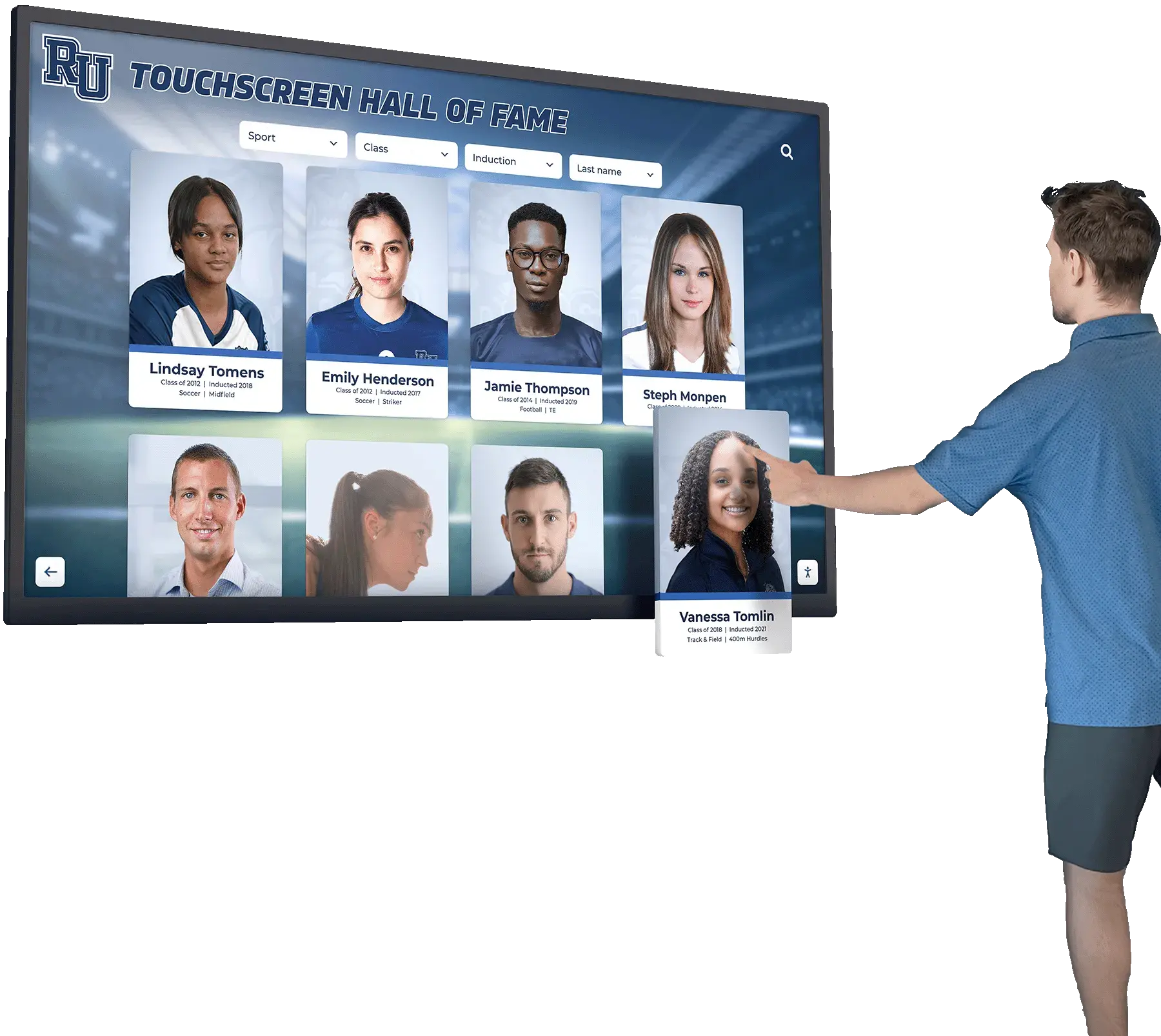
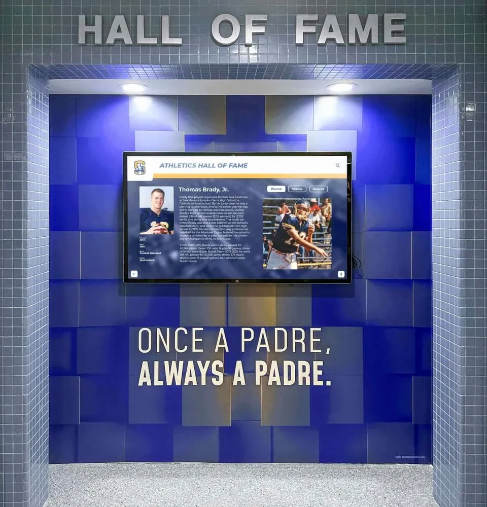
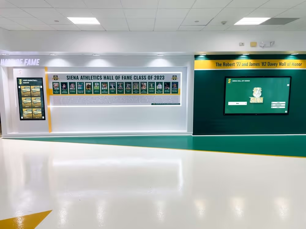
Search and filter controls that narrow the inductee profile cards displayed on a hall of fame touchscreen must carry aria-labelledby so screen reader users hear the same label text sighted visitors read when identifying each control's purpose
Common Errors and How to Fix Them
Error: Visible label rendered as heading with no id attribute; control has no aria-labelledby
The most common failure on platforms that use heading-styled labels: the label element exists visually but carries no id, so aria-labelledby cannot reference it. Controls lack accessible names because the reference target is unreachable.
Fix: Add an id attribute to every visible label element that serves as an accessible name source. Assign stable, descriptive IDs (“search-label,” “sport-filter-label,” “class-year-label”) rather than auto-generated IDs that may change between renders. Add aria-labelledby to each control referencing the corresponding label element’s id.
Error: aria-labelledby references an ID that matches a hidden element
A label element is hidden using display:none or visibility:hidden and its ID is referenced by aria-labelledby. The reference exists but the target is not in the accessibility tree, producing an empty accessible name.
Fix: If the label must be visually hidden, use the visually-hidden CSS technique (position absolute, 1×1 pixel dimensions, overflow hidden) rather than display:none or visibility:hidden. Alternatively, render the label as visible text and add an id to it.
Error: aria-label and aria-labelledby both present on the same control
When both aria-label and aria-labelledby are present on the same element, the WAI-ARIA specification gives precedence to aria-labelledby. If aria-label was added to provide a name and aria-labelledby was added later pointing to a different element, the aria-label value is silently ignored. The control’s accessible name comes from the aria-labelledby reference.
Fix: Remove aria-label when aria-labelledby is the intended labeling mechanism. Verify the final accessible name using the DevTools Accessibility panel to confirm which attribute’s value is winning.
Error: aria-labelledby present on the form wrapper but not on individual controls
A search form container carries aria-labelledby pointing to a form heading, but the individual input elements inside the form have no labeling. Screen readers may not expose the form-level aria-labelledby as the accessible name for controls inside it—individual controls require their own accessible names.
Fix: Each control within a form requires its own accessible name through native <label for> association, aria-labelledby, or aria-label. The form-level name (from a role="search" landmark or <form aria-labelledby>) contextualizes the form but does not replace individual control names.
Error: Accessible name from aria-labelledby is too generic when controls are reused across multiple pages
A single heading “Search” serves as the label for the name search input on every page that includes a search interface. Each input on every page carries aria-labelledby="search-heading". On a page with two search inputs—one for inductee names and one for award categories—both inputs reference the same “Search” heading and are announced identically.
Fix: Provide distinct label text for each control and assign unique IDs. “Search Inductees by Name” and “Search by Award Category” give screen reader users the specificity they need to distinguish the two fields.
Error: Dynamic ID generation breaks aria-labelledby references after re-renders
A JavaScript framework generates control IDs and label IDs dynamically. On first render, the search input has id="field-001" and its label has id="label-001", correctly linked. After a component re-render, the IDs become id="field-002" and id="label-002" but the aria-labelledby on the input still reads "label-001"—a broken reference.
Fix: Use stable, non-dynamic IDs for label and control elements on hall of fame search interfaces. If the component framework requires unique IDs across instances (to support multiple search panels on one page), generate the ID once at component mount time and reuse it across re-renders rather than regenerating it on each render cycle.
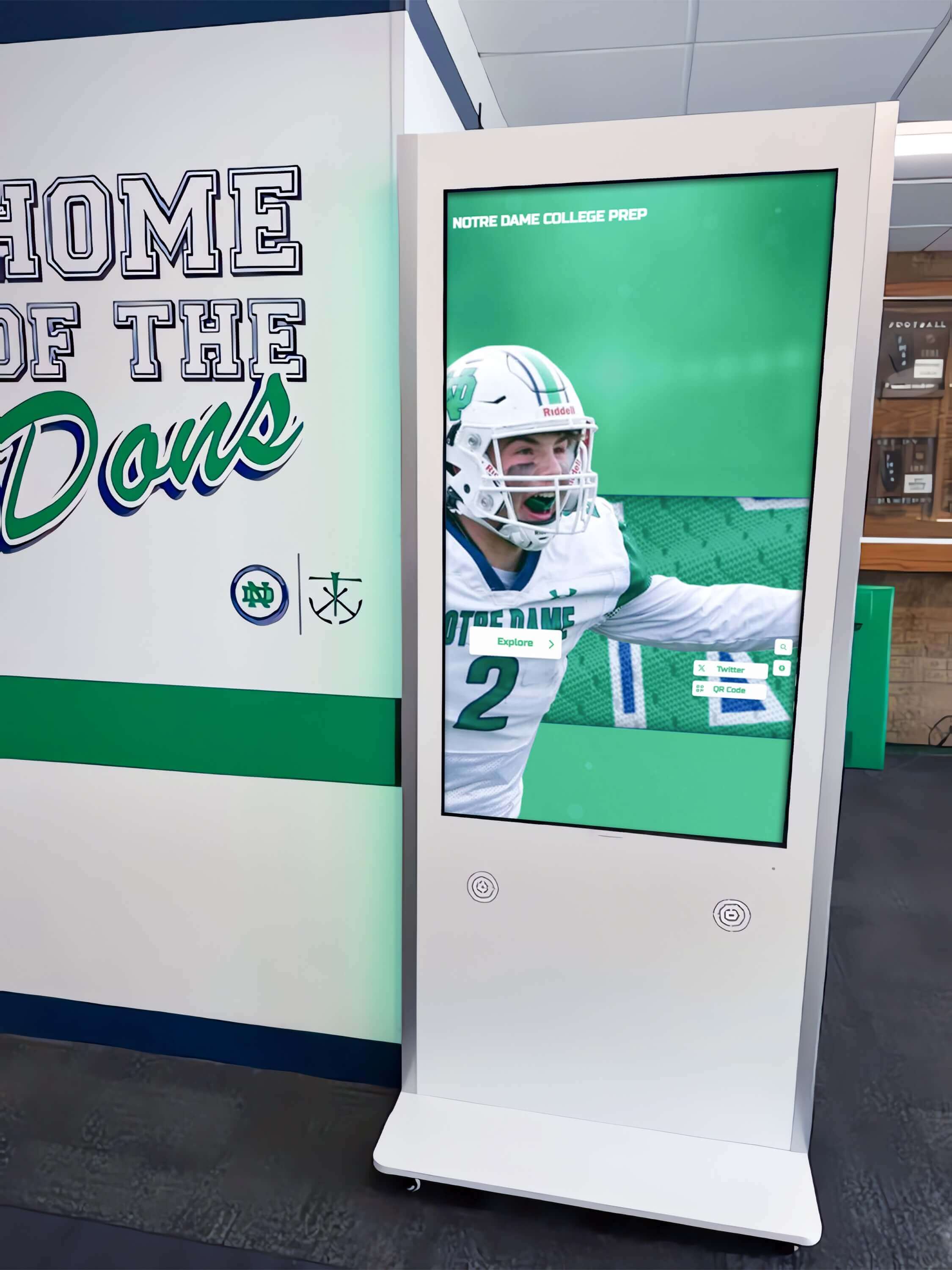
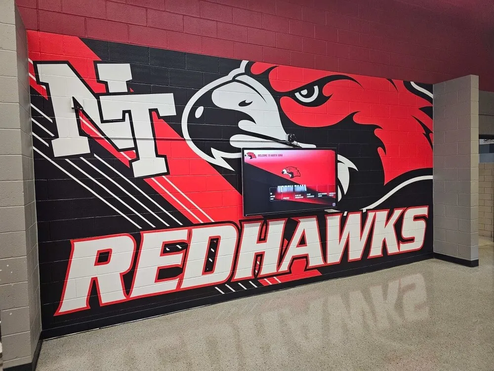
Kiosk-based hall of fame interfaces in school hallways must expose search and filter controls with correct aria-labelledby associations—so every visitor, including those using assistive technology peripherals, can identify and operate the search interface to find inductees
Frequently Asked Questions
Q: What is the difference between aria-labelledby and aria-label?
A: Both attributes provide an accessible name for an element, but they differ in source. aria-label takes an inline string—the attribute value itself is the accessible name: aria-label="Search inductees". aria-labelledby takes one or more element IDs—the text content of the referenced elements becomes the accessible name. When both attributes are present on the same element, aria-labelledby takes precedence per the WAI-ARIA specification. Use aria-labelledby when a visible label element already exists and can be referenced; use aria-label when no suitable visible element exists to reference. For inductee search controls with visible label text, aria-labelledby is preferred because it links the accessible name to existing visible content—ensuring the screen reader name and the visual name remain synchronized even if the visible text changes.
Q: Can aria-labelledby reference multiple IDs?
A: Yes. aria-labelledby accepts a space-separated list of IDs, and screen readers concatenate the text content of all referenced elements in the order the IDs appear. For a search input positioned beneath a section heading (“Find an Inductee”) and beside a descriptor (“Search by name or sport”), aria-labelledby="section-heading search-descriptor" produces the accessible name “Find an Inductee Search by name or sport.” Use multi-ID values when the composed name is more descriptive than either element alone, and test the concatenated result with a screen reader to confirm it is natural and accurate.
Q: Does aria-labelledby work differently on touch devices and kiosk interfaces?
A: aria-labelledby is processed by the browser’s accessibility tree engine and exposed to assistive technology through the platform’s accessibility API. On iOS (VoiceOver) and Android (TalkBack), the same HTML attribute produces the same accessible name result as on desktop screen readers. Kiosk interfaces running Chromium-based browsers render and expose aria-labelledby identically to desktop Chrome. The practical difference on touch interfaces is that visitors navigate by swipe rather than Tab; screen readers on touch devices still announce control names on focus, and the same accessible name quality requirements apply.
Q: Should we use aria-labelledby on the search results region as well?
A: aria-labelledby can label regions and landmarks as well as form controls. A search results region with role="region" should carry aria-labelledby referencing a visible heading or status element that names the region (“Search Results for ‘Williams,’” “47 Inductees Found”). This makes the region identifiable by name in screen reader landmark navigation. This is distinct from labeling the search input itself—the input requires aria-labelledby for its accessible name; the results region requires aria-labelledby to give the region a meaningful landmark name. Both are part of a complete accessible search interface.
Q: How do we handle search inputs inside modal dialogs or expanded panels?
A: Search inputs inside modal dialogs or expanded detail panels require the same aria-labelledby considerations as page-level search controls, with one additional factor: the dialog itself is typically labeled by a heading inside it (through aria-labelledby on the role="dialog" element). If the search input inside the dialog references the same heading as the dialog’s aria-labelledby, the search input’s accessible name is the dialog heading text—which may be too broad. Provide a distinct visible label for the search input inside the dialog and reference that label’s ID through aria-labelledby on the input.
Q: Our platform uses a third-party search component. How do we request aria-labelledby fixes?
A: Submit a support request identifying each control that lacks an accessible name—describe the control, its location on the page, and the visible label text that should be programmatically associated. Reference WCAG 2.1 Success Criterion 4.1.2 (Name, Role, Value) and note that the missing aria-labelledby association means screen reader users cannot identify the control from its announcement. Request that the component accept a labelId or aria-labelledby prop that the parent template can set to reference any visible label element in the consuming page. After the vendor deploys the fix, repeat the Step 2 DevTools inspection and Step 5 screen reader test on a staging build before accepting the update as production-ready.
Q: How often should we run an aria-labelledby audit for inductee search controls?
A: Run a full audit at platform launch, after any update that adds or modifies search or filter controls, and annually as part of a broader accessibility review. Priority audit moments include: when new filter dimensions are added to the inductee gallery (new sport categories, new award types, new date range controls); when search interface templates are redesigned or updated; and when the platform migrates to a new front-end framework that may regenerate component IDs differently. A quick spot-check takes under five minutes per control: focus the search input, listen to NVDA’s or VoiceOver’s announcement, confirm the name matches the visible label. Run this spot-check before each induction ceremony season when visitor traffic to the recognition platform peaks.
A digital hall of fame’s search and filter interface is the navigation layer that makes a recognition database of hundreds of inductees usable in seconds. For visitors using assistive technology, that layer must announce its controls accurately—matching the visible label text that sighted visitors read before interacting. aria-labelledby is the attribute that creates the programmatic connection between a visible label element and the control it names: one attribute, one ID reference, and the search input that screen reader users reach becomes “Search Inductees by Name” rather than an unnamed text field or a disappearing placeholder.
A complete digital hall of fame aria-labelledby audit covers name search inputs, sport filter comboboxes and checkbox groups, class-year selectors, advanced search panel fields, and any custom control built from non-native HTML elements. The six-step checklist—inventory every control, inspect for aria-labelledby, confirm referenced elements are accessible, validate group containers, test with a screen reader, and verify kiosk rendering—surfaces labeling failures that automated accessibility scanners frequently miss because detecting a meaningful name requires understanding the visual design context, not just the presence of an attribute. Running the audit before each induction season and after any platform update that touches search or filter controls takes under an hour and ensures that every visitor navigating your school’s recognition program—including students who navigate by keyboard, parents using screen readers on mobile devices, and community members accessing the kiosk in your lobby—can identify and operate the controls that connect them to the inductee they came to find.
Learn more about Rocket Alumni Solutions’ Digital Wall of Fame platform to understand how the platform’s search and filter controls are built with accessible names that screen reader users hear when navigating inductee recognition interfaces on both web and touchscreen kiosk deployments.
Schedule a Demo of an Accessible Hall of Fame Search Interface
Rocket Alumni Solutions builds digital wall of fame platforms with search and filter controls that carry accurate accessible names—so every visitor, regardless of how they navigate, hears the same label a sighted visitor reads. See how accessible inductee search works for your school's recognition program in a live demo.
Schedule Your Accessible Hall of Fame Demo