


A digital hall of fame ARIA-multiselectable audit is a structured review confirming that every filter list on your recognition platform that allows visitors to select more than one sport, class year, or award category at a time carries aria-multiselectable="true" on its container element—and that each individual option inside that container carries an aria-selected value of "true" or "false" reflecting its current state. Without this attribute, a visitor using JAWS, NVDA, VoiceOver, or TalkBack can open a sport filter list, navigate through Football, Basketball, Baseball, and Volleyball options, and never hear that multiple simultaneous selections are possible. The short answer for school administrators, athletic directors, IT teams, and recognition-program owners: identify every listbox, grid, or tree component on your hall of fame platform that supports multi-item selection; inspect each container in browser DevTools to confirm aria-multiselectable="true" is present; verify that every child option carries aria-selected="true" or "false" matching its current selection state; confirm that selecting or deselecting an option updates both its own aria-selected value and any live result count without resetting other selected options; and verify the full interaction with NVDA or VoiceOver before each induction season or major platform update.
When a school’s digital hall of fame offers filter lists—controls that let a parent browse Football and Basketball inductees simultaneously, or let an alumni visitor view all Class of 1995 and Class of 2000 honorees at once—those lists represent a fundamentally different interaction model from single-selection tabs. A single-selection sport tab switches the display from one category to another. A multi-select sport filter list adds or removes a category from the currently displayed results without clearing the others. That additive, toggling interaction is the defining characteristic of a multiselectable widget, and aria-multiselectable="true" is the WAI-ARIA attribute that informs assistive technology of this capability before the visitor begins selecting.
For athletic directors, IT teams, and recognition-program administrators who maintain digital inductee archives—whether web-based collections, touchscreen lobby kiosks, or both—the aria-multiselectable audit addresses a gap that many platforms leave open even after their single-select filters have been made accessible. It goes beyond whether the filter list is reachable by keyboard to whether screen reader users know, before they begin interacting, that they can build a compound filter rather than having to choose only one category.

Sport, class-year, and award filter lists on a hall of fame recognition platform must carry aria-multiselectable="true" so assistive-technology users know compound multi-category selections are possible—not just single-category switching
What WCAG Requires for Multi-Select Filter Lists
WCAG 2.1 Success Criterion 4.1.2 (Name, Role, Value) at Level A requires that for all user interface components, the name and role can be programmatically determined, and states, properties, and values that can be set by the user can be programmatically determined and set. aria-multiselectable is a WAI-ARIA property that communicates a widget’s selection model—whether one item or multiple items can be simultaneously selected. A filter listbox that visually allows multi-selection but does not carry aria-multiselectable="true" fails to communicate its selection model programmatically, constituting a failure of SC 4.1.2.
WCAG 2.1 SC 1.3.1 (Info and Relationships) at Level A additionally requires that information conveyed through visual presentation be programmatically determinable. When a filter list visually indicates that multiple items are selected—through checkmarks, filled chips, or highlighted rows—that multi-selection state must be available programmatically through aria-selected values and the container’s aria-multiselectable attribute, not only through visual styling.
Both SC 4.1.2 and SC 1.3.1 are Level A requirements—the foundational accessibility tier referenced by virtually every school ADA compliance policy. Schools should consult the authoritative WCAG 2.1 specification at www.w3.org and their institutional accessibility advisor for guidance specific to their program. Recognition programs that maintain physical display cases alongside their digital platform can review how a comprehensive athletic website content checklist covers teams, records, awards, and recognition components, but the digital interface’s accessibility obligations apply regardless of what physical assets accompany it.
The aria-multiselectable Attribute: How It Works
aria-multiselectable is a WAI-ARIA property that accepts Boolean values: "true" or "false" (the default when absent). It is applicable to the following roles:
role="listbox"— the most common pattern for filter lists; indicates multiple options can be selected simultaneouslyrole="grid"— grid rows or cells that support simultaneous selection of multiple itemsrole="tree"— tree nodes that support multi-selectionrole="treegrid"— combined tree and grid supporting multi-selectionrole="tablist"— applicable when the design intentionally supports multiple active tabs simultaneously (uncommon in standard hall of fame interfaces)
For hall of fame filter interfaces, the most frequently audited pattern is role="listbox" with aria-multiselectable="true". When this attribute is present, screen readers announce the component as a “multi-select listbox” before a visitor navigates its options—alerting them that they can select Football, then additionally select Basketball, without the first selection being automatically cleared.
Each child option within the multiselectable listbox continues to use aria-selected="true" or "false" to communicate individual selection state. The container’s aria-multiselectable="true" changes the semantics of the widget; the options’ aria-selected values communicate which specific items are currently chosen.
<!-- Correct: multiselectable listbox with aria-selected on each option -->
<ul role="listbox" aria-multiselectable="true" aria-label="Filter inductees by sport">
  <li role="option" id="opt-football" aria-selected="true">Football</li>
  <li role="option" id="opt-basketball" aria-selected="true">Basketball</li>
  <li role="option" id="opt-baseball" aria-selected="false">Baseball</li>
  <li role="option" id="opt-volleyball" aria-selected="false">Volleyball</li>
</ul>
In this example, a visitor has selected both Football and Basketball. A screen reader announces the component as a multi-select listbox, announces Football as selected, announces Basketball as selected, and announces Baseball and Volleyball as not selected. The visitor knows two filters are active and can add or remove more without uncertainty about whether their existing selections will be cleared.
Hall of Fame Filter List Scenarios Requiring aria-multiselectable
Multi-Sport Selection Lists
The most common scenario on school hall of fame platforms is a sport filter list that allows visitors to narrow the inductee gallery to one or more sports simultaneously. A parent might want to see all inductees from both Football and Track and Field. An alumni visitor might filter for Basketball, Baseball, and Swimming to find teammates from multiple sports.
When this filter list is implemented as a custom component—a <ul> or <div> with child option elements—the container must carry both role="listbox" and aria-multiselectable="true". A native HTML <select multiple> element handles multi-select announcement natively and does not require ARIA attributes. Many hall of fame platforms replace the native select with a custom-styled component for visual design flexibility; those custom components require aria-multiselectable="true" on the container.
The multi-sport filter list is typically the first filter visitors encounter, and it must communicate its multi-selection capability clearly to screen reader users before they begin selecting. A visitor who navigates to a sport filter without hearing “multi-select listbox” may assume only one sport can be active at a time—and may avoid selecting additional sports, missing inductees they were specifically seeking.
Schools that manage athletic recognition across many sports—building archives covering every varsity and junior varsity program over decades—benefit from multi-select filters that make the full archive navigable. For programs developing recognition archives that include academic alongside athletic recognition, how AP Scholar and academic award recognition integrates into a digital display illustrates the breadth of filter categories a comprehensive recognition platform may need to support beyond sport alone.
Class-Year and Graduation-Cycle Filter Lists
Many hall of fame platforms allow visitors to filter inductees by graduation year, induction class, or decade. When the design allows visitors to select multiple class years simultaneously—viewing the Class of 1990, Class of 1991, and Class of 1992 at once to find a sibling cohort—the class-year filter list must carry aria-multiselectable="true".
Class-year filters serve alumni who attended school during overlapping years and family members researching relatives from specific eras. An alumni family attending a reunion may want to view all inductees from a span of four or five years to find multiple siblings or classmates from the same era. A multi-select class-year filter supports this directly; a single-select filter forces them to search one year at a time.
The class-year filter is also relevant for induction ceremony planning. Schools that host annual events—coordinating alumni travel, program printing, and venue logistics—often see the multi-select class filter generate compound views that reflect real attendance patterns of reunion visitors who cluster around overlapping graduation years. For programs managing the logistical and financial planning behind alumni recognition events, a guide to annual alumni golf event management covers the coordination side that complements the digital display’s accessibility requirements.
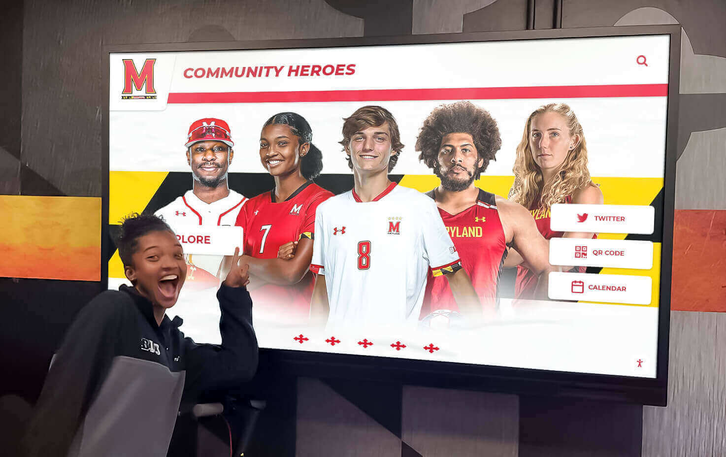
Class-year filter lists that let visitors view inductees from multiple graduation years at once must carry aria-multiselectable="true" so screen reader users know they can build compound year-range filters before they begin selecting
Award Category Multi-Select Filters
Award category filters—allowing visitors to view inductees who received MVP honors, All-Conference selections, state championships, and academic excellence awards simultaneously—represent the same multi-selection pattern applied to recognition type rather than sport or year. A visitor researching an inductee’s full recognition profile may want to filter for both “All-State” and “Team Captain” to identify athletes who achieved both distinctions.
Award category filter lists that support multiple simultaneous selections require aria-multiselectable="true" on the listbox container. When a visitor selects “All-State” and then selects “Academic Excellence” without the first selection clearing, the screen reader user must hear that both items are now selected. aria-selected="true" on both option elements communicates the dual selection; aria-multiselectable="true" on the container establishes the expectation that this dual state is valid and intentional.
Recognition programs that honor inductees across both athletic and academic categories celebrate the full range of student achievement. The recognition events where inductees are celebrated—and where the digital hall of fame often receives its highest traffic—involve careful ceremony preparation. Award acceptance speech examples that acknowledge schools, coaches, and the broader community illustrate the scope of recognition categories that a comprehensive award-category filter may need to surface for families and visitors searching by honor type.
Combined Filter Panels with Multi-Attribute Selection
Some hall of fame platforms implement a combined filter panel—a sidebar or overlay where visitors can simultaneously select sport categories, class years, award types, and other attributes to build a compound filter across multiple dimensions. Each dimension within this panel may be its own multiselectable listbox, or the entire panel may be implemented as a grid with selectable rows.
For a grid-based combined filter panel, aria-multiselectable="true" belongs on the role="grid" container, and each selectable row or cell carries aria-selected="true" or "false". Screen readers announce the grid as a multi-select grid, and each row’s selected state is announced individually.
Recognition platforms that serve schools with both athletic and academic archives—covering sports programs, academic honor societies, performing arts programs, and community service recognition—benefit from combined filter panels that let visitors cross-reference multiple attributes simultaneously. Athletic program archives that maintain records subject to institutional data policies should ensure that filter interface changes align with established athletic archive legal hold procedures when archive data is under legal hold—multi-select filter combinations that surface restricted records could expose data that should be restricted during active legal holds.
See Accessible Multi-Select Filters on a Hall of Fame Platform
Rocket Alumni Solutions' digital wall of fame platform builds multi-select sport, class-year, and award filter lists with complete ARIA multiselectable and aria-selected markup from the ground up—so every visitor, including those using screen readers or keyboard navigation, hears which filters are active and knows additional selections are possible. Request a demo to see how accessible multi-select filter navigation works for your school's inductee collection.
Request Your Custom DemoThe ARIA-Multiselectable Audit: Step-by-Step Checklist
Complete this checklist on the web-based inductee collection and on any browser-rendered lobby kiosk interfaces. Steps 1 through 4 require only browser DevTools. Steps 5 and 6 require a screen reader—NVDA on Windows or VoiceOver on macOS.
Step 1: Map Every Multi-Select Filter Component
Before testing, document every filter list, listbox, grid, or tree component on your hall of fame pages that supports selecting more than one item simultaneously. Common multi-select components on recognition platforms include:
- Sport category filter list (select Football AND Basketball simultaneously)
- Class-year or graduation-cycle filter list (select multiple years or decades)
- Award category filter list (select multiple honor types simultaneously)
- Combined filter panel with multiple attribute dimensions
- Grid-based filter rows where multiple rows can be checked simultaneously
- Trophy type or recognition tier filter lists
For each component, record:
- The HTML element type used (ul, div, select, table)
- Whether
role="listbox",role="grid", or another ARIA role is present on the container - Whether
aria-multiselectableappears anywhere in the component markup - Whether individual options carry
aria-selectedattributes
Step 2: Inspect the Container for aria-multiselectable=“true”
For each multi-select filter component identified in Step 1, open browser DevTools (F12 in Chrome, Firefox, or Edge) and inspect the container element.
- Load the inductee gallery page where the multi-select filter is visible.
- In the DevTools Elements panel, locate the container element that wraps all filter options.
- Check whether
aria-multiselectable="true"is present on the container.
A correctly implemented multi-select filter container appears as:
<ul role="listbox" aria-multiselectable="true" aria-label="Filter inductees by sport">
  <!-- options -->
</ul>
An incorrectly implemented container appears as:
<ul class="filter-list multi-select" aria-label="Sport filter">
  <!-- options -->
</ul>
In the second example, no ARIA role is present and aria-multiselectable is absent. Screen readers encounter an unstructured list with no indication that it is a selection widget, let alone one that supports multiple simultaneous selections. The class="multi-select" communicates the pattern only to the visual rendering engine.
- If
role="listbox"is present butaria-multiselectableis absent, the component is exposed to screen readers as a standard single-select listbox by default—even if the JavaScript behavior allows multiple selections. Users who hear “listbox” without “multi-select” will assume only one item can be active at a time.
Step 3: Inspect Individual Options for aria-selected
After confirming the container carries aria-multiselectable="true", inspect the child option elements.
- Locate a filter option that should currently be selected—for example, “Football” if Football inductees are currently displayed.
- Confirm the option carries
aria-selected="true". - Locate an unselected option—for example, “Basketball” when only Football is active.
- Confirm the option carries
aria-selected="false".
A correctly implemented selected option appears as:
<li role="option" id="opt-football" aria-selected="true">Football</li>
An incorrectly implemented option appears as:
<li class="option selected" data-value="football">Football</li>
No ARIA role, no aria-selected—the option’s selection state is tracked only through a CSS class and a data attribute, both invisible to assistive technology.
- Select a second option in the UI (clicking “Basketball” while “Football” is still selected). Inspect both options in DevTools.
Pass: Both “Football” and “Basketball” carry aria-selected="true" simultaneously. The container still carries aria-multiselectable="true".
Fail: Selecting “Basketball” sets its aria-selected to "true" but clears "true" from “Football”—indicating the JavaScript handler is treating this as a single-select widget regardless of the aria-multiselectable container attribute.
Step 4: Verify Keyboard Multi-Selection Behavior
Navigate to the multi-select filter list using only the keyboard. Tab to the filter component and verify the following keyboard interactions work as expected:
| Key | Expected Behavior |
|---|---|
| Arrow Down / Arrow Up | Moves focus to next or previous option without changing selection state |
| Space | Toggles the focused option’s selection state (adds if unselected, removes if selected) |
| Shift + Arrow Down / Up | Extends the selection to include the next or previous option (range selection) |
| Ctrl + A / Cmd + A | Selects all options when the platform supports select-all |
| Escape | Closes the filter panel if it is an overlay; does not clear existing selections |
Pass: Arrow keys move focus without altering selection. Pressing Space on “Basketball” while “Football” is already selected adds “Basketball” without deselecting “Football.”
Fail: Pressing arrow keys changes the selected option to the one with focus, clearing all other selections—identical to single-select behavior regardless of the aria-multiselectable container attribute.
Recognition programs running touchscreen kiosk interfaces should verify that the kiosk hardware supports external keyboard input for accessibility testing. Programs managing kiosk hardware and power delivery infrastructure—including verifying USB-C power delivery capabilities for recognition display hardware—should also ensure the kiosk’s OS and browser layer does not intercept keyboard events before they reach the filter component.

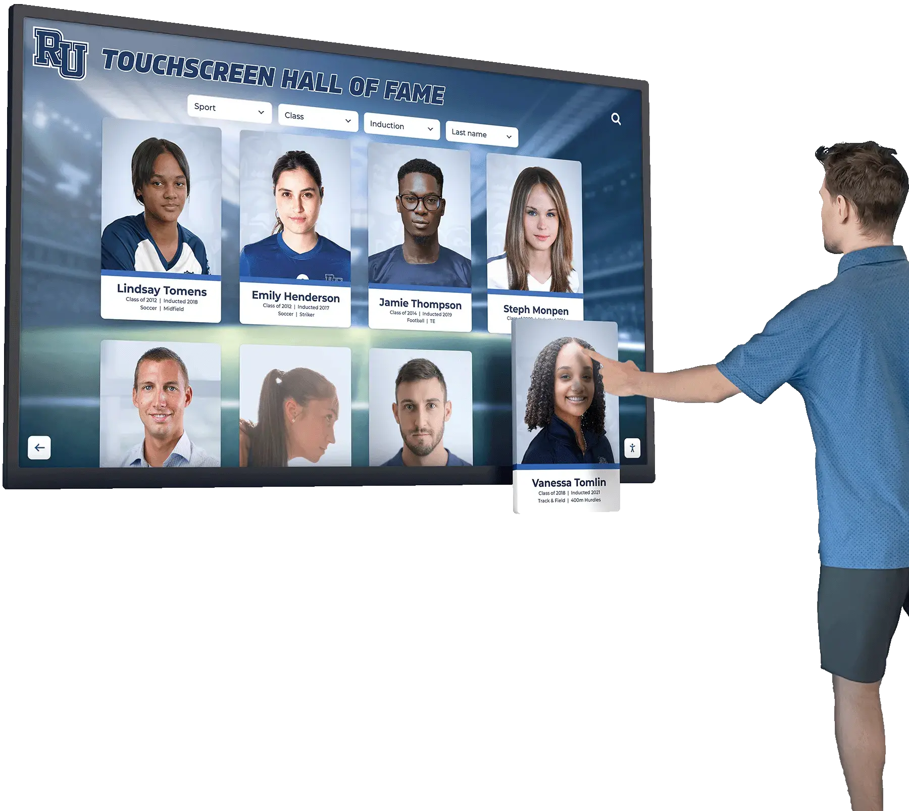
Hall of fame touchscreen kiosk filter lists must carry aria-multiselectable="true" and support keyboard multi-selection so visitors using assistive input devices at the kiosk can navigate sport, year, and award filters without relying on touch alone
Step 5: Test Multi-Selection with a Screen Reader
With NVDA running on Windows (or VoiceOver on macOS), navigate to the inductee gallery and locate the sport filter list using the screen reader’s landmark navigation.
Initial announcement test:
Navigate to the filter listbox. NVDA should announce the component’s role and multi-select capability before you interact with any option.
Pass (NVDA): NVDA announces something similar to “Filter inductees by sport, multi-select listbox” or “sport filter, list box, multi-select.”
Fail (NVDA): NVDA announces only “sport filter, list box” without indicating multi-select capability. The visitor does not know multiple selections are possible before beginning to interact.
Individual option state test:
Navigate through the options using arrow keys. NVDA announces each option with its name and selected state.
Pass: NVDA announces “Football, selected, 1 of 6” and “Basketball, not selected, 2 of 6” as you move through options.
Fail: NVDA announces option names without any selected-state information, or announces all options as “not selected” regardless of actual state.
Multi-selection toggle test:
With “Football” already selected, move focus to “Basketball” and press Space to add it to the selection. Listen to NVDA’s announcement after the toggle.
Pass: NVDA announces “Basketball, selected” immediately after the Space keypress. Returning focus to “Football” still announces “Football, selected”—confirming both options remain simultaneously selected.
Fail: NVDA announces “Basketball, selected” but returning to “Football” announces “Football, not selected”—indicating the JavaScript handler cleared the first selection when the second was added.
Step 6: Verify Live Result Count Updates
When a visitor selects or deselects a filter option, the inductee result count and displayed cards should update to reflect the new compound filter. This update should be communicated to screen reader users without requiring them to navigate away from the filter list.
- Locate the element on the page that displays the result count (for example, “Showing 47 inductees”).
- Inspect this element in DevTools to confirm it carries an
aria-liveattribute.
Pass: The result count element carries aria-live="polite" so that count changes are announced after filter selection completes, without interrupting ongoing navigation.
Fail: The result count element has no aria-live attribute. Screen reader users who select a filter option and hear the correct multi-select announcement have no way of knowing how many inductees the compound filter returned without navigating away from the filter list.
- Select a filter option and listen for the result count announcement.
Pass: After selecting “Basketball” while “Football” is already selected, NVDA announces something like “Showing 94 inductees” after a brief pause—indicating the aria-live region broadcast the content change.
Fail: NVDA remains silent after the filter selection. The visitor must navigate manually to the result count to discover how many inductees the compound filter returned.
Quick-Reference Audit Table
| Filter Component Type | Required ARIA Pattern | Common Failure Mode |
|---|---|---|
| Multi-sport selection listbox | role="listbox" + aria-multiselectable="true" on container; role="option" + aria-selected on each option | aria-multiselectable absent; component exposed as single-select listbox |
| Class-year multi-select listbox | Same listbox pattern; aria-multiselectable="true" required when multiple years can be active simultaneously | CSS class tracks multi-selection; no ARIA role or aria-multiselectable on container |
| Award category multi-select listbox | Same listbox pattern | aria-multiselectable="true" absent; keyboard navigation behaves as single-select despite visual multi-selection |
| Combined filter panel (grid-based) | role="grid" + aria-multiselectable="true" on grid; aria-selected on each selectable row or cell | Grid rows use checkboxes instead of aria-selected; aria-multiselectable not on grid container |
Native <select multiple> | No ARIA required; browser handles multi-select announcement natively | No failure for the native element; verify size attribute makes multiple options visible |
| Filter chip group | role="listbox" + aria-multiselectable="true" when chips function as multi-select options | Chips implemented as toggle buttons; aria-pressed used instead of aria-selected; aria-multiselectable not on container |
| Result count live region | aria-live="polite" on the result count element | No aria-live; count changes not broadcast to screen reader users after filter selection |
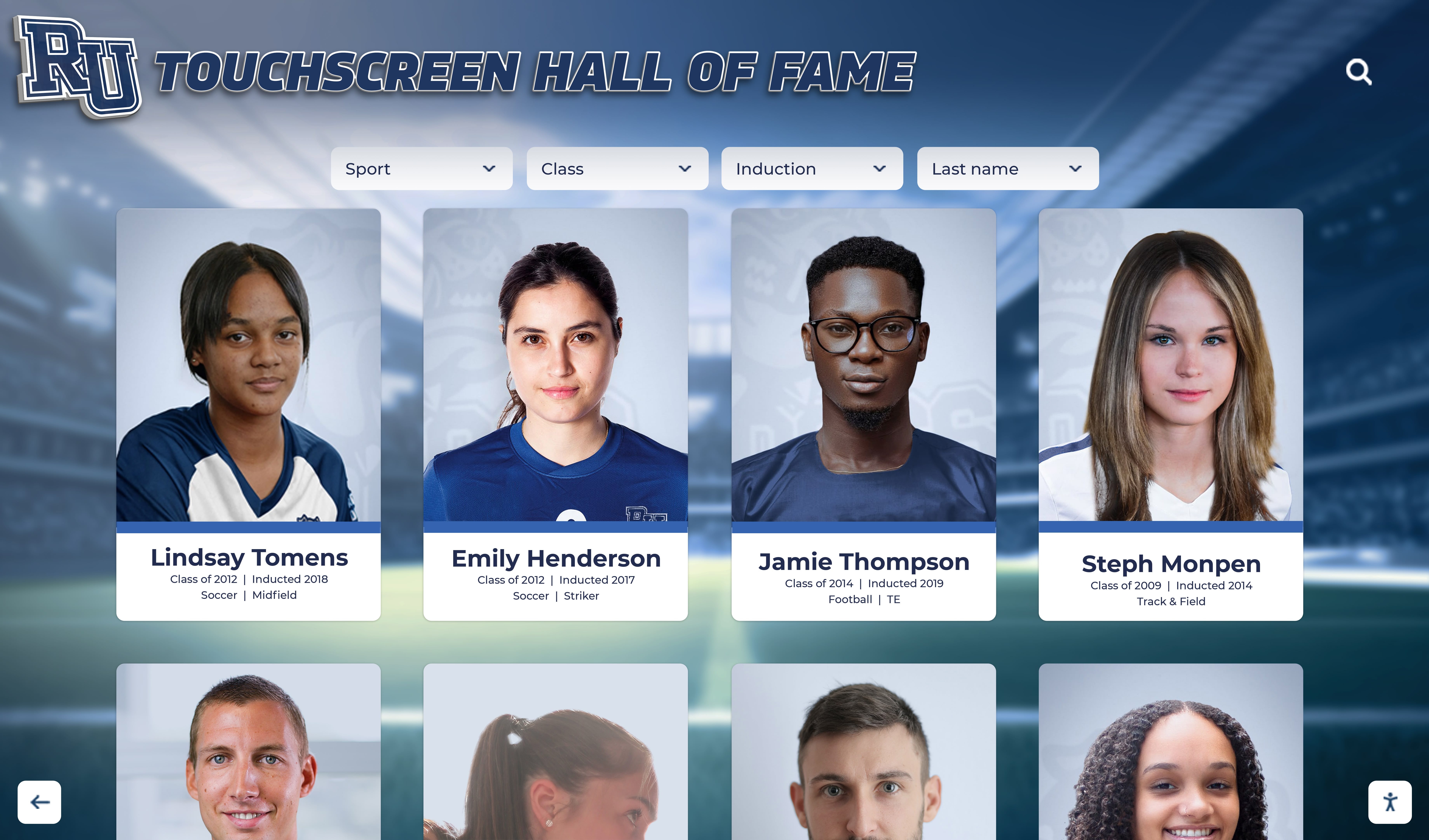
When a hall of fame filter list controls which inductee portrait cards appear in the result grid and allows multiple sports or award categories to be selected at once, the container must carry aria-multiselectable="true" so screen reader users know compound selections are possible
Pass/Fail Code Examples
Multi-Sport Filter Listbox — Pass
<ul
  role="listbox"
  aria-multiselectable="true"
  aria-label="Filter inductees by sport"
  id="sport-filter"
  tabindex="0"
>
  <li role="option" id="opt-football" aria-selected="true">Football</li>
  <li role="option" id="opt-basketball" aria-selected="true">Basketball</li>
  <li role="option" id="opt-baseball" aria-selected="false">Baseball</li>
  <li role="option" id="opt-volleyball" aria-selected="false">Volleyball</li>
  <li role="option" id="opt-track" aria-selected="false">Track and Field</li>
</ul>
Both Football and Basketball carry aria-selected="true". Screen readers announce “multi-select listbox” and identify both selected options. Keyboard users press Space to toggle individual options without clearing existing selections.
Multi-Sport Filter Listbox — Fail
<ul class="filter-list sport-filter" data-multi="true">
  <li class="option selected" data-value="football">Football</li>
  <li class="option selected" data-value="basketball">Basketball</li>
  <li class="option" data-value="baseball">Baseball</li>
  <li class="option" data-value="volleyball">Volleyball</li>
</ul>
No ARIA role on the container, no aria-multiselectable, no role="option", and no aria-selected on any item. Screen readers encounter an unstructured list of text items. The data-multi="true" attribute carries no WAI-ARIA semantic meaning.
Class-Year Multi-Select Listbox — Pass
<ul
  role="listbox"
  aria-multiselectable="true"
  aria-label="Filter inductees by graduation year"
  tabindex="0"
>
  <li role="option" id="yr-1990" aria-selected="true">Class of 1990</li>
  <li role="option" id="yr-1991" aria-selected="true">Class of 1991</li>
  <li role="option" id="yr-1992" aria-selected="false">Class of 1992</li>
  <li role="option" id="yr-1993" aria-selected="false">Class of 1993</li>
</ul>
Award Category Multi-Select Listbox — Pass
<ul
  role="listbox"
  aria-multiselectable="true"
  aria-label="Filter inductees by award category"
  tabindex="0"
>
  <li role="option" id="award-allstate" aria-selected="true">All-State</li>
  <li role="option" id="award-captain" aria-selected="true">Team Captain</li>
  <li role="option" id="award-academic" aria-selected="false">Academic Excellence</li>
  <li role="option" id="award-mvp" aria-selected="false">MVP</li>
</ul>
Combined Filter Panel (Grid) — Pass
<table
  role="grid"
  aria-multiselectable="true"
  aria-label="Filter inductees by sport and award"
>
  <thead>
    <tr>
      <th scope="col">Sport</th>
      <th scope="col">Award Type</th>
    </tr>
  </thead>
  <tbody>
    <tr role="row" aria-selected="true">
      <td role="gridcell">Football</td>
      <td role="gridcell">All-State</td>
    </tr>
    <tr role="row" aria-selected="false">
      <td role="gridcell">Basketball</td>
      <td role="gridcell">MVP</td>
    </tr>
  </tbody>
</table>
Live Result Count — Pass
<p aria-live="polite" id="result-count">Showing 94 inductees</p>
When JavaScript updates the text content of this element after a filter selection, the screen reader announces the updated count after a brief pause without interrupting the user’s current navigation position.
Common Errors and How to Fix Them
Error: aria-multiselectable absent from the container
The most common failure for multi-select filter lists is implementing multiple aria-selected="true" values correctly on individual options but omitting aria-multiselectable="true" from the container. Screen readers expose the component as a standard single-select listbox. A visitor who selects Football and hears “Football, selected” then moves to Basketball—expecting that selecting it will add to the active filter—hears no indication that multi-selection is supported. Fix: add aria-multiselectable="true" to the container element that carries role="listbox" or role="grid". This is a single attribute addition to the container element.
Error: JavaScript handler treats the listbox as single-select
A common implementation error occurs when aria-multiselectable="true" is correctly placed on the container but the JavaScript event handler clears all other selections before setting the new option’s aria-selected to "true". The component appears correct in the initial DOM but behaves as a single-select widget during interaction. Fix: the event handler for a multi-select listbox should toggle only the targeted option’s aria-selected value—setting it to "true" if it was "false", and "false" if it was "true"—without modifying any other option’s aria-selected state.
Error: aria-selected absent from child options
Some implementations place aria-multiselectable="true" on the container but track individual selection state only through CSS classes or data attributes on the option elements. Screen readers encounter a multi-select listbox container but options without aria-selected—so the multi-select announcement is correct but individual option states are not communicated. Fix: add aria-selected="true" or aria-selected="false" to every role="option" element. Ensure the JavaScript handler updates aria-selected values alongside any CSS class changes.
Error: No aria-live region for result count
The result count element updates visually when selections change but carries no aria-live attribute. Screen reader users who select a filter option hear the selection announced but must navigate away from the filter list to find and read the updated count. Fix: add aria-live="polite" to the result count element. Use "polite" rather than "assertive" to avoid interrupting other screen reader announcements; the count update is informational, not urgent.
Error: Filter chips using aria-pressed instead of aria-selected
When filter chips are implemented as toggle buttons with role="button" and aria-pressed, they communicate an on/off state but not a selection-within-a-set model. Screen readers announce each chip’s pressed state independently with no indication that multiple chips together form a selection widget. Fix: if filter chips function as options within a multi-select group, implement the container as role="listbox" with aria-multiselectable="true" and each chip as role="option" with aria-selected. If the chips function as independent toggle buttons with no set relationship, aria-pressed on role="button" is acceptable but the container should not carry aria-multiselectable.
Error: aria-multiselectable applied to a tablist used as a multi-filter
Some implementations use a tablist pattern for filter categories and set aria-multiselectable="true" on the role="tablist" container, expecting multiple tabs to be simultaneously active. While aria-multiselectable is technically applicable to role="tablist" in the WAI-ARIA specification, the standard tab pattern assumes only one tab is active at a time, and most screen reader announcements are tuned to this expectation. Multi-select filtering implemented using a tablist with aria-multiselectable="true" may produce unexpected or inconsistent screen reader behavior. Fix: use role="listbox" with aria-multiselectable="true" for filter components that support multiple simultaneous active selections. Reserve role="tablist" for standard single-selection tab navigation.
Recognition programs that manage media archives alongside inductee profiles—including video highlight reels and ceremony recordings—should ensure that filter interface updates do not disrupt how athletic archive subtitle and caption files are served when filtered results include video content. A correctly implemented multi-select filter should pass the correct parameters to the video asset retrieval system regardless of how many filter options are simultaneously active.

Whether a recognition program pairs physical shield plaques with a digital touchscreen or runs an entirely digital collection, multi-select filter lists on the digital interface must carry aria-multiselectable="true" and per-option aria-selected values for screen reader users
Frequently Asked Questions
Q: What is the difference between aria-multiselectable and aria-selected?
A: aria-multiselectable is a container-level property that communicates whether a selection widget allows multiple simultaneous selections. aria-selected is an item-level state that communicates whether a specific option is currently selected. Both are required for an accessible multi-select filter list: aria-multiselectable="true" on the container tells the screen reader user that multiple selections are possible before they interact; aria-selected="true" or "false" on each option tells them which options are currently active. Either attribute alone is insufficient—the container attribute sets the expectation; the option attributes fulfill it.
Q: Does a native HTML <select multiple> element require aria-multiselectable?
A: No. A native <select> element with the multiple attribute communicates its multi-select capability to screen readers through the browser’s native accessibility implementation without requiring ARIA attributes. The aria-multiselectable requirement applies to custom components—any filter list built from <ul>, <div>, or similar non-semantic elements with ARIA roles applied. If your hall of fame platform uses a native <select multiple> for sport or year filtering, verify only that each <option> correctly reflects its selected state through the native selected property.
Q: Our hall of fame platform is provided by a third-party vendor. How do we request aria-multiselectable fixes?
A: Submit a support ticket identifying the specific filter list component where aria-multiselectable="true" is missing or where the JavaScript handler does not correctly maintain multiple simultaneous aria-selected="true" values. Reference the WAI-ARIA listbox role definition, which lists aria-multiselectable as an applicable property, and WCAG 2.1 SC 4.1.2 in your request. Ask for a specific timeline and request post-deployment verification guidance. After the vendor updates the platform, repeat Steps 2 through 6 of the audit checklist to confirm the implementation is correct. For programs with booster club and administrative support structures that manage accessibility procurement decisions, how booster club prepaid expense schedules apply to technology upgrades can help frame the budget cycle for requesting platform accessibility improvements.
Q: How is aria-multiselectable different from aria-checked on checkboxes?
A: aria-checked applies to role="checkbox" and role="menuitemcheckbox" elements—individual toggleable controls that communicate a checked or unchecked state. A group of checkboxes within a <fieldset> does not require aria-multiselectable on the container; each checkbox communicates its own state independently. aria-multiselectable applies to selection widgets—role="listbox", role="grid", role="tree"—where a unified selection model is maintained across all child options. If your hall of fame filter uses a group of role="checkbox" elements, aria-multiselectable is not required. If it uses role="option" elements within a role="listbox", aria-multiselectable="true" is required to indicate that multiple options can be simultaneously selected.
Q: Should aria-multiselectable=“false” be set explicitly when only one selection is allowed?
A: No. The aria-multiselectable attribute defaults to "false" when absent—a single-select widget does not require aria-multiselectable="false" stated explicitly. Setting it explicitly to "false" does no harm and makes the code self-documenting, but it is not required by the WAI-ARIA specification. For audit purposes, the absence of aria-multiselectable on a single-select listbox is not a failure.
Q: Does the aria-multiselectable audit apply to the touchscreen kiosk as well as the web platform?
A: Yes. Hall of fame kiosk interfaces that render in a browser-based environment—the most common architecture for modern touchscreen recognition systems—are subject to the same HTML and WAI-ARIA requirements as web-based pages. Multi-select sport, year, and award filter lists on the kiosk interface require aria-multiselectable="true" exactly as their web counterparts do. Visitors using an external keyboard or other assistive input device at the kiosk rely on the same ARIA attributes to understand the filter list’s selection model before they begin interacting.
Q: How often should we run an aria-multiselectable audit?
A: Run a full audit at initial platform launch, after any update that adds or modifies filter list components, after major platform version upgrades, and annually as part of a broader accessibility review. A quick spot-check—loading the inductee gallery, inspecting the sport filter container in DevTools for aria-multiselectable="true", selecting two options to confirm both carry aria-selected="true" simultaneously, and listening with NVDA for the multi-select announcement—takes under ten minutes and is appropriate after any deployment that touches filter functionality.
Every school’s digital hall of fame is built to make inductee stories discoverable to every visitor who arrives—family members navigating a touchscreen kiosk at an induction ceremony, alumni searching for classmates on a mobile browser at a reunion, and community members exploring the archive from home. Multi-select filter lists that allow visitors to view Football and Basketball inductees together, or to browse the Class of 1990 and Class of 1991 simultaneously, deliver genuine value when they work for every visitor. aria-multiselectable="true" on the filter container and aria-selected on each option are the two attributes that make that value accessible to screen reader users—without them, the same filter list is functionally opaque to anyone navigating by keyboard or assistive technology.
Adding aria-multiselectable="true" to an existing filter container is a single attribute addition. Ensuring the JavaScript handler maintains multiple simultaneous aria-selected="true" values without clearing prior selections is a targeted handler update. Running the six-step audit checklist before each induction season costs less than an hour and confirms that the platform serving your recognition program is fully accessible to every visitor who arrives at your hall of fame.
Learn more about Rocket Alumni Solutions’ Digital Wall of Fame platform to understand how the platform’s cloud-based CMS and WCAG 2.1 AA-compliant interface architecture handle aria-multiselectable, multi-select filter lists, and live result-count regions for recognition programs of any size.
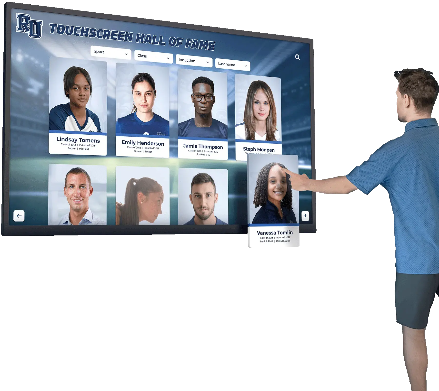
A digital hall of fame recognition platform must implement aria-multiselectable="true" on every filter list that supports compound selections—so screen reader users navigating sport, class-year, and award filters have the same multi-selection capability as sighted visitors using the same interface
Schedule a Demo of an Accessible Multi-Select Hall of Fame Filter
Rocket Alumni Solutions builds interactive touchscreen and web-based recognition programs with complete ARIA multi-select filter support built in—sport, class-year, and award filter lists carry aria-multiselectable="true", per-option aria-selected state, and live result count regions so every visitor can build compound inductee filters regardless of how they navigate. See how it works for your school's recognition archive.
Schedule Your Accessible Hall of Fame Demo