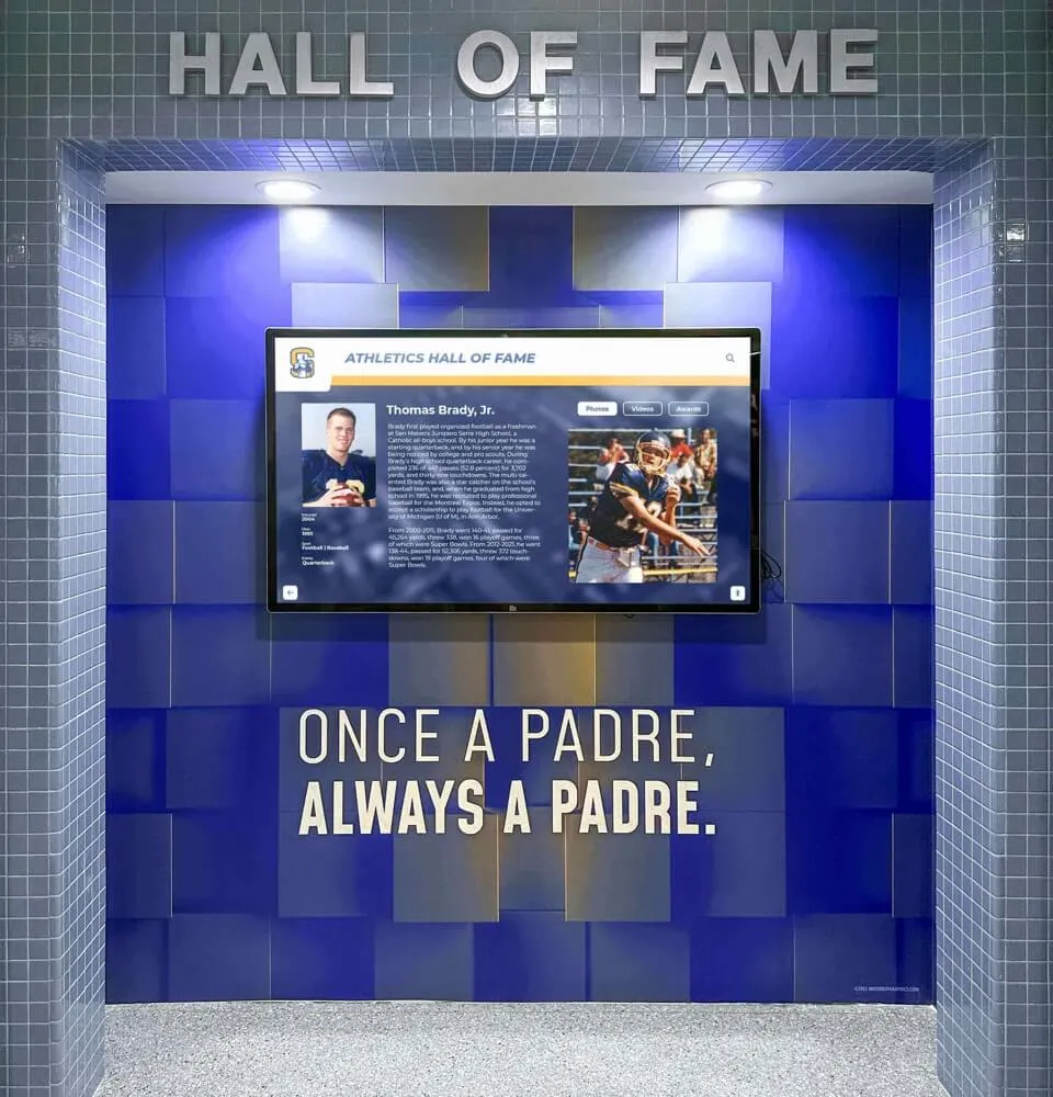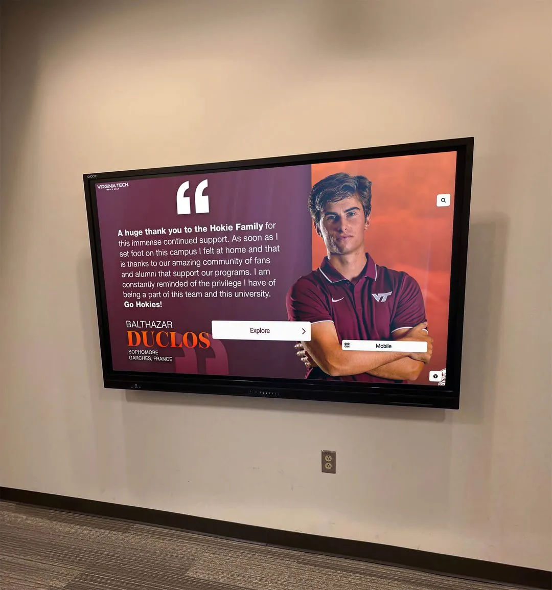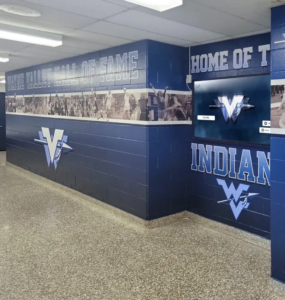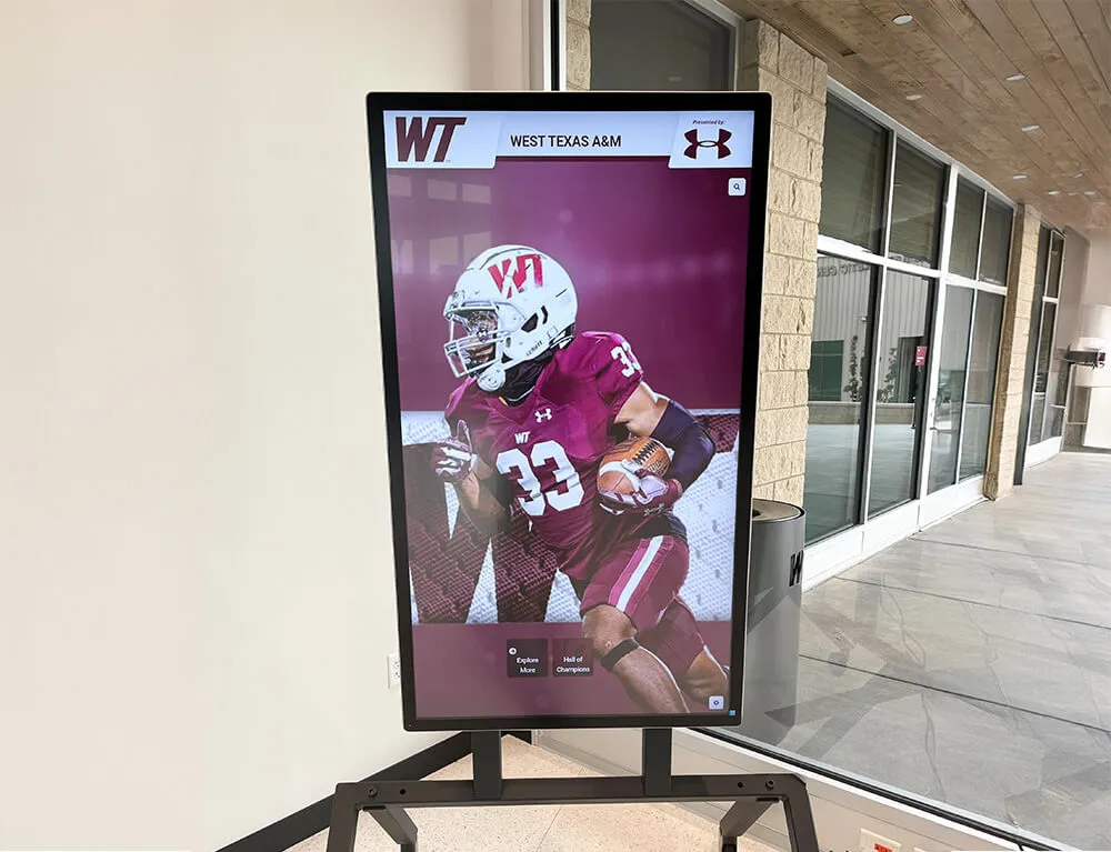



A digital hall of fame ARIA-selected audit is a structured review confirming that every sport-category tab, era filter button, custom filter listbox, and inductee detail panel tab on your recognition platform carries a correct aria-selected attribute—so keyboard and assistive-technology users hear which option is currently chosen. Without this attribute, a visitor navigating your hall of fame with NVDA, JAWS, VoiceOver, or TalkBack can move through a row of sport tabs—Football, Basketball, Baseball, Volleyball—and hear nothing that identifies which tab is currently active. The short answer for school administrators, athletic directors, and IT teams: identify every tab, listbox option, or selectable widget element that can be chosen; inspect each element in browser DevTools to confirm aria-selected carries the value "true" on the selected item and "false" on all others in the same set; verify the value updates dynamically when the visitor activates a different option; and confirm the announcement with NVDA or VoiceOver before each induction season.
When a student, parent, or community member navigates a school’s digital hall of fame using only a keyboard—or while connected to a screen reader on a touchscreen kiosk—the visual indicators that designers rely on to show an active state become invisible. A bold tab label, a highlighted era button, or a filled filter chip communicates the selected category at a glance to sighted visitors. Screen reader users need the same information delivered through the markup, and aria-selected is the WAI-ARIA attribute defined for exactly that purpose.
For athletic directors, IT teams, and recognition-program administrators who maintain digital inductee archives—whether web-based collections, touchscreen lobby kiosks, or both—the aria-selected audit fills a gap that many platform implementations leave open. It addresses not just whether a tab is reachable by keyboard, but whether the selected state of that tab is announced to the visitor who cannot see the visual distinction between the active “Football” tab and the inactive “Basketball” tab beside it.

Every sport-category tab, era filter, and inductee detail tab on a hall of fame recognition platform should carry aria-selected so assistive-technology users know which option is active without relying on visual styling alone
What WCAG Requires for Selected-State Communication
WCAG 2.1 Success Criterion 4.1.2 (Name, Role, Value) at Level A requires that for all user interface components, the name and role can be programmatically determined, and states and properties can be programmatically set. When a sport-category tab is visually styled as selected—through background color, border weight, or font emphasis—that selection state is a component property that must be programmatically determinable under SC 4.1.2. A CSS class such as class="selected" or class="active" affects visual rendering and is invisible to assistive technology; aria-selected is the WAI-ARIA attribute that makes the same state available to a screen reader.
WCAG 2.1 SC 1.3.1 (Info and Relationships) at Level A additionally requires that information conveyed through visual presentation be programmatically determinable. A selected filter tab that is visually distinguished from unselected tabs conveys information—specifically, “the content currently shown corresponds to this category”—and that information must be available programmatically, not only visually.
Both SC 4.1.2 and SC 1.3.1 are Level A requirements—the foundational accessibility tier referenced by virtually every school ADA compliance policy. Schools should consult the authoritative WCAG 2.1 specification at www.w3.org and their accessibility advisor for compliance guidance specific to their program. Recognition programs that also maintain physical award cases alongside digital platforms can explore how digital displays compare to traditional award cases for schools managing space constraints, but the digital interface’s accessibility obligations apply regardless of what physical displays accompany it.
The aria-selected Attribute: How It Works
The aria-selected attribute accepts three values: "true", "false", and the default state when the attribute is absent. Its meaning and the elements it applies to are defined by the WAI-ARIA specification.
aria-selected is a required property for certain ARIA roles:
role="tab"— required. The selected tab within a tablist must carryaria-selected="true"; all other tabs in the same tablist must carryaria-selected="false".role="option"— required. The selected option within a listbox must carryaria-selected="true".role="gridcell",role="row",role="columnheader",role="rowheader"— applicable when grid rows or cells support selection.role="treeitem"— applicable when tree nodes support selection.
For hall of fame filter interfaces, the most commonly audited patterns are the tab role (sport-category tabs, era tabs, inductee detail tabs) and the option role (custom filter dropdown or listbox components).
<!-- Correct: tablist with aria-selected on each tab -->
<div role="tablist" aria-label="Filter inductees by sport">
  <button role="tab" id="tab-football" aria-selected="true" aria-controls="panel-football">Football</button>
  <button role="tab" id="tab-basketball" aria-selected="false" aria-controls="panel-basketball">Basketball</button>
  <button role="tab" id="tab-volleyball" aria-selected="false" aria-controls="panel-volleyball">Volleyball</button>
</div>
When a visitor activates the “Basketball” tab, the JavaScript handler must update aria-selected to "true" on the Basketball tab and "false" on the previously selected Football tab at the same time it updates visual styling and reveals the basketball inductee panel. Failing to update aria-selected dynamically—leaving it set to its initial value regardless of user interaction—produces a broken experience where the screen reader always announces the first tab as selected regardless of what the visitor has chosen.
Hall of Fame Scenarios Requiring aria-selected
Sport-Category Filter Tabs
Sport-category filter tabs are the most commonly encountered aria-selected pattern on school hall of fame platforms. A gallery organized by sport—Football, Basketball, Baseball, Soccer, Volleyball, Track and Field, Swimming—requires each sport tab to carry aria-selected="true" when it is the active category and aria-selected="false" when it is not.
The complete implementation requires:
role="tablist"on the tab container with a descriptivearia-labelsuch as “Filter inductees by sport”role="tab"on each tab button witharia-selectedreflecting its current statearia-controlson each tab referencing the ID of its corresponding tabpanelrole="tabpanel"on each content region witharia-labelledbyreferencing the tab’sid- Keyboard navigation within the tablist: arrow keys to move between tabs, Tab to move focus into the active panel
Screen reader users who navigate a sport filter without aria-selected implementation will hear each tab button announced without any indication of which sport is currently shown in the inductee grid below. The visitor hears “Football, tab. Basketball, tab. Baseball, tab.” without knowing which one controls the displayed content—comparable to receiving a printed program with no way to identify the current page.
For programs evaluating the full range of digital recognition tools—from what a comprehensive digital hall of fame installation covers from hardware to software—the sport-category tab interface is often a primary discovery path for first-time visitors. Ensuring that interface is equally accessible to screen reader users protects the core value the platform delivers.
Era and Decade Archive Tabs
Many school recognition programs organize their inductee archive by era or decade—“Pre-1990,” “1990s,” “2000s,” “2010s,” “2020–Present.” Each era tab functions identically to a sport tab from an ARIA perspective: the selected tab must carry aria-selected="true" and all others must carry aria-selected="false".
Era tabs are particularly important for programs with long institutional histories, where families of inductees from earlier decades may visit specifically to find their relative’s era. A visitor using a screen reader who cannot determine which decade is currently displayed—because aria-selected is absent or static—must read the inductee names visible in the panel to infer which era is active.
For programs that manage both inductee recognition and donor recognition within the same platform, schools combining hall of fame displays with donor wall recognition systems often implement era and giving-cycle tabs on both sections. The aria-selected audit should cover both the inductee and donor interfaces when the platform includes them.
Inductee Detail Tabs (Biography, Statistics, Awards, Media)
Individual inductee profile pages commonly present biographical information, career statistics, awards history, and media in a tabbed layout. Each tab—“Biography,” “Statistics,” “Awards,” “Media”—controls a corresponding content panel. The selected tab must carry aria-selected="true".
The profile detail tab is where a screen reader user is most likely to be reading extended content: a career narrative, a season-by-season record, a list of championship seasons. If the tab interface lacks aria-selected, the visitor cannot confirm which section is currently open without reading the content itself to identify it.

Inductee profile detail tabs must carry aria-selected on the active tab so screen reader users can immediately identify which section—Biography, Statistics, Awards, or Media—is currently shown without reading the panel content to infer it
Filter Dropdown and Listbox Components
Some hall of fame platforms implement sport-category or class-year filtering as a custom ARIA listbox. When a custom listbox is used—a <ul> or <div> with role="listbox" and child elements with role="option"—the selected option must carry aria-selected="true".
A native <select> element handles selected-state announcement natively through the browser and does not require aria-selected. However, many custom-styled filter dropdowns replace the native <select> with a custom component. For these components, aria-selected on the selected role="option" element is required by the WAI-ARIA specification.
<!-- Correct: custom listbox with aria-selected on the selected option -->
<ul role="listbox" aria-label="Filter inductees by sport" aria-activedescendant="opt-football">
  <li role="option" id="opt-football" aria-selected="true">Football</li>
  <li role="option" id="opt-basketball" aria-selected="false">Basketball</li>
  <li role="option" id="opt-baseball" aria-selected="false">Baseball</li>
</ul>
A custom dropdown that uses only CSS classes to mark the selected option provides no programmatic selected-state information to screen readers—identical to the tab failure pattern but within a dropdown widget. Recognition programs that use touchscreen lobby kiosks with large on-screen filter menus for sport or year selection should pay particular attention to this pattern. Campus touchscreen kiosks used for directories and wayfinding frequently use custom dropdown components for category selection, and the same accessibility requirements apply to recognition kiosk filter menus.
Alphabetical Index and Letter Navigation Tabs
When an inductee directory uses an A–Z letter index, clicking a letter tab reveals that letter’s inductees. If the letter tabs are implemented as role="tab" elements within a role="tablist", the selected letter must carry aria-selected="true". If they are implemented as navigation links that load separate pages, aria-current="page" is the appropriate attribute rather than aria-selected.
The key question is whether the letter view updates the page without navigating (a client-side tab interaction → aria-selected) or loads a new URL (page navigation → aria-current). Both patterns require the active state to be programmatically communicated; the correct attribute depends on the implementation.
The ARIA-Selected Audit: Step-by-Step Checklist
Complete this checklist on the web-based inductee collection and on any browser-rendered lobby kiosk interfaces. Steps 1 through 3 require only browser DevTools. Steps 4 and 5 require a screen reader—NVDA on Windows or VoiceOver on macOS.
Step 1: Map Every Selectable Widget on Key Page Types
Before testing, document every group of tabs, listbox components, or filter controls on your hall of fame pages that has a concept of a “selected” item. Common selectable widget sets include:
- Sport-category tab strip on the inductee gallery
- Era or decade tab strip for archive browsing
- Inductee detail tabs (Biography, Statistics, Awards, Media) on profile pages
- Class-year or induction-cycle tab strip
- Custom filter dropdown or listbox for sport, year, or alphabetical filtering
- Letter index tabs on an A–Z inductee directory
- View-mode toggle tabs (Grid view / List view) if implemented as a tablist
For each widget set, record the element types used (buttons, divs, anchors), whether ARIA roles are present, and whether aria-selected appears on any element.
Step 2: Inspect the Selected Element in DevTools
For each selectable widget identified in Step 1, load the relevant page and open browser DevTools (F12 in Chrome, Firefox, or Edge).
- Navigate to a page where one element in the widget should be selected—for example, the Football inductee gallery, where the “Football” tab should be selected.
- In the DevTools Elements panel, locate the active tab button.
- Check whether
role="tab"is present on the element and whetheraria-selectedcarries the value"true".
A correctly implemented selected tab appears as:
<button role="tab" id="tab-football" aria-selected="true" aria-controls="panel-football">
  Football
</button>
An incorrectly implemented selected tab appears as:
<button class="tab active" data-sport="football">
  Football
</button>
In the second example, no ARIA role is present, no aria-selected attribute is present, and class="active" communicates selected state only to the visual rendering engine—not to assistive technology.
- Check the sibling tabs in the same widget. Each non-selected tab should carry
aria-selected="false". Setting"false"explicitly on all non-selected tabs is the more robust practice and is consistent with the WAI-ARIA Authoring Practices Guide examples.
Step 3: Activate a Tab and Verify Dynamic Update
Interact with the tab widget by clicking or pressing Enter or Space on a non-selected tab. After the page updates to show the new tab’s content, inspect the previously selected tab and the newly activated tab in DevTools.
Pass: The newly activated tab now carries aria-selected="true". The previously active tab now carries aria-selected="false".
Fail: Both tabs carry aria-selected="true" simultaneously, or the originally selected tab retains "true" regardless of which tab was activated. This indicates the JavaScript handler updates visual state but does not update ARIA attributes.
For recognition programs that also need to maintain accessible ARIA landmark regions and inductee navigation flows, integrating the selected-state verification in Step 3 with a broader landmark structure audit ensures that both the landmarks enclosing tab panels and the tab selected states are correct simultaneously.
Step 4: Test Tab Selection with a Screen Reader
With NVDA running on Windows (or VoiceOver on macOS), navigate to the inductee gallery and locate the sport-category tab strip using the screen reader’s landmark navigation (D in NVDA to jump to the next landmark). Move to the tablist landmark and navigate the tabs using the arrow keys.
Pass: NVDA announces each tab with its name, role, and selected state. The active tab is announced as “Football, tab, 1 of 6, selected.” Non-selected tabs are announced as “Basketball, tab, 2 of 6, not selected” or similar. VoiceOver on macOS announces “Football, selected, tab 1 of 6.”
Fail: NVDA announces “Football button” or “Football tab” without any selected-state information. The visitor cannot distinguish the active tab from inactive tabs without visual reference.
After identifying the active tab, activate a different tab using arrow keys followed by Space or Enter. Listen to the screen reader’s announcement of the newly activated tab.
Pass: NVDA announces the newly activated tab as selected (“Basketball, tab, 2 of 6, selected”) immediately after activation.
Fail: NVDA continues to announce the original tab as selected, or announces no selection state on the newly activated tab. This confirms the dynamic aria-selected update is not firing.
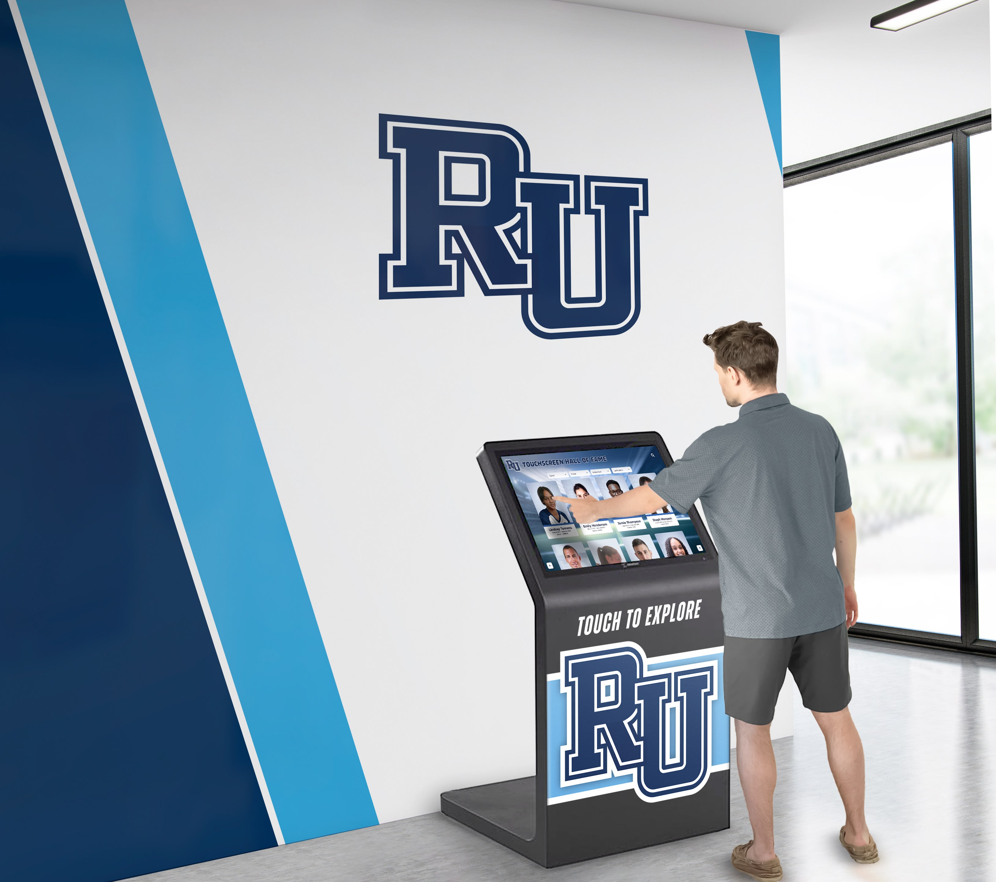
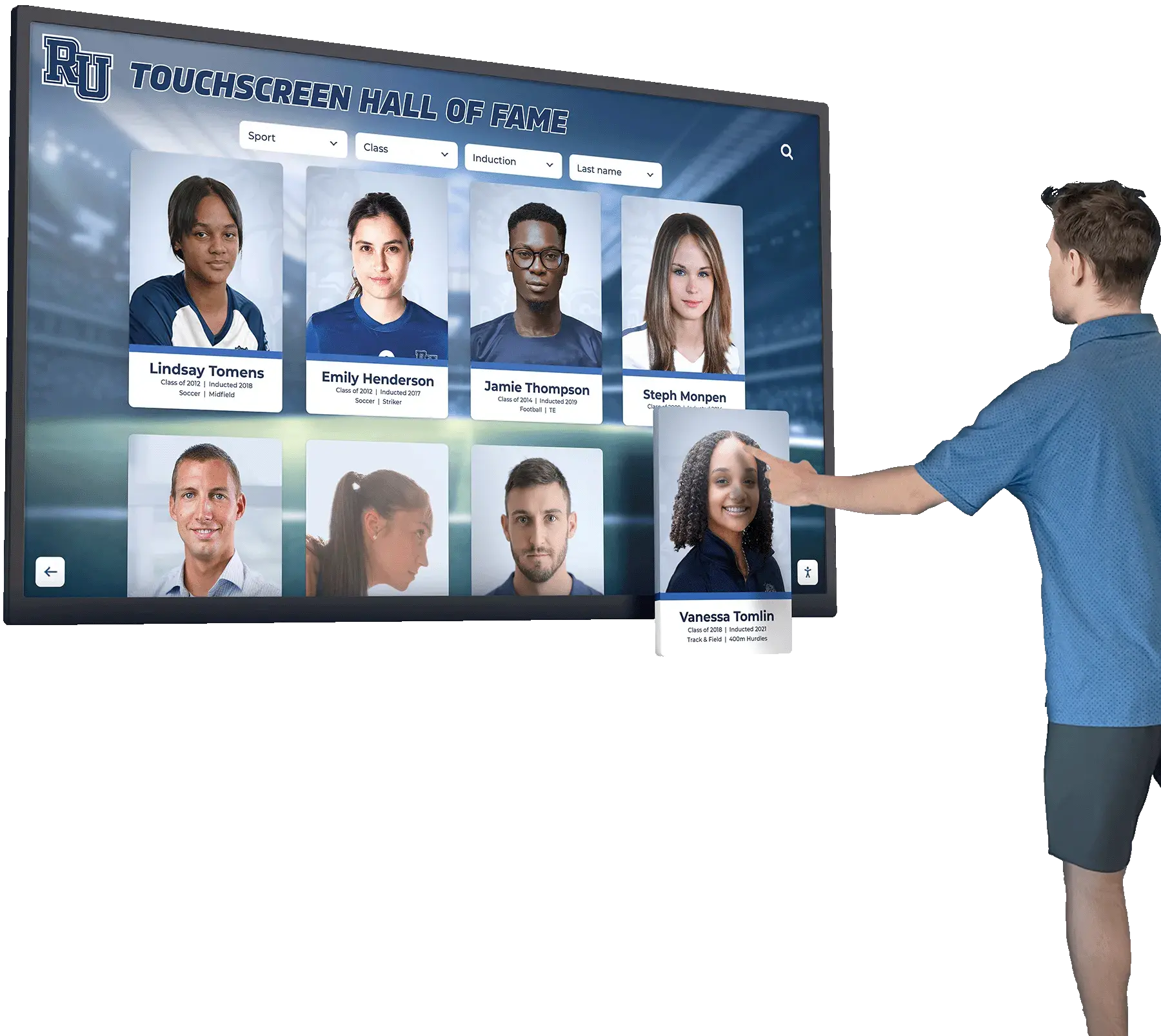
Screen reader users navigating touchscreen kiosk filter tabs rely entirely on aria-selected to determine which sport, era, or category is currently shown—the attribute must update dynamically on every tab activation, not only on initial page load
Step 5: Test Filter Listbox Components with a Screen Reader
Navigate to any custom filter dropdown or listbox component on the hall of fame platform. Open the component and navigate through the options using the arrow keys.
Pass: Each option is announced with its name and selected state (“Football, selected” or “Basketball, option 2 of 6”). The currently selected option carries aria-selected="true" and is announced accordingly.
Fail: Options are announced without any selected-state information. The visitor must navigate the full option list and infer which option is selected from context—often impossible without visual reference.
After selecting a different option, confirm the screen reader announces the new selection and that aria-selected updates in DevTools.
See an Accessible Hall of Fame Tab Interface in Action
Rocket Alumni Solutions' digital wall of fame platform implements WCAG 2.1 AA accessibility from the ground up. Sport-category tabs, era filters, inductee detail panels, and touchscreen kiosk filter components carry complete ARIA selected-state markup—so every visitor, including those using assistive technology, hears which category is active. Request a demo to see how accessible tab navigation and filter results work for your school.
Request Your Custom DemoPass/Fail Code Examples
The following examples show correct and incorrect markup for the selectable widget patterns most commonly audited on school hall of fame pages.
Sport Filter Tablist — Pass
<div role="tablist" aria-label="Filter inductees by sport">
  <button role="tab" id="tab-football" aria-selected="true" aria-controls="panel-football" tabindex="0">Football</button>
  <button role="tab" id="tab-basketball" aria-selected="false" aria-controls="panel-basketball" tabindex="-1">Basketball</button>
  <button role="tab" id="tab-volleyball" aria-selected="false" aria-controls="panel-volleyball" tabindex="-1">Volleyball</button>
</div>

<div role="tabpanel" id="panel-football" aria-labelledby="tab-football" tabindex="0">
  <!-- Football inductee cards -->
</div>
<div role="tabpanel" id="panel-basketball" aria-labelledby="tab-basketball" tabindex="-1" hidden>
  <!-- Basketball inductee cards -->
</div>
<div role="tabpanel" id="panel-volleyball" aria-labelledby="tab-volleyball" tabindex="-1" hidden>
  <!-- Volleyball inductee cards -->
</div>
Sport Filter Tablist — Fail
<div class="tab-strip">
  <button class="tab active">Football</button>
  <button class="tab">Basketball</button>
  <button class="tab">Volleyball</button>
</div>

<div id="football" class="tab-panel show">
  <!-- Football inductee cards -->
</div>
<div id="basketball" class="tab-panel" style="display:none">
  <!-- Basketball inductee cards -->
</div>
No ARIA roles or attributes are present. Screen readers encounter three unlabeled buttons with no selected-state information and no tablist structure. The panel association is encoded only in JavaScript—invisible to assistive technology.
Era Archive Tab — Pass
<div role="tablist" aria-label="Browse inductees by era">
  <button role="tab" id="tab-pre1990" aria-selected="false" aria-controls="panel-pre1990" tabindex="-1">Pre-1990</button>
  <button role="tab" id="tab-1990s" aria-selected="true" aria-controls="panel-1990s" tabindex="0">1990s</button>
  <button role="tab" id="tab-2000s" aria-selected="false" aria-controls="panel-2000s" tabindex="-1">2000s</button>
  <button role="tab" id="tab-2010s" aria-selected="false" aria-controls="panel-2010s" tabindex="-1">2010s</button>
</div>
Inductee Detail Profile Tab — Pass
<div role="tablist" aria-label="Inductee profile sections">
  <button role="tab" id="tab-bio" aria-selected="true" aria-controls="panel-bio" tabindex="0">Biography</button>
  <button role="tab" id="tab-stats" aria-selected="false" aria-controls="panel-stats" tabindex="-1">Statistics</button>
  <button role="tab" id="tab-awards" aria-selected="false" aria-controls="panel-awards" tabindex="-1">Awards</button>
  <button role="tab" id="tab-media" aria-selected="false" aria-controls="panel-media" tabindex="-1">Media</button>
</div>

<div role="tabpanel" id="panel-bio" aria-labelledby="tab-bio" tabindex="0">
  <p>Inductee biographical content goes here.</p>
</div>
Custom Listbox Filter — Pass
<ul role="listbox" id="sport-filter" aria-label="Filter inductees by sport" aria-activedescendant="opt-football">
  <li role="option" id="opt-football" aria-selected="true">Football</li>
  <li role="option" id="opt-basketball" aria-selected="false">Basketball</li>
  <li role="option" id="opt-baseball" aria-selected="false">Baseball</li>
</ul>
Custom Listbox Filter — Fail
<ul class="custom-dropdown open">
  <li class="selected" data-value="football">Football</li>
  <li data-value="basketball">Basketball</li>
  <li data-value="baseball">Baseball</li>
</ul>
No role="listbox" or role="option" attributes and no aria-selected are present. The custom dropdown functions visually but is exposed to screen readers as an unstructured list of text items with no selection state.
Audit Summary Table
| Widget Type | Required ARIA Pattern | Common Failure Mode |
|---|---|---|
| Sport-category filter tabs | role="tab" + aria-selected="true/false"; container has role="tablist" | CSS class marks active tab; no ARIA role or aria-selected present |
| Era or decade archive tabs | Same tablist pattern as sport tabs | aria-selected set only in initial HTML; not updated on tab activation |
| Inductee detail tabs (Bio, Stats, Awards) | Full tablist pattern; aria-selected updates on every tab activation | Tabs implemented as <div> elements with click handlers; no ARIA roles |
| Class-year selector tabs | Tablist pattern; aria-selected="true" on active year | JavaScript updates class but not aria-selected |
| Custom filter listbox | role="listbox" with role="option" children; aria-selected="true" on selected item | Custom <ul> used without ARIA roles; selection tracked via data-* or CSS only |
| A–Z letter index tabs | Tablist pattern (client-side) or aria-current="page" (page navigation) | Letter links have no active-state attribute of any kind |
| View-mode toggle (Grid / List) | Tablist pattern if visually styled as tabs; aria-selected on active mode | Toggle buttons use aria-pressed but are structured as tabs |
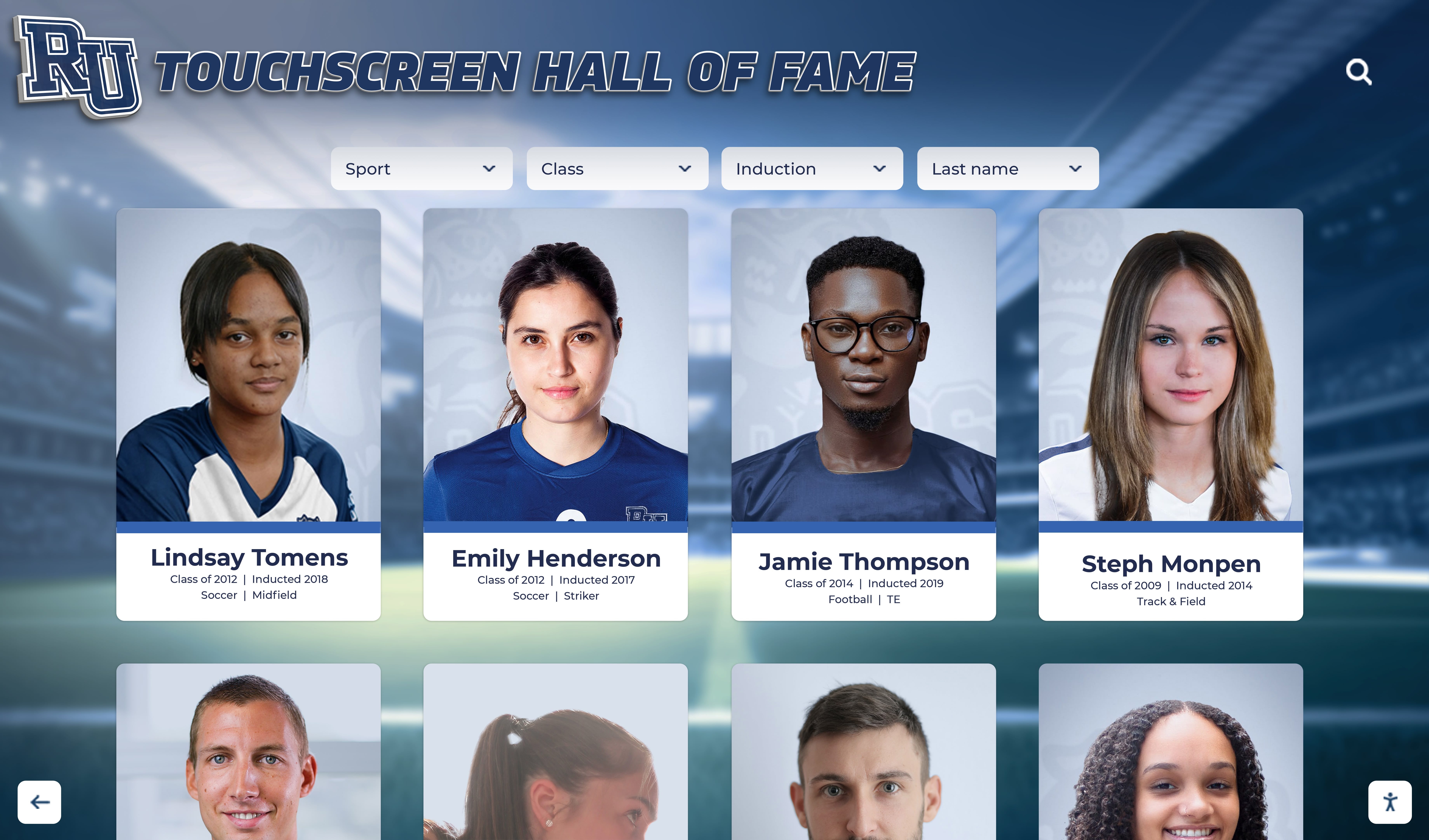
The sport-category and era tabs controlling which inductee cards appear in the grid must carry aria-selected on the active tab—so screen reader users know which category is displayed without having to read the card content to infer it
Common Errors and How to Fix Them
Error: CSS class used instead of aria-selected
The most common failure is using a class—class="active", class="selected", class="current-tab"—to mark the selected tab without adding aria-selected. CSS classes change visual appearance but carry no ARIA semantic meaning. A screen reader user hears “Football, tab” with no indication it is selected. Fix: add aria-selected="true" to the active tab element and aria-selected="false" to all other tabs in the same tablist. The CSS class and the ARIA attribute can and should coexist on the same element.
Error: aria-selected not updated dynamically on tab activation
Setting aria-selected="true" on the initially active tab in HTML but failing to update it in the JavaScript event handler that switches tabs is a very common implementation error. The initial state is correct; subsequent interactions break the announcement. Fix: in the tab activation handler, set aria-selected="false" on all tabs in the tablist first, then set aria-selected="true" on the newly activated tab. Pair this with the roving tabindex pattern: set tabindex="-1" on all tabs, then tabindex="0" on the activated tab.
Error: aria-selected=“true” applied to multiple tabs simultaneously
A JavaScript handler that sets aria-selected="true" on the newly activated tab without first clearing it from the previously active tab leaves two tabs with aria-selected="true". A screen reader user who navigates the tabs hears two tabs announced as selected—confusing and misleading. Fix: before setting "true" on the new tab, iterate over all tabs in the tablist and set their aria-selected to "false", then set the activated tab to "true".
Error: role=“tab” applied without role=“tablist” on the container
Individual role="tab" elements that are not children of a role="tablist" container are exposed to screen readers without the tablist group context. A screen reader may not announce the tab count (“1 of 6”) or the tablist label. Fix: wrap all tab buttons in a container element that carries role="tablist" and a descriptive aria-label.
Error: aria-selected on non-tab roles
Some implementations apply aria-selected to elements with role="button" rather than role="tab", or to elements with no explicit ARIA role. aria-selected is defined in the WAI-ARIA specification only for specific roles; applying it to a generic button may not produce the expected screen reader announcement. Fix: use role="tab" on tab-style selection controls within a role="tablist". For non-tab toggle patterns—a single on/off button—use aria-pressed instead.
Error: Inductee detail tabs missing aria-selected after initial page load
In single-page application frameworks, tab panels sometimes render with no aria-selected attribute on any tab until after the first user interaction. The initial selected tab is identified only through CSS. Fix: ensure the server-rendered or initial-render HTML includes aria-selected="true" on whichever tab is active when the page first loads.
For programs that combine hall of fame recognition with table-based record boards, accessible table header markup for hall of fame record displays follows the same principle: every ARIA attribute must be present in the initial DOM, not only injected in response to interaction. Recognition programs that also manage recognition display certificates and scheduled content publishing may have administrative tab interfaces in their content management tools; the same aria-selected requirements apply to those interfaces as to the public-facing inductee gallery.

Whether a recognition program combines physical shields with a digital touchscreen or runs an entirely digital collection, the tab navigation and filter interfaces on the digital component require aria-selected for screen reader users
Frequently Asked Questions
Q: Is aria-selected required by WCAG 2.1?
A: WCAG 2.1 Success Criterion 4.1.2 (Name, Role, Value) requires that for all user interface components, the role and current states be programmatically determinable. The WAI-ARIA specification defines aria-selected as a required property for role="tab" elements within a role="tablist". An ARIA tablist that omits aria-selected on its tab elements fails to implement the tab role as specified by WAI-ARIA, which constitutes a failure of SC 4.1.2. Consult the authoritative WCAG 2.1 specification at www.w3.org and your institution’s accessibility advisor for compliance guidance specific to your program.
Q: What is the difference between aria-selected and aria-current?
A: aria-selected and aria-current address related but distinct patterns. aria-selected is used for elements within formal ARIA selection widgets—specifically role="tab" in a tablist, role="option" in a listbox, and role="gridcell" or role="row" in a selectable grid. It communicates that a particular item is the chosen item within the widget’s selection model. aria-current is used for navigation contexts where an element represents the current location—the active page link in a site navigation menu, the current step in a form flow. For sport-category tabs that filter an inductee gallery client-side without navigating, aria-selected is correct. For sport-category links that navigate to separate page URLs, aria-current="page" is correct.
Q: Our hall of fame platform is a third-party system. How do we request aria-selected fixes?
A: Submit a support ticket to your platform vendor identifying the specific tab strip or filter widget where aria-selected is missing or not updating dynamically. Reference the WAI-ARIA specification’s tab role definition, which lists aria-selected as a required property, and WCAG 2.1 SC 4.1.2 in your request. Ask for a timeline and post-deployment verification guidance. After the vendor updates the platform, repeat the DevTools inspection in Steps 2 and 3 and the screen reader tests in Steps 4 and 5.
Q: Does this apply to the touchscreen kiosk as well as the website?
A: Hall of fame kiosk interfaces that render in a browser-based environment—the most common architecture for modern touchscreen recognition systems—are subject to the same HTML and WAI-ARIA requirements as web-based pages. Sport-category filter tabs, era selectors, and inductee detail tabs on the kiosk interface require aria-selected just as their web-based equivalents do. Visitors using an external keyboard or other assistive input device at the kiosk rely on the same ARIA attributes to understand which tab or filter option is currently active.
Q: Do we need aria-selected on every tab, or only the active one?
A: The WAI-ARIA specification requires aria-selected="true" on the selected tab. For unselected tabs, aria-selected="false" should also be present. Setting "false" explicitly on all non-selected tabs is the more robust and explicit practice, consistent with the WAI-ARIA Authoring Practices Guide examples. It removes ambiguity for screen readers with varying implementations of the tab role.
Q: Can we use aria-pressed instead of aria-selected for sport filter buttons?
A: aria-pressed is the correct attribute for standalone toggle buttons that have an on/off state independent of other buttons. aria-selected is correct for items within a formal selection widget where selecting one item deselects others—the tablist pattern. If your sport filters are implemented as role="tab" elements within a role="tablist", use aria-selected. If your sport filters are standalone toggle buttons where multiple sports can be selected simultaneously, use aria-pressed and omit role="tab". The choice should match the actual interaction model.
Q: How often should we run an aria-selected audit?
A: Run a full audit at initial platform launch, after any update that adds or modifies tab strips or filter controls, and annually as part of a broader accessibility review. A lightweight spot-check—loading the inductee gallery, inspecting the active sport tab in DevTools for aria-selected="true", switching tabs to confirm the attribute updates—takes under five minutes and is appropriate after any deployment that touches filter or tab functionality. For programs that host high-attendance events like championship induction ceremonies—similar in visitor volume to how championship banner print workflows involve precision preflight before a high-stakes event—running an accessibility spot-check before the event protects the experience during peak usage.
Every school’s digital hall of fame is built to make inductee stories discoverable. A visitor who navigates the sport-category tabs without hearing which category is selected—or who opens an inductee profile and cannot tell which detail tab is active—encounters a recognition platform that functions for sighted users and fails others. Adding aria-selected="true" to the active tab, aria-selected="false" to all sibling tabs, and ensuring the JavaScript handler updates those values on every tab activation is a small, targeted change. For the ARIA tablist pattern, it is not optional—the WAI-ARIA specification requires it. Running this audit before each induction season, and verifying the result with NVDA or VoiceOver, costs less than an hour and ensures that the navigation serving your recognition program is fully accessible to every visitor who arrives at your hall of fame.
Learn more about Rocket Alumni Solutions’ Digital Wall of Fame platform to understand how the platform’s cloud-based CMS and accessible interface architecture handle aria-selected, tablist patterns, and filter-result panel associations at the template level for recognition programs of any size.
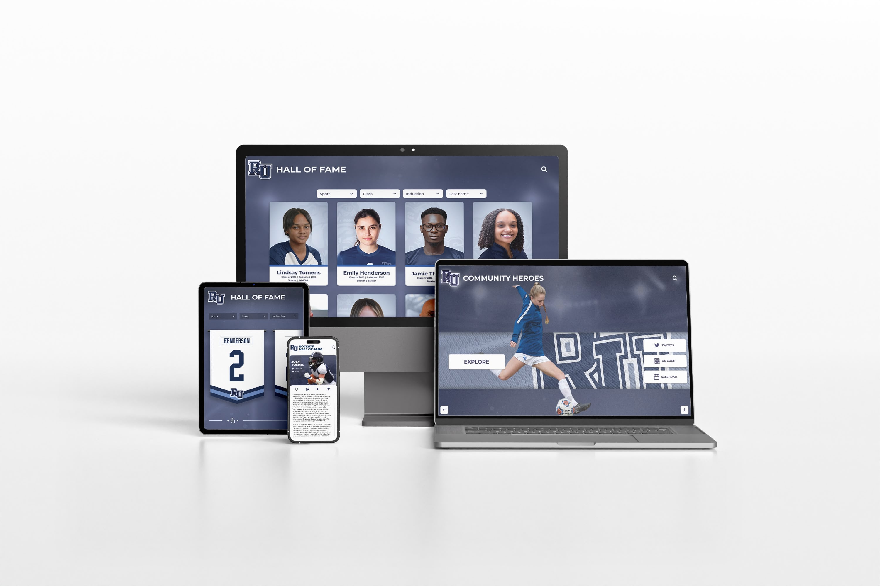
A digital hall of fame recognition platform must carry correct aria-selected implementation across every device and viewport—sport-category tabs, era filters, and inductee profile tabs serve the same screen reader users whether accessed on desktop, tablet, or mobile
Schedule a Demo of an Accessible Digital Hall of Fame
Rocket Alumni Solutions builds interactive touchscreen and web-based recognition programs designed to serve every visitor—keyboard users, touch users, and screen reader users alike. Complete aria-selected implementation for sport-category tabs, era filter strips, inductee detail panels, and touchscreen kiosk filter components is built into the platform from the ground up. See how it works for your school's inductee collection.
Schedule Your Accessible Hall of Fame Demo