Digital Hall of Fame Modal Dialog Accessibility: Focus, Labels, and Escape Behavior
- Home /
- Digital Wall of Fame Blog - Recognition Display Insights & Resources /
- Digital Hall of Fame Modal Dialog Accessibility: Focus, Labels, and Escape Behavior
The Easiest Touchscreen Solution


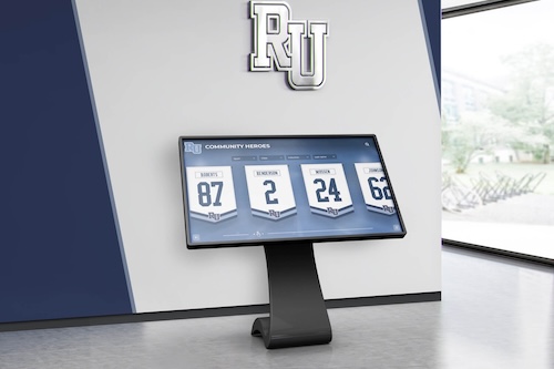
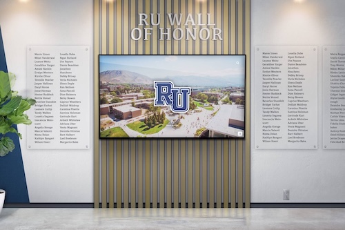
Live Example: Rocket Alumni Solutions Touchscreen Display
Interact with a live example (16:9 scaled 1920x1080 display). All content is automatically responsive to all screen sizes and orientations.
Digital hall of fame modal dialog accessibility is the practice of ensuring that every overlay panel, inductee profile popup, lightbox, and confirmation dialog on a school’s recognition touchscreen meets three core requirements: focus moves into the dialog when it opens, the dialog carries correct ARIA labels so assistive technology announces it properly, and users can reliably dismiss it — via the Escape key on keyboards or a visible close control on touchscreens. These requirements map directly to WCAG 2.1 Success Criterion 4.1.2 (Name, Role, Value) at Level AA and the ARIA Authoring Practices Guide specification for modal dialog patterns. For athletic directors, IT staff, and facilities teams managing interactive hall of fame kiosks, a failed modal means visitors may find focus stranded outside the dialog, hear no screen-reader announcement when an inductee profile opens, or be unable to dismiss an overlay during a live recognition event.
This guide gives your team a practical audit framework: a definition of each failure mode, a control-by-control pass/fail table, a numbered test sequence, and remediation language for submitting fix requests to your platform vendor.
Direct answer: A digital hall of fame modal dialog passes the accessibility test when (1) focus moves automatically to the dialog or its heading when it opens, (2) the dialog element carries role="dialog" and an aria-labelledby attribute pointing to a visible title, (3) focus is trapped inside the dialog while it is open, (4) pressing Escape closes the dialog, and (5) focus returns to the element that triggered the modal when it closes. Any modal that fails one of these five conditions does not meet WCAG 2.1 Level AA requirements.

Every overlay panel and inductee popup on a hall of fame display is a modal dialog that must meet WCAG 2.1 requirements for focus management, ARIA labeling, and Escape behavior
What Modal Dialog Accessibility Means for Hall of Fame Displays
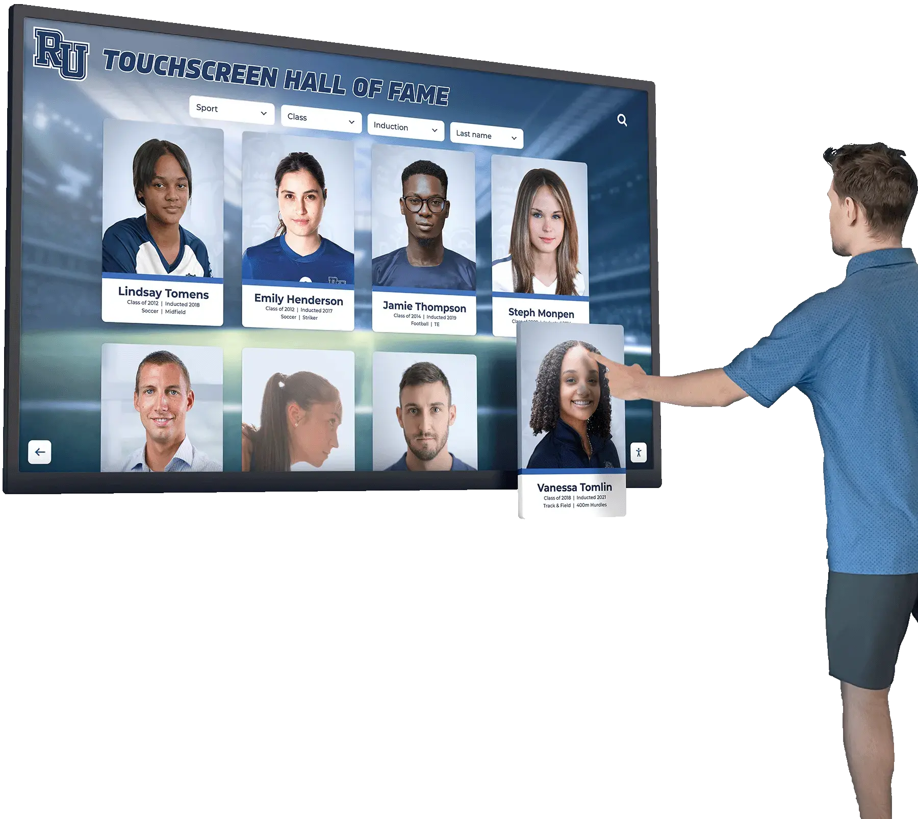
Modal dialogs appear throughout interactive recognition kiosks more often than administrators typically realize. The most visible is the inductee profile overlay — when a visitor taps a portrait card, the full biography, statistics, and photo gallery expand into a dialog that sits above the browse grid. But modals also appear as:
- Photo lightboxes: Tapping any image in a profile or championship gallery opens a full-screen overlay
- Video player overlays: Championship highlight reels and ceremony recordings that play in a dialog rather than inline
- QR code display dialogs: A panel that generates a mobile-handoff QR code for the visitor to scan
- Confirmation dialogs: “Are you sure you want to leave this profile?” or reset confirmations on kiosk idle timers
- Sponsor detail panels: Clicking a sponsor tile opens a contact or description overlay
- Nomination or feedback forms: Entry forms that open in a dialog above the main interface
Each of these overlays is a modal dialog for accessibility purposes, regardless of whether the developer labeled it as one. The three accessibility properties — focus management, ARIA labeling, and Escape behavior — apply to all of them.
Focus Management
When a modal opens, the browser’s focus — the position from which keyboard navigation and screen-reader output operate — should move into the dialog. The ARIA Authoring Practices Guide recommends focusing either the first focusable element inside the dialog or, when the dialog contains a substantial amount of content, the dialog’s container element itself (configured with tabindex="-1"). For a touchscreen hall of fame kiosk, the practical test is simple: after tapping to open a profile, can a keyboard user immediately Tab through the profile’s content without first Tabbing out of the modal?
While the modal is open, focus must also be trapped: Tab and Shift+Tab should cycle only through interactive elements inside the dialog, not escape to the underlying page. When the modal closes, focus must return to the button or card that triggered the opening. If a visitor taps a profile card and the overlay closes, focus should go back to that same card so keyboard and assistive-technology users have a reliable orientation point.
ARIA Labels
A dialog element without correct ARIA attributes is invisible to screen readers as a dialog. The required pattern is:
<div role="dialog" aria-modal="true" aria-labelledby="modal-title-id">
  <h2 id="modal-title-id">Athlete Name — Class of 2018</h2>
  ...
</div>
role="dialog" announces the element as a dialog to assistive technology. aria-modal="true" tells modern screen readers to treat content outside the dialog as inert. aria-labelledby connects the dialog to its visible heading so the screen reader announces the inductee’s name when focus enters. Without these attributes, a visitor using a screen reader hears no announcement that a new panel has opened — the interface simply changes visually with no corresponding audio cue.
Escape Behavior
On keyboard-accessible interfaces, the Escape key is the universal control for dismissing a modal. WCAG Success Criterion 2.1.2 (No Keyboard Trap) requires that focus not be locked indefinitely inside any component, and the ARIA Authoring Practices Guide specifically prescribes Escape as the keyboard trigger for closing dialogs. On a touchscreen kiosk where physical keyboards are rare, the equivalent requirement is a clearly labeled, large-target close button — typically an X icon in the corner with a minimum 44×44px touch target. Both the Escape key (for any connected keyboard or accessibility device) and the visible close button must reliably dismiss the modal.
Why Hall of Fame Kiosks Are Particularly Vulnerable
Most consumer apps implement modal dialogs correctly because modern frameworks (React, Angular, Vue) provide accessible dialog components by default. Hall of fame kiosk interfaces are more likely to have failures for three reasons:
Custom overlay implementations. Recognition display platforms often build their own inductee profile overlays using <div> elements styled to look like dialogs rather than using the browser’s native <dialog> element or a tested accessible component. Custom implementations frequently omit role="dialog", skip focus management entirely, and handle Escape only as an afterthought.
No keyboard testing during QA. Kiosk software development teams primarily test with touch interactions. A profile modal that opens and closes perfectly with a tap may have never been tested with a keyboard, meaning focus management and Escape behavior have never been validated against actual assistive-technology use.
Third-party content panels. Programs that display content across multiple award categories — from 1,000-point scorer recognition displays to academic achievement leaderboards — often pull those specialized sections from separate modules or third-party integrations. Each module may implement its own dialog pattern with inconsistent accessibility properties across them.
For institutions with WCAG 2.1 AA compliance obligations — including most schools receiving federal funding — modal dialog accessibility is not optional. Level AA includes Success Criterion 4.1.2 (Name, Role, Value), and the ARIA Authoring Practices dialog pattern is the established implementation standard.

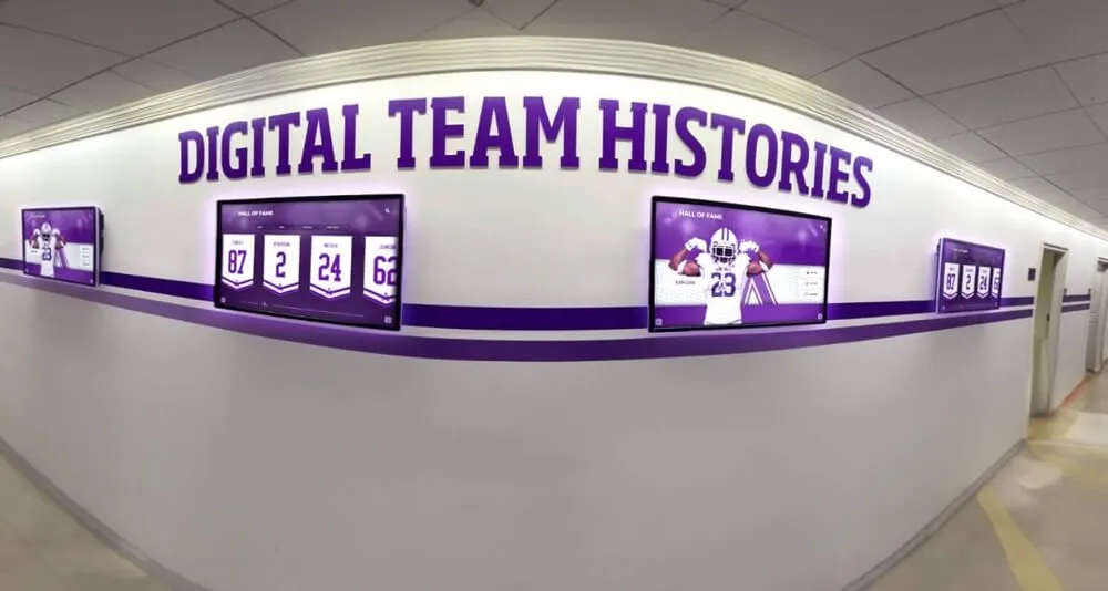
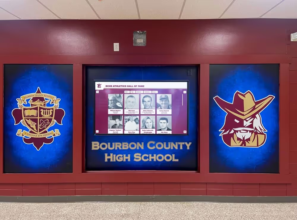
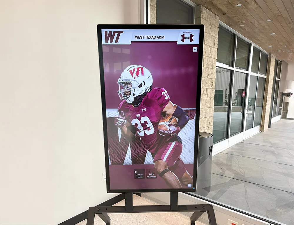
Inductee profile cards are the highest-traffic modal trigger on most hall of fame kiosks — a failed focus implementation here affects every visitor who browses the display
Pass/Fail Test Matrix by Dialog Type
Test each dialog type in your hall of fame system against the five criteria below. A single FAIL in any column means that dialog type does not meet WCAG 2.1 Level AA modal accessibility requirements.
| Dialog Type | Focus Enters Dialog | Focus Trapped | ARIA Label Present | Escape Closes | Focus Returns to Trigger |
|---|---|---|---|---|---|
| Inductee profile overlay | Required | Required | role="dialog" + aria-labelledby inductee name | Required | Required: returns to profile card |
| Photo / image lightbox | Required | Required | aria-label="Photo gallery" or aria-labelledby caption | Required | Required: returns to thumbnail |
| Video player overlay | Required | Required | aria-label="Video player" or aria-labelledby clip title | Required | Required: returns to play button |
| QR code display panel | Required | Required | aria-label="QR code" or descriptive aria-labelledby | Required | Required: returns to QR trigger |
| Sponsor detail panel | Required | Required | aria-labelledby sponsor name | Required | Required: returns to sponsor logo |
| Confirmation dialog | Required — focus to first button | Required | aria-labelledby question text | Required (closes or cancels) | Required: returns to action trigger |
| Nomination / feedback form | Required — focus to first field | Required | aria-labelledby form title | Required | Required: returns to open button |
| Achievement filter drawer | Required | Required | aria-labelledby filter heading | Required | Required: returns to filter button |
What “Focus Trapped” means in practice: pressing Tab from the last focusable element inside the dialog should cycle back to the first focusable element inside the dialog — not jump to the browser address bar or a background page element.
What “Focus Enters Dialog” means in practice: after the dialog opens (following a tap or click), focus should be on a focusable element inside the dialog. If focus remains on the trigger button behind the overlay, that is a failure even if the modal is visually correct.
Numbered Test Sequence
Run this sequence once per dialog type listed in the matrix above. You need a keyboard connected to the kiosk (a standard USB keyboard is sufficient) for Steps 3, 4, and 5. Steps 1 and 2 are observation steps that require only touch interaction.
Step 1 — Open the dialog and observe focus. Tap the trigger element (a profile card, a video thumbnail, a QR code button). As soon as the dialog appears, press Tab once. If the Tab moves focus to an element inside the dialog — a close button, a heading, an internal link — that is a passing focus-entry indicator. If Tab jumps to an element outside the dialog or to the browser’s chrome, record FAIL: Focus not entering dialog.
Step 2 — Inspect the dialog’s ARIA attributes.
With the dialog open, use your browser’s developer tools (right-click the overlay container and choose Inspect) to check whether the dialog container has role="dialog". Check for aria-labelledby pointing to the visible dialog title element, or aria-label providing a text description. Check for aria-modal="true". If any of these are missing, record FAIL: Missing ARIA attribute with the specific attribute noted.
Step 3 — Test focus trapping with Tab.
With the dialog open, press Tab repeatedly to cycle through all focusable elements inside the dialog: close button, headings configured with tabindex, internal links, video controls, gallery navigation arrows, and form fields. After reaching the last focusable element, press Tab once more. The expected result is that focus cycles back to the first focusable element inside the dialog. If focus escapes to the page behind the dialog, record FAIL: Focus not trapped.
Step 4 — Test Escape key behavior. With the dialog open and focus somewhere inside it, press the Escape key. The expected result is that the dialog closes immediately. If the dialog does not close, or if pressing Escape only dismisses a nested component (such as an image lightbox inside a profile overlay) without closing the outer dialog, record FAIL: Escape does not close dialog and note which nesting level failed.
Step 5 — Verify focus return after close. After the dialog closes (either via Escape or via the close button), observe where focus lands. Tab once and confirm focus is now on the element that triggered the dialog — the profile card, the video thumbnail, or the QR button. If focus goes to the top of the page, to an unrelated element, or is lost entirely (no visible focus ring anywhere), record FAIL: Focus not returned to trigger.
Step 6 — Test the visible close button on touchscreen. Without a keyboard, open the dialog by tapping its trigger. Tap the close button (typically an X in the upper corner). Verify: the dialog closes, the interface returns to the browse state, and the display responds to the next tap within two seconds. If the close button is smaller than approximately 44×44 pixels, or if a tap near — but not precisely on — the button fails to close the dialog, note the tap target size as a secondary finding.
Step 7 — Repeat for each dialog type. Navigate to each interactive section of your kiosk — the browse view, the individual profile view, the records board, the media gallery, the sponsor panel — and trigger each dialog type you identified. Repeat Steps 1 through 6 for each type. Programs that display specialized inductee categories, such as 1,000-point scorer recognition boards or academic achievement panels, should test those category-specific overlays separately, as they may use different component implementations than the standard inductee profile modal.
Step 8 — Document and photograph each failure. For each FAIL, record: the dialog type, the screen or view, the step number at which it failed, the specific behavior observed, and any ARIA attributes present or absent from the developer tools inspection. A screenshot of the inspector panel showing missing attributes is useful when reporting to your platform vendor.
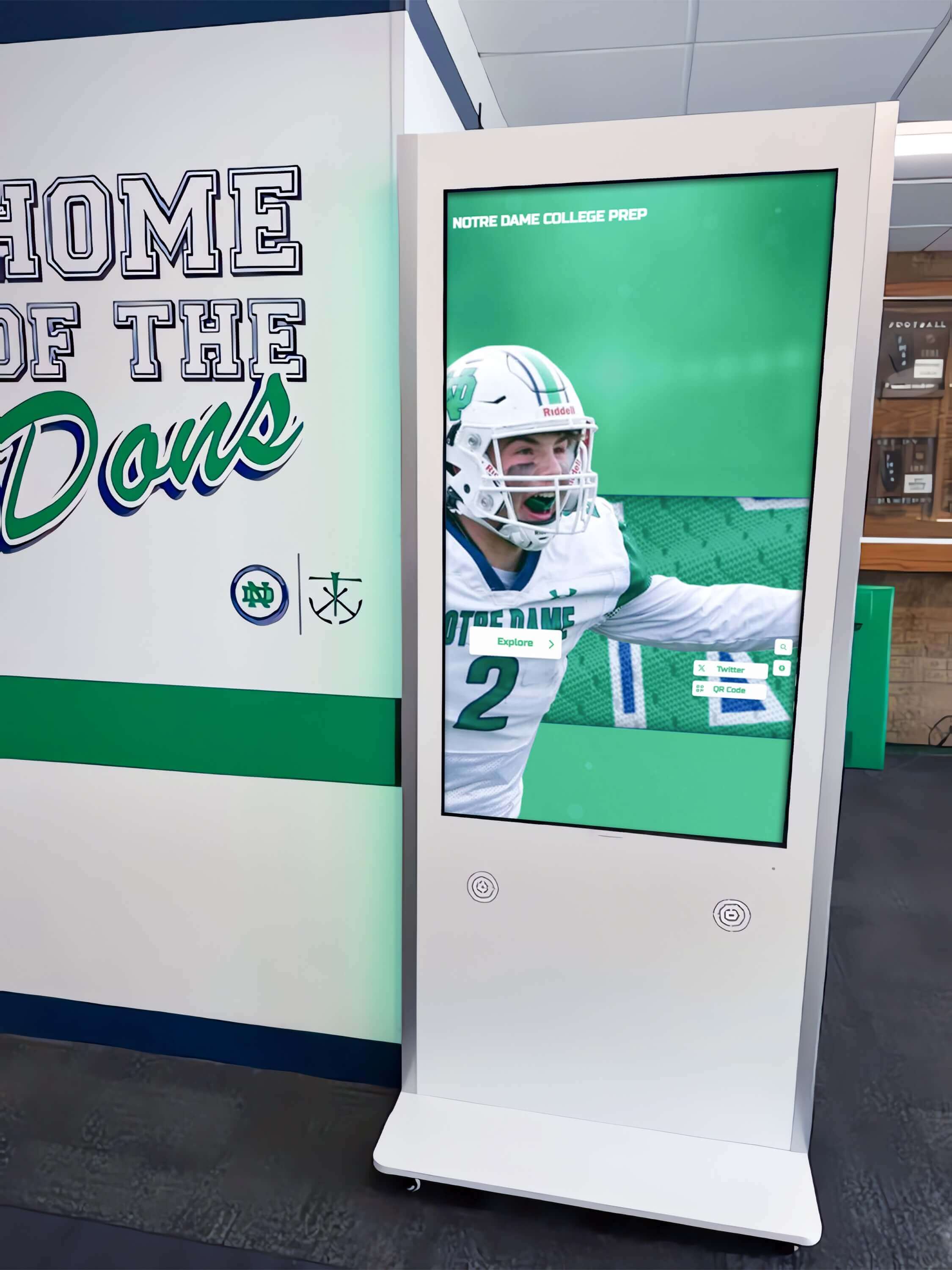
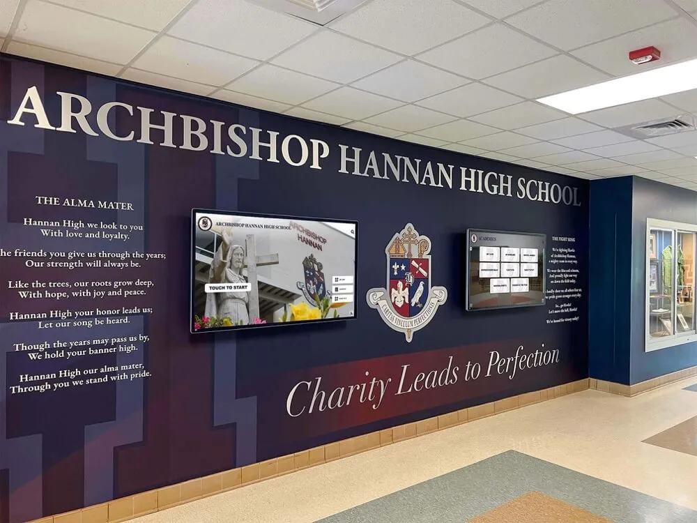
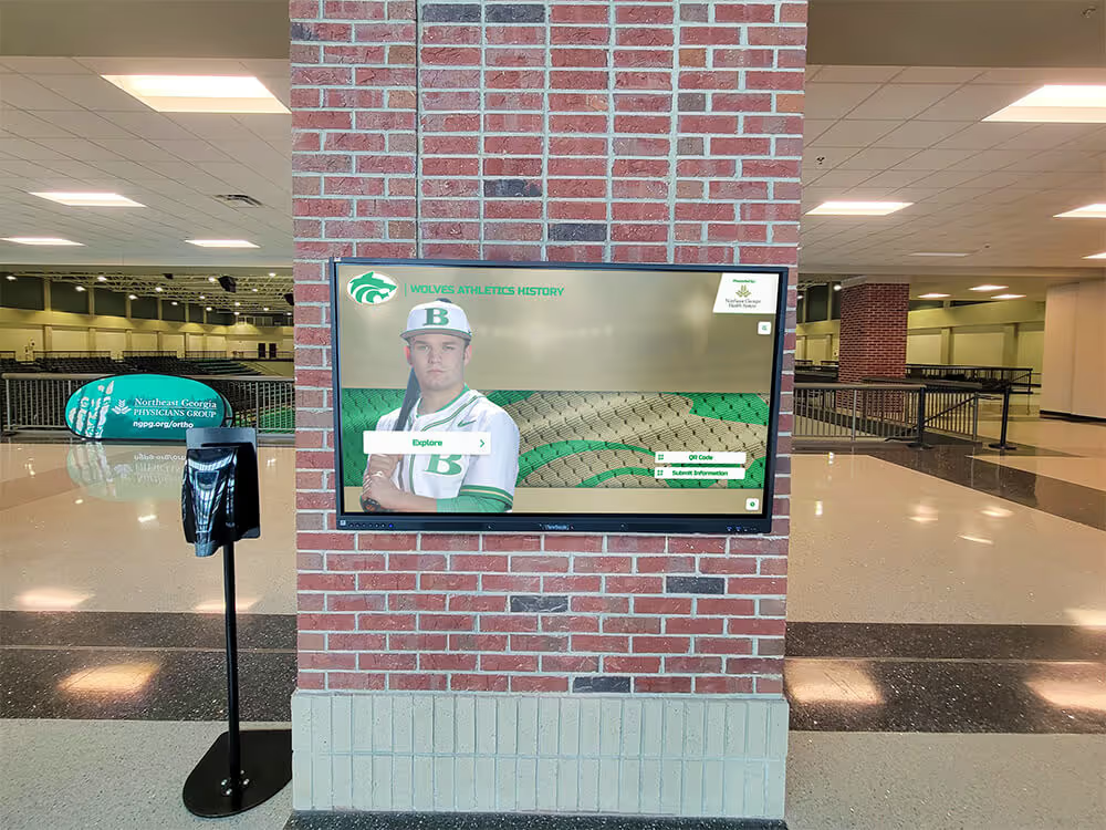
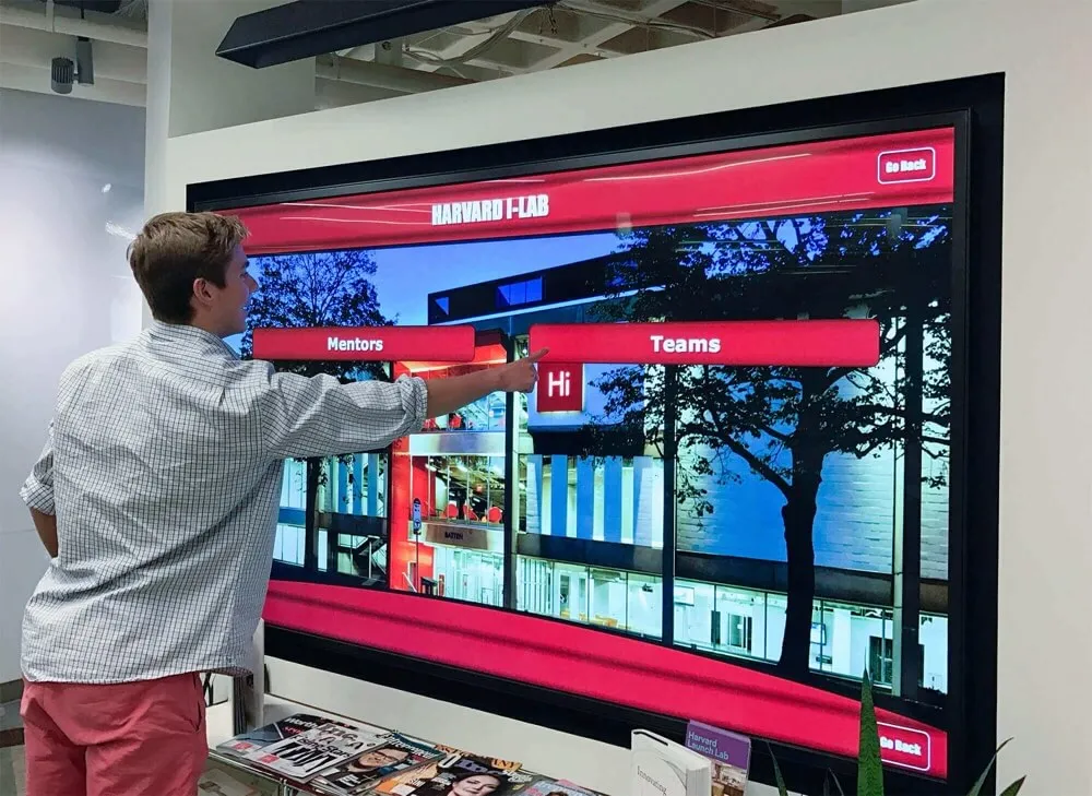
Hallway kiosks serve mixed audiences across the school day — modal dialogs that trap focus incorrectly or lack Escape support are disorienting for any visitor, not only those using assistive technology
Common Failure Patterns and Remediation Language
Knowing how to describe a failure precisely helps non-technical staff write useful reports for platform vendors or internal developers. These are the patterns most frequently found in hall of fame modal audits.
Missing role="dialog" and aria-labelledby. The overlay is built from a <div> with a CSS class that visually resembles a dialog but carries no ARIA attributes. The screen reader does not announce a dialog has opened. Report: “The inductee profile overlay container lacks role='dialog' and aria-labelledby. Please add both attributes. The aria-labelledby value should reference the inductee name heading element inside the overlay.”
Focus remains on trigger after open. Tapping a profile card opens the overlay but focus stays on the card behind it. Tab from the card goes to the next card in the grid, not into the overlay. Report: “When the profile overlay opens, focus does not move into the dialog. The JavaScript that opens the overlay should call .focus() on either the first focusable element inside the dialog container or the container itself (add tabindex='-1' to the container if focusing it directly).”
No focus trap. Focus can Tab out of the dialog into the background page while the modal is open. Report: “The profile overlay does not trap focus. While the dialog is open, Tab cycles through background elements as if the dialog were not present. Please implement a focus trap that constrains Tab and Shift+Tab to elements within the dialog while it is open, releasing the trap only when the dialog closes.”
Escape key does nothing. The dialog has no keydown event listener for the Escape key. Report: “Pressing Escape while the [dialog type] is open does not close it. Please add a keydown listener to the document or the dialog container that calls the close function when event.key === 'Escape'.”
Focus lost on close. After the dialog closes, focus goes to the <body> element or disappears entirely, forcing keyboard users to Tab from the beginning of the page. Report: “When the profile overlay closes, focus is not returned to the triggering element. Please store a reference to the trigger element before opening the dialog and call .focus() on that reference when the dialog closes.”
Programs that manage multiple recognition touchpoints — athletic hall of fame displays, academic achievement leaderboards, and student award archives — face an additional challenge: each display may use a different underlying platform. Teams working on academic achievement award recognition alongside athletic displays should audit each system separately, since a fix applied to the athletic hall of fame platform does not transfer to a separately hosted academic achievement display.
Scope: Which Modals to Include
Every overlay that obscures the background interface is in scope, regardless of how the development team describes it internally — lightbox, drawer, sheet, popup, or panel.
Always include:
- Inductee profile overlays
- Image and photo lightboxes
- Video player overlays
- QR code display panels
- Confirmation and alert dialogs
- Sponsor and partner detail panels
Include if present:
- Category or sport filter drawers
- Achievement leaderboard detail views (see guidance on above-30 ACT scorer leaderboards for how academic recognition overlays are structured alongside athletic displays)
- Nomination or feedback forms
- Settings or accessibility preference panels
- Admin-access login modals
Out of scope:
- Tooltips that appear on hover without obscuring background content
- Inline expandable sections that push other content down rather than overlaying it
- Full-page navigation transitions where no background content remains visible
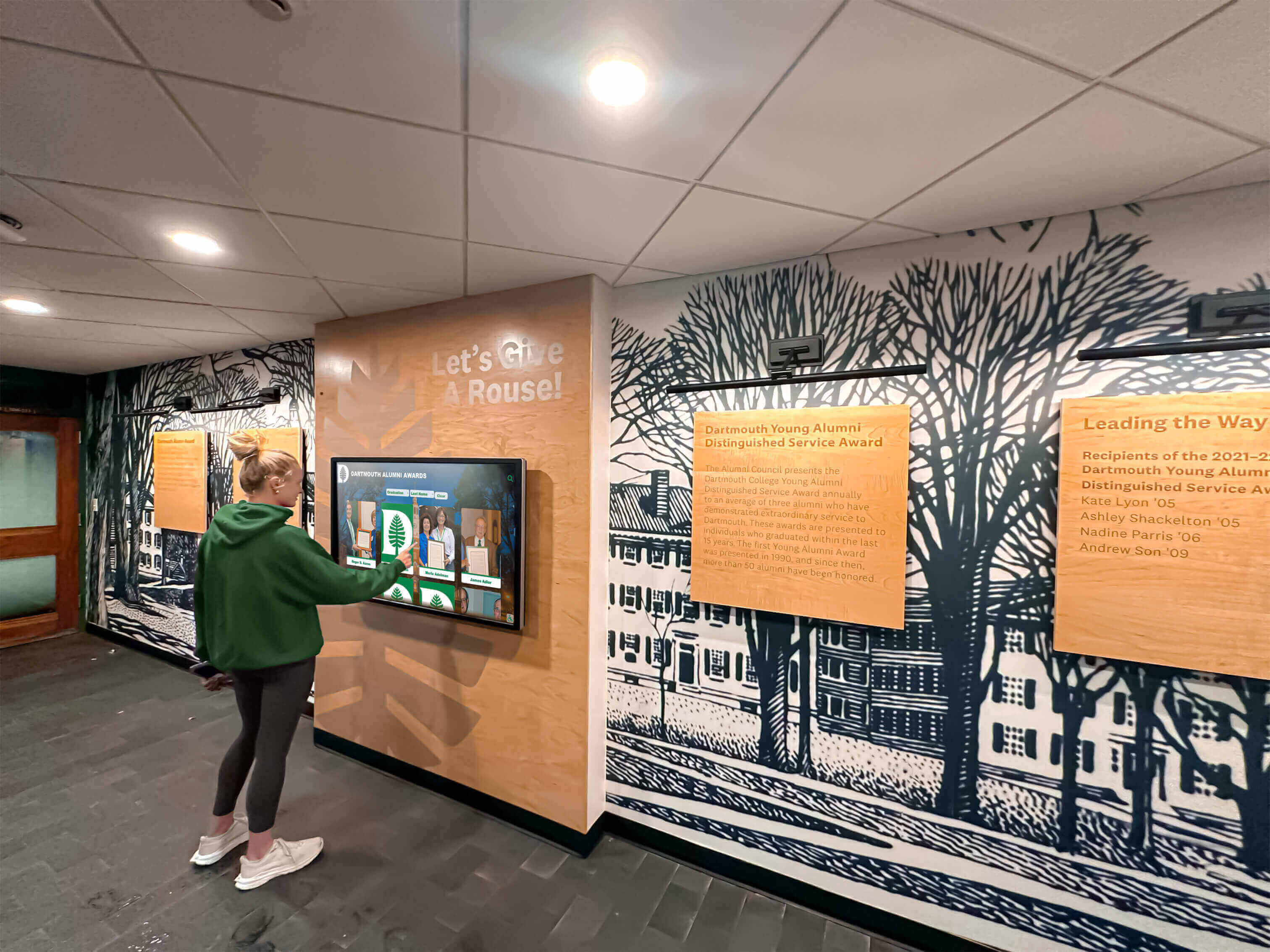
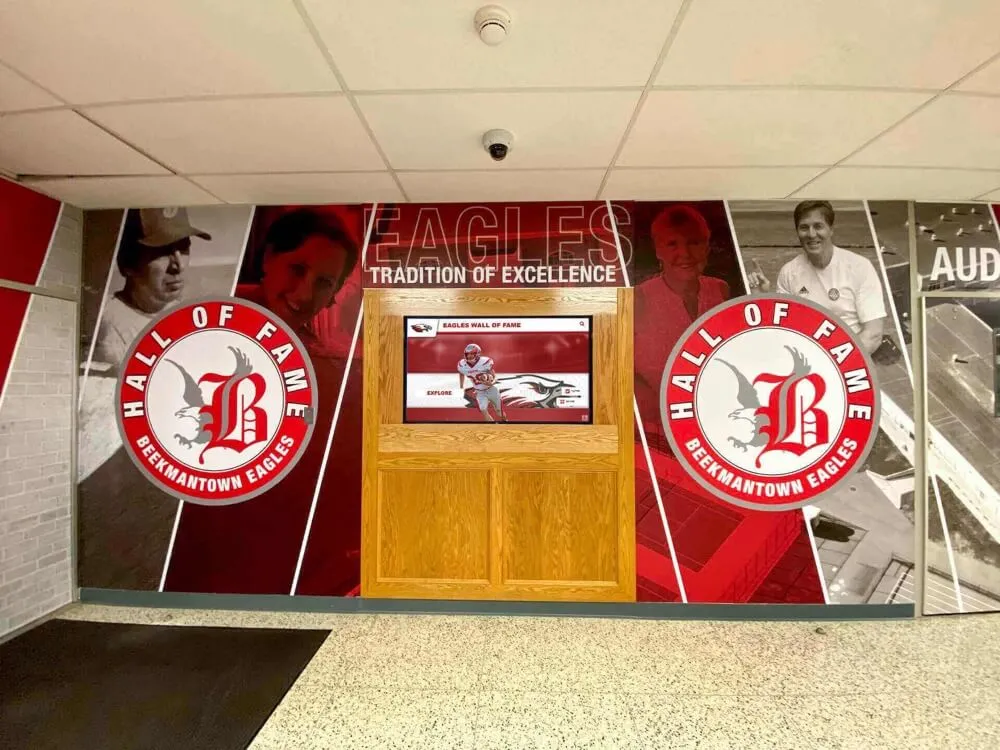
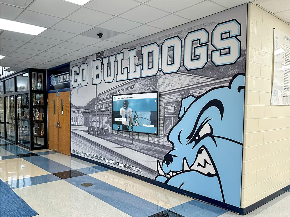
Students, families, and alumni all use hall of fame kiosks — modal accessibility failures are not limited to visitors with disabilities; they frustrate any user unfamiliar with the display
Connecting Modal Accessibility to Your Recognition Program Calendar
Modal accessibility testing is not a one-time event. Recognition programs update inductee profiles, add photo galleries, and introduce new content types throughout the year. Each content update is an opportunity to introduce a dialog that has not been tested.
Before each induction ceremony or recognition event. Inductee profile modals that carry new content — different photo layouts, additional video, updated bio sections — should be spot-tested two weeks before the event. This allows time for a vendor fix to be deployed before the lobby kiosk is the center of attention during a public ceremony.
When adding new award categories. Programs that expand to include additional recognition tracks — youth sports award displays alongside varsity athletic recognition, or displays integrated across additional kiosk and digital signage locations — should test modal accessibility in each new category’s profile view before going live. Category-specific profile layouts often differ from the standard inductee overlay and may use separate component code.
After platform software updates. Hall of fame kiosk platforms typically deploy software updates on a scheduled basis. A vendor update that modifies the inductee profile component may also change its ARIA attributes or event handling. Add a five-minute modal spot-check to your post-update verification checklist.
When deploying new hardware. Kiosk hardware changes — a new screen size, a different operating system version, an updated browser runtime — can affect how focus management and keyboard events behave even if the application code has not changed. Test modal accessibility on new hardware before removing the old unit from public access.
For programs managing academic recognition alongside athletic displays — such as schools that track above-30 ACT scorer leaderboards in a separate display alongside their athletic hall of fame — coordinating modal accessibility audits across both systems in a single review cycle is more efficient than treating each independently.
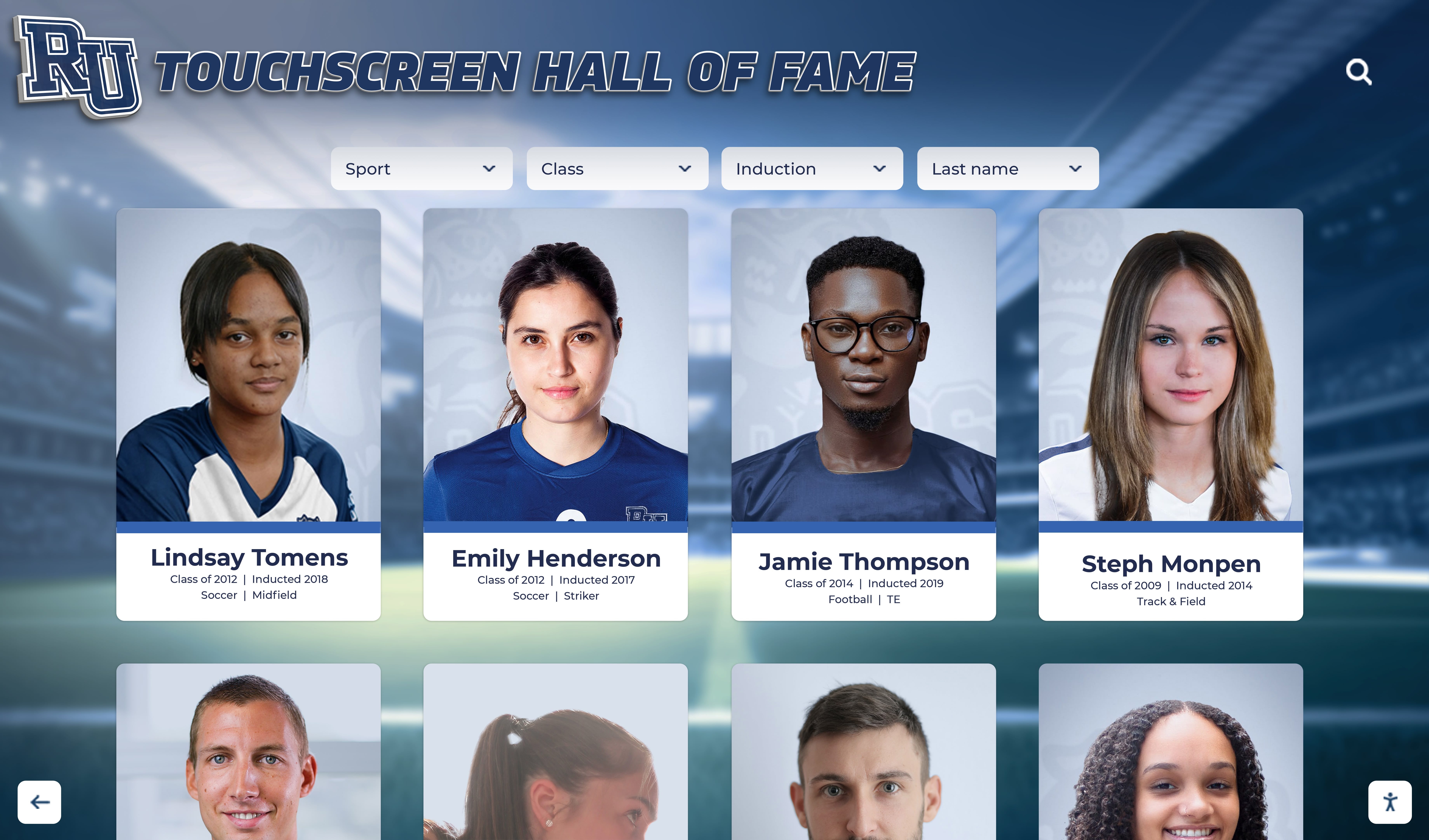
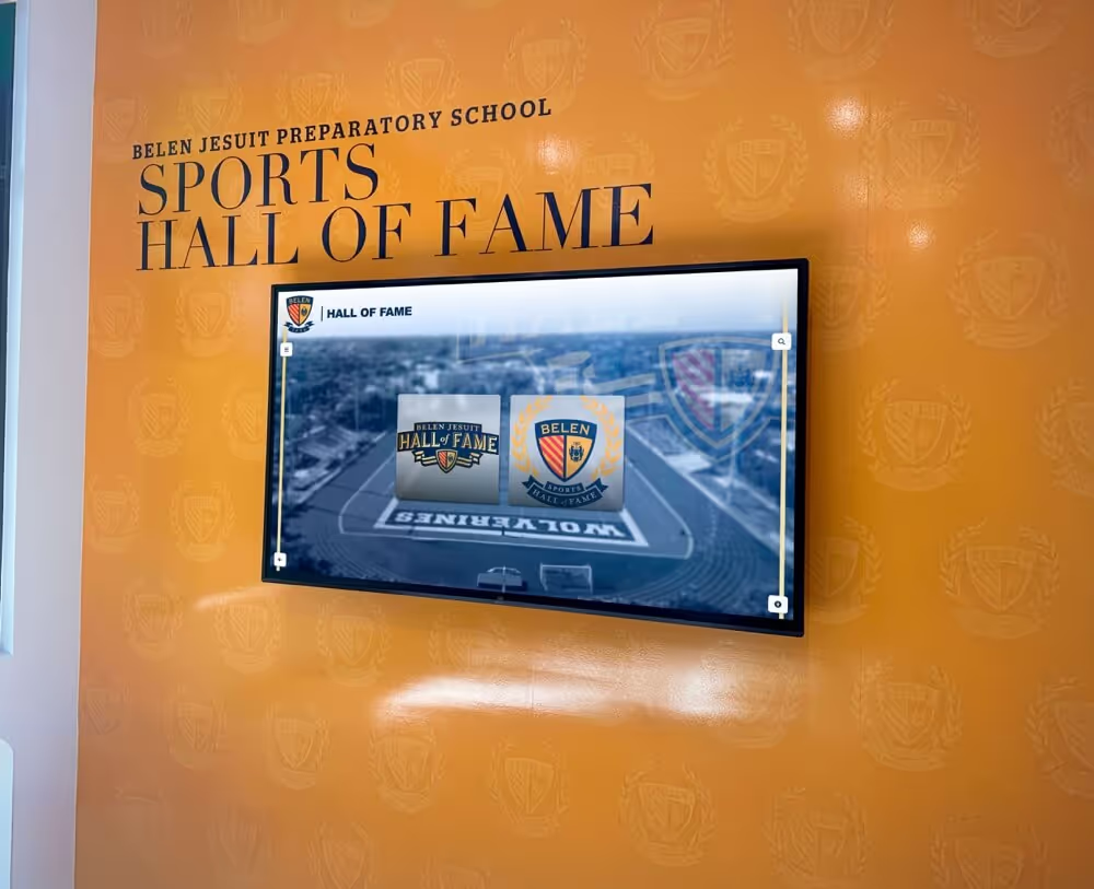
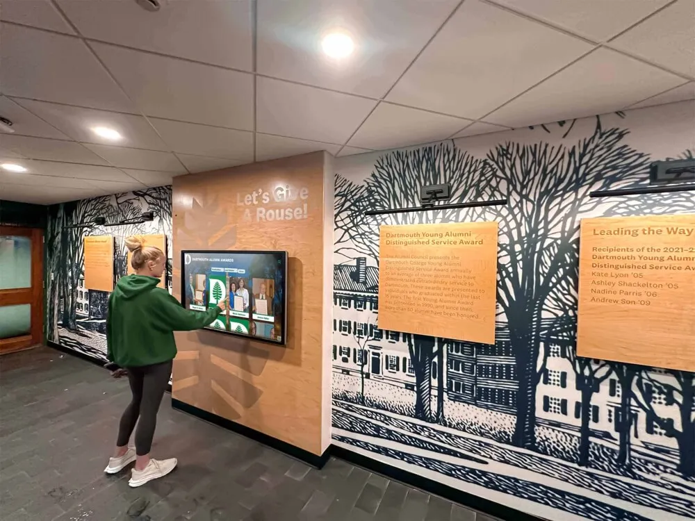
Portrait card grids are the primary entry point to inductee profile modals — ensuring these overlays pass the full test sequence is the highest-impact accessibility improvement available to most programs
Frequently Asked Questions
Does WCAG 4.1.2 apply to our kiosk if it runs a dedicated application rather than a website? Yes, if the application is delivered through a browser runtime — as most hall of fame platforms are — WCAG 2.1 applies. Native app-based kiosks are subject to equivalent requirements under ADA Section 508. If you are unsure whether your platform uses a browser or a native runtime, ask your vendor; the answer determines which specific standard applies, but the practical accessibility requirements for modal dialogs are nearly identical in both cases.
Our platform vendor says modals are “working as designed.” How should we respond? “Working as designed” typically means the vendor’s QA process did not include keyboard or screen-reader testing. Respond with the specific failure: the WCAG success criterion number (4.1.2 for missing ARIA attributes, 2.1.2 for focus trapping), the step in the test sequence at which the failure was observed, and the expected behavior. A vendor with WCAG 2.1 AA compliance claims should be able to produce documentation showing these specific patterns were tested against the criteria.
Are there automated tools that can detect missing ARIA dialog attributes?
Partially. Browser extensions like axe DevTools and WAVE can detect missing role="dialog" attributes and absent aria-labelledby references on rendered HTML. However, they cannot reliably detect dynamic focus management failures — focus not entering the dialog, focus not trapped, focus not returned — because those failures occur at runtime based on JavaScript behavior. Use automated tools as a first pass, not as the complete audit.
How long does a full modal accessibility audit take? For a typical hall of fame kiosk with four to six distinct dialog types, a first-time audit following the numbered sequence takes two to three hours, including developer tools inspection for each dialog type. Repeat audits after software updates take thirty to sixty minutes if only a subset of dialogs changed. Bringing a second tester — one to perform interactions, one to observe focus and inspect developer tools — reduces both audit time and the chance of missing a failure.
Does a 1,000-point scorer recognition panel need to meet these requirements if it navigates to a new page? If tapping the milestone entry navigates away to a new page, modal dialog accessibility requirements do not apply to that interaction. However, if the entry opens an overlay panel above the current page — as is common in single-page kiosk applications — it is a modal dialog and must meet all five criteria. Consult a 1,000-point scorer recognition guide for how these profiles are typically structured and whether the implementation uses page navigation or overlay dialogs.
Should we test modal accessibility on the school’s web-based hall of fame directory separately from the lobby kiosk? Yes. The web-based directory and the kiosk interface may use different rendering paths, different browser runtimes, and sometimes different component libraries. A fix applied to one may not transfer to the other. Test each separately and report findings for each environment. This is especially important for schools that maintain academic achievement recognition alongside athletic hall of fame displays on separate hosted platforms.
Summary: What a Passing Modal Implementation Looks Like
A digital hall of fame kiosk that passes the modal dialog accessibility test has these observable characteristics across every overlay type:
- Focus moves automatically into the dialog container or its first focusable element when the dialog opens
- Tab and Shift+Tab cycle only through elements inside the dialog while it is open
- Each dialog container has
role="dialog"andaria-labelledbyreferencing its visible title aria-modal="true"is present on the dialog container- Pressing Escape closes the dialog from any state
- A clearly labeled close button with a minimum 44×44px touch target is visible and functional
- Focus returns to the trigger element — profile card, thumbnail, or button — when the dialog closes
- No background content is reachable via Tab while the dialog is open
Schools that achieve this state provide a more confident, more inclusive recognition experience for every visitor who interacts with their lobby kiosk — students, families, alumni, guests with disabilities, and first-time visitors unfamiliar with touchscreen recognition displays. Modal dialog accessibility is one of the more straightforward WCAG 2.1 audits to validate in-house, and the common failures — missing ARIA attributes, absent focus traps, missing Escape handlers — require targeted, scoped changes to the platform’s component code rather than a full interface redesign.
If your platform vendor positions its product as WCAG 2.1 AA compliant, request documentation showing modal dialogs were tested specifically against focus management, ARIA labeling, and Escape behavior. Then run the eight-step test sequence above to verify. Compliance statements that are not backed by component-level test evidence are not a reliable substitute for direct observation.
See a Hall of Fame Display Built for Accessibility
Rocket Alumni Solutions builds digital hall of fame touchscreen displays designed to meet WCAG 2.1 AA standards — including proper modal dialog focus management, ARIA labeling, and keyboard accessibility — so your school's recognition experience works for every visitor who steps through the door. Request a custom demo to see the platform in action and ask your accessibility questions directly.
Request Your Custom DemoLive Example: Rocket Alumni Solutions Touchscreen Display
Interact with a live example (16:9 scaled 1920x1080 display). All content is automatically responsive to all screen sizes and orientations.